Friday, December 21, 2012

Wednesday, December 19, 2012

I still have to scan / photograph all my sketchbooks from the semester as well as my recent pencil drawings out of classes...

But here's just more of that super analytical drawing. Let me know whatcha think...
Masamune Shirow Inspired


Title:  Masamune Shirow Inspired
Date: December 19, 2012
Medium: Photoshop

Notes:  Continuing on with the planar analysis. This one is extremely contour heavy, but I think this is a good method to start using. It's basically like having a coloring book at this point because the shadows / highlights have literally shown themselves in their entirety. Thanks characterdesigns.com for the pose!


Monday, December 17, 2012

I've taken the weekend off... just maxxing and relaxing. Ahhh it was amazing!

I love just chillin' out and just drinking, watching movies, and all around having fun.

But, I must at least start to push into the working direction again.

Well, here's the first 'sketch' of the break so far...
Just trying to use what I learned from the semester and actually apply it to regular work.

Facial Plane Study


Title:  Facial Plane Study
Date: December 17, 2012
Medium: Photoshop

Notes:  This was an attempt to take things that I learned from this semester and start to apply it to all my outside work. I think this is turning out pretty well so far... I might keep going, I might start a new one. Who knows? Either way, I think this method works interestingly, plus I finally get to bring back my contour drawing. YAY!!


Wednesday, December 12, 2012


Continuing on from the last post...

Drawing Composition Class!

Reduction from Reference


Title:  Reduction from Reference
Date: September 10, 2012
Medium: Collage, Conte, Charcoal
Scale: 30" x 22"

Notes:  I worked from a representation master and reduced the painting to no more than four values. The tried to really emphasize the composition throught the design of the entire piece.


Reduction from Life


Title:  Reduction from Life
Date: September 17, 2012
Medium: Collage, Conte, Charcoal, Ink Wash, Acrylic
Scale: 30" x 22"

Notes:  Using the same techniques as before, I needed to work from observation using a complex subject. In this case a still life. I made sure to emphasize the overall design of the objects and the finished result.


Compositional "Architecture"


Title:  Compositional "Architecture"
Date: September 24, 2012
Medium: Vine Charcoal, Chalk
Scale: 30" x 22"

Notes:  While working from observation, I was to do a drawing using a single focal point. The point was to focus on one object and make the entire composition serve that single focal point.


"Building" Composition


Title:  "Building" Composition
Date: October 1, 2012
Medium: Vine Charcoal, White Chalk, White Acrylic
Scale: 22" x 30"

Notes:  This piece was entirely based on blocking in the composition using a push-and-pull method while working. I was to push the media around with the white and black meeting in the middle creating a huge variety of grays throughout the piece. This was also worked in from a still life during class.

 
Interior / Exterior Space


Title:  Interior / Exterior Space
Date: October 8, 2012
Medium: Ink Wash, Conte, White Chalk, Charcoal
Scale: 30" x 22"

Notes:  The point of this piece was to focus on an interior looking out into an exterior. You had to make sure that the entire composition was based solely around this fact. The piece was to be a push into the outside.


Expanding Picture Plane


Title:  Expanding Picture Plane
Date: October 8, 2012
Medium: Charcoal
Scale: Each piece is 15" x 15"

Notes:  While working from a still life I was supposed to try and create three different pieces that were each a composition of there own. The point was to make each one use the rule of thirds and create a good focal point in each piece. Then I was to join them together to create one solid composition.


Extreme Viewpoint


Title:  Extreme Viewpoint
Date: October 15, 2012
Medium: Ink Wash, Conte, Charcoal
Scale: 30" x 22"

Notes:  Working from observation I did a drawing which presented the subject from an extreme angle. In this case, that angle was a worm's eye view. 


Grid and Rule of Thirds


Title:  Grid and Rule of Thirds
Date: October 29, 2012
Medium: Ink Wash, Charcoal, White Acrylic, White Chalk
Scale: 30" x 22"

Notes:  Working from observation, I used a landscape to make a grid-like armature that also implemented the rule of thirds.


Decorative Space


Title:  Decorative Space
Date: November 5, 2012
Medium: Oil Pastel
Scale: 30" x 22"

Notes:  Working from observation, I did a full color drawing that transformed the three-dimensional objects into flat surfaces. The point of this was to reference pop-art of the '60's to create a piece using those non-realistic and non-traditional color scheming. 


Grid Reproduction


Title:  Grid Reproduction
Date: November 12 - 19, 2012
Medium: Black Ink and Stick, White Acrylic
Scale: 22" x 30"

Notes:  Firstly, we had to create one mark (in my case it was that cross pattern) and then lay in highlights and low-lights according that that single mark. Secondly, we had to use a master (in this case William Whitaker) and try to reproduce it according to a grid. It is extremely difficult at times to FORCE a piece to work on a grid, but this was my finished result.


Applied Cezanne Study


Title:  Applied Cezanne Study
Date: December 3, 2012
Medium: Charcoal, Chalk, White Acrylic
Scale: 22" x 30"

Notes:  Working from observation, I was to create a piece that emphasized the light and shadow according to how Cezanne would have. Very loose gestural line-marks, large strokes, and paying close attention to the structure were of the greatest import during this piece. I am glad that my subject was so willing to sit there during the creation of this (Thank you madam!!!).


Repetition / Movement


Title:  Repetition / Movement
Date: December 10, 2012
Medium: White Chalk, White Acrylic, Vine Charcoal
Scale: 22" x 30"

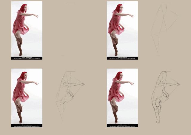
Notes:  Using referenece, we were to simulate a movement in space. The image was to make it look like a sort-of 'ghosted' image throughout. We were meant to attempt to show movement throughout the piece. I think I bit off a bit more than I could chew, but I sure tried! (Reference image from: http://tasastock.deviantart.com/ - Thanks!!)


Let's let this blog get real weird for a moment...

Sooooo, oh man! This semester was INSANE! I literally didn't think it was going to ever end. But thank god I'm finally on break. Now it's time to get all that schooling that I've been in, let it float to the top, through the sifter and try and apply it all to the artses that I make on the side during break.

The next few days will just be a gathering of my sketchbooks, paintings, drawings, etc. and just pretty much playing catch-up. I have sooo much to upload, and then it'll be time to create even MOAR!

I guess I should get to it...

Let's start with Idea, Process, and Critique (IPC class):

Consumption Junction


Title:  Consumption Junction
Date: October 18, 2012
Medium: Sculptural Form

Notes:  My sole purpose of this piece is to show, in a very literal sense, that the energy drinks that people consume are speeding up the process in which we expire. Much like batteries, the human body can only withstand so much energy intake before it overloads. The same can be said about energy drink consumption. It tends to wear on the body rather quickly.

This piece was actually created using an energy drink and ibuprofen. We were required to make something using one repeated form (in my case the pill form) and make it mean something.


Addiction Transformation


Title:  Addiction Transformation
Date: November - December 6, 2012
Medium: Photoshop
Scale: Original Scale Varies

Notes: I am exploring the thought that one can literally become addicted to anything. Is it possible? Can an addiction eventually become an obsession? In that same vein, can it even become a life-threatening compulsion? From my research it appears that anything can become addictive through sheer repetition.

The work presented here is my exploration into all these aspects at once. I initially started with a photograph, taken every twelve hours (one at 10:00AM, and then one at 10:00PM). This step was meticulous as it could impose upon anything that was being done at the time. After this simple data collection had ended, I gathered up all these images and began to paint them all, one-by-one. They started as small digital paintings (thus the first one being the smallest), and eventually became larger. This is to represent that an addiction always starts small, but develops into a full-blown, can’t live without, obsession.

Digital painting is another aspect that is prevalent throughout this piece. It is representing that ‘quick-fix’ that one can experience through some drugs. It literally has no dry time, and can be corrected extremely fast, so there is much less risk involved. Thus the person attempting this can get quick satisfaction from this type of media.

I am exploring the transformation both physically and psychologically that one experiences in the throes of addiction. Each image’s quality gets a bit more diminished with a crest at about image fifteen. The viewer is meant to see a visual connection between the image quality and the figure represented.

Through research, it shows that the minimum amount of days it takes to develop (and break) an addiction is actually only twenty-one (thirty for maximum impact). These two recurring numbers found their way into my piece. The number of paintings presented takes on this minimum, while the time spent on each painting takes on the latter number (thirty minutes each).

The doors over each piece are to represent the unknown when first beginning an addiction. They are each numbered to simply show the day that each painting was done. These are hung in a random fashion to show the mindset that one has when starting an addiction, meaning you never know where you’ll end up or even where you’re beginning when first undertaking an addiction (which initially one might not view as an addiction).


Title:  Entwined Revelations
Date: November 26, 2012
Medium: Sculptural Form

Notes: With the apparent addiction to technology, is it more important to use our devices, or breathe air? With addictions such as nomophobia (the fear of being without a cell phone – which is said to result in heroin addiction like withdrawal) on the rise, the public seems to vote for the former. A majority of people wouldn’t consider a day without their myriad of devices, they would rather stop breathing.

Everyday, I go through seeing people ignore others, trapped entirely in their electronic devices. I understand that we live in an age of technology, but when did man get taken out of the equation. Technology has completely withdrawn humanity from nature. If you go to a park on any given Saturday, you don’t even see children out on the playgrounds anymore. I have gone entire weekends, walking through parks, and noticing the complete lack of children. When I was a child going to the park was the only thing that we ever wanted to do. We would play and interact from sun-up till sundown. It has become a very sickening problem that needs addressing. Humanity is so far out of touch with nature because of our complete obedience to our technological devices.
In my opinion the world has gone from a world of regular social interaction to a ‘screen’ society. We are lacking interaction in most forms, making way for the virtual world to overtake the physical. Humans rank as one of the most socially dependent creatures in the world, but it is amazing how a social need affects birds. They need this social interaction. The small subjects in the trees are going to be tiny tinfoil birds with televisions for faces. They are to expressly show the visual representation of what social interaction looks like. The wires themselves are to be a clue as to the way we interact with not only ourselves, but to nature itself. I plan on using small electronic devices on the end of each of the wires that will play a TV static sound. This is to show the distinct disconnect between man and nature.
The viewers themselves should be able to climb into the trees to view the subject matter up close. As well as pick up and inspect the birds themselves. The dangling ‘sound devices’ will be discarded electronic devices to show how fast we move in this purchase and throw away consumerist society.

I want to make sure to have a very disturbing contrast between the electronic man-made versus the natural element.

Technological Sea


Title:  Technological Sea
Date: September 18, 2012
Medium: Sculptural Form

Notes: My intention of this piece is to open the eyes of people to show that they are literally drowning in a sea of technology.

I plan on using a piece of wood, affixing a sculptural form of a hand to it, then draping a multitude of wires over the hand one-by-one.

The hand is to look youthful and smooth, thus I want to use tape to bind the hand after it's been sculpted out of tinfoil. The point of this is to not only help the hand retain form, but to help it become more structurally sound for when I drape the wires over the piece.

I will affix the hand down with glue and more tape, all the while attempting to work as fast as possible.

I will then drape wires onto the piece one by one, affixing them down on the edges so that they can stay free on the inside of the piece. To make the piece interesting and convincing, it would be best to use wires that are differing colors and thickness.

The piece is to be represented with the wires being 'water' and the hand attempting to break out of it, but unfortunately getting sucked right back in.


I'll have to update more soon with my next class!

Monday, October 29, 2012

There is so much art that I have to go and photograph. I'd say approx. two sketchbooks at least to get onto here... not even counting the finals from actual projects. Either way... the time is now to start playing with the catch-up.

Hello again, Dear Ashley


Title:  Hello again, Dear Ashley
Date: October 29, 2012
Medium: Photoshop
Scale: Original is 1100px x 1200px

Notes: This was mostly just a test to see how in-depth that technique that I've been studying can really go. As you can see, it REALLY helps with proportions and getting angles down. As always, I'm decently happy with this for now, let me come back and look at it in a few hours and I might have to go... "BLECHH!" But the subject matter keeps me wanting to paint (mah special lady friend).


Pose Studies (with Bonus Tutorial)


Title:  Pose Studies (with Bonus Tutorial)
Date: October 29, 2012
Medium: Photoshop
Scale: Original is 2100px x 650px

Notes: These are just those studies that I am continuing. I wanted to show how they were put together, thus the tutorial. This is based upon a combination of Bargue drawing and Greecian analytically drawing. Hopefully the tutorial helps it make sense...


Title:  Pose Studies (with Color)
Date: October 29, 2012
Medium: Photoshop

Notes: Trying to keep using that technique, only this time... throw some color into the mix. Obviously I need to learn how color interacts much more before I really continue pushing in that direction. Maybe this might be a good time to start using movie stills again!


Wednesday, October 24, 2012

Here's the tutorial on how I've been drawing lately for anyone that's interested... If you guys like it, I'll go more in depth and actually try and explain this stuff at detail.

Basically it's been a combination of Bargue drawing and how the Greeks draw. You are constantly searching for angle relationships.

I'll post some actual work soon, but I just wanted to toss this up really fast.


Friday, September 28, 2012

Sanity, Gone: Part I.0


Title:  Sanity, Gone: Part I.0
Date: September 27, 2012
Medium: Ink, Vine Charcoal, White Chalk
Scale: Page was approximately 3' x 5' or so...

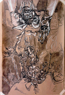
Notes: A fellow Illustrator (Robert Burns) and I, managed to just go completely crazy on a big-ass sheet of paper. After about every fifteen minutes we spun it around and worked on the opposite end. This is pretty much the result of like one-hour worth of insanity. We just had absolutely fun!


IPC Hand Practice


Title:  IPC Hand Practice
Date: September 25, 2012
Medium: Foil

Notes: An practice attempt to make a tin-foil hand that would actually stand on it's own. Success!


Hands, meet Hands


Title:  Hands, meet Hands
Date: September 26 & 27, 2012
Medium: Ink and White Chalk

Notes: The 'non-tan' paper was for part of a thirty minute draw straight through on just hands. Honestly with my interest in hands coupled with the fact that I just enjoy drawing them... time literally FLEW by. Still sooo many pages of hands left to go before I'm decent at them.


Sunday, September 23, 2012

Charles "Derpy" Gibson


Title:  Charles "Derpy" Gibson
Date: September 19, 2012
Medium: Ink
Scale: Each page is 9" x 12"

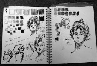
Notes: We've started to look into ink for my Illustration class, and like I said last post, we were introduced to Charles Dana Gibson. So here's my attempt (multiple times) to recreate the 'Gibson Girl'. This was almost laughable on my part... because I just kept going and going, trying to get the damn thing correct. Other than that, we were trying a multitude of mark making techniques. Trying to achieve 'visual grays' by using the ink in different ways.


Face Painting


Title:  Face Painting
Date: September 20, 2012
Medium: Photoshop

Notes: I've REALLY begun to study when it comes to getting value in it's correct place. It's kind of silly how slowly the painting comes now, but how much better it looks in terms of accuracy. I'm just constantly measuring and checking, measuring and checking. It's an exhausting process, but the results are much more appealing for sure!


Clare, From Life


Title:  Clare, From Life
Date: September 17 & 19, 2012
Medium: Ink
Scale: Each 'page' is 9" x 12"

Notes: We did a few life drawings that were timed. Each one was about twenty minutes. The focus was to really get in there with the ink and use measuring and mark making to it's maximum. The top right was to only use one value to really get the form out. This was extremely fun and I want to do many, many more of these.


Wednesday, September 19, 2012

We've been doing a ton of drawing and ink stuff that I will show later in my Illustration class.

John actually introduced me to a cool new illustrator, Charles Dana Gibson. I think that this is pretty much the epitome of what I want to do in terms of my ink works. And then learn to translate that into digital painting (perhaps over the line work?).

Anyway, just a one-hour study session. Trying to learn how to really pay attention to what I'm drawing. John, I'm just throwing it out there if you see this... you're blowing my mind teaching me these awesome techniques!

Studying Techniques


Title:  Studying Techniques
Date: September 19, 2012
Medium: Photoshop

Notes: Each of these is using a different technique to get value. I'm trying to learn every way I can and see what really sticks for me. Honestly the Gibson method might be the most interesting, but how does that translate to painting? I mean I guess I could start to put washes on top of what I draw, but I feel like I need some color instead of just straight value. Maybe I could digital paint over these lines? I'm not sure yet really... will definitely need more experimentation and practice before this makes sense. Anyway, the second method is a bit closer to edge / planar analysis. It was meant to find the contours and big mass of color to just get all the things in the right place. And finally, the third one is a subtractive form of painting. I was just blocking in the black shapes and then coming back into it with the lighter tones until it started to get closer to what I was looking for. Hopefully all of these make sense, but regardless... I'll have more of them soon.


Monday, September 17, 2012

Just a few quick lunch doodles...

Hel-Looks Study


Title:  Hel-Looks Study
Date: September 17, 2012
Medium: Photoshop

Notes: As always, I'm studying from Hel-Looks. I'm beginning to wonder if maybe I'm not doing this whole studying thing right. Maybe I need to consult with my teacher and see if he has any pointers. I wonder if maybe I'm just stuck in contour mode. I need to start gathering the forms faster and better and maybe that will help me a bunch.


Title:  John Sketch
Date: September 17, 2012
Medium: Photoshop

Notes: A guy sat down next to me during lunch and I just went into it full-on paint style! Fun quick sketch.


So, as always, my promises to update more often go unfulfilled, but here it is. I just keep trucking on.

School has been grinding my to the bone, so I decided that working was less important for the moment and that I should focus entirely on school. Oh it feels so nice to actually get a decent night's rest. So much homework, so little time.

I've been doing a little bit of searching lately for what really matters art-wise, and I think that it's really important to just do art all the time. There really isn't an easier way around it than that. Other than that, I've discovered these fancy little brush pens that help a ton with my mark making. I would recommend that everyone that struggles with stroke economy to pick up one of these. Of course I would stick with the solid black, but that's just me. Maybe you want to do all your drawings in a crazy purple or something...

Also, if you look on my links on the left, you'll notice that I've added two more. Two people that I go to school with who are pretty damn talented. I would suggest you check out Clare Caldwell and Mary Tuttle.

Anyway... here's the art:

Uncle LAN


Title:  Uncle LAN
Date: September 11, 2012
Medium: Ink
Scale: Original is 11" x 17"

Notes: This is the first project related to my Idea, Process and Criticism class (IPC). It deals with my topic of technological addiction. I wanted to show this as a sort of introduction to my overall topic choice. I hope that it conveys it well. Oh, and it's made on Bristol board that was soaked for about four to six hours in coffee. I wanted the final piece to have this sort of vintage look to it.


Life Drawing I


Title:  Life Drawing I
Date: Variable
Medium: Graphite
Scale: Each 'page' is 9" x 12"

Notes: Getting back into the swing of things with a ton of life drawing... this is just the graphite ones. I have a ton more in the pipe.


Life Drawing II


Title:  Life Drawing II
Date: Variable
Medium: Ink
Scale: Each 'page' is 9" x 12"

Notes: Getting back into the swing of things with a ton of life drawing... this time in ink-o-vision. Just gotta keep on trucking... only a ton of hours to go before I reach the 10k hour mark.


Marko Studies


Title:  Marko Studies
Date: September 13, 2012
Medium: Graphite
Scale: Original is 9" x 12"

Notes: Marko Djurdjevic you crafty devil. I'll get around to getting how you do your incredible stuff someday... But until then I'll just keep studying yours and drooling at your amazing skills.


Losing My Mind


Title:  Losing My Mind
Date: September 11, 2012
Medium: Graphite
Scale: Original is 9" x 12"

Notes: I hope someone can find it...

Follow Mat @artofmatk

Follow Ash @ashley.storyteller