Showing posts with label notes. Show all posts

Saturday, September 28, 2013

Illustration 3: Critique Notes


Title: Illustration 3: Critique Notes
Date: September 23, 2013
Medium: Pencil

Notes: During critique I decided it would be fun to draw each person as they were getting critiqued. This is the order that we were critiqued. I tried not to move too much and just draw the people where they were sitting from my angle. It was actually really fun and a good change to get back into life drawing for a minute.

Illustration 3: Silhouettes


Title: Illustration 3: Silhouettes
Date: September 19 - 22, 2013
Medium: Photoshop CS3
Scale: Each piece fits on an 8" x 10"

Notes: This was actually a continuing even further from this.
I think these turned out alright. There are some serious wavy line issues that I need to address, but all-in-all I think that it was a pretty valiant attempt.

Sunday, June 9, 2013


"Through Fire and Flames" - DragonForce

Sorry I haven't been around for a bit, but I just wanted to throw a quick update for everyone. I have been drawing like a madman lately (stuff that I can't show yet as it's a project that my fiancee and I have been working on together), but I thought it would be nice to just show you guys that I'm not dead yet!

Either way, more updates are definitely on the way. I would like to get back to what I was doing last summer and try and update like every other day or something.

Also, the other reason that I haven't been updating is that I'm getting back into wood carving, and not only does that stuff take a while to do, but it also doesn't tend to look like much until the end result. Gotta get those guns, and what better way to do that then to carve like a beast. BEASTMODE!

Assorted Anatomy


Title: Assorted Anatomy
Date: January - May 2013
Medium: Graphite
Scale: Each 'page' is 11" x 14"

Notes:  The majority of these are supposed to be full-page spreads of anatomy study. The hands and feet were meant to be a double-page spread that would act as one piece, but the way the picture was taken (one day I need to make a damn light-box) makes them look like separate pieces. The skull studies though (I actually was looking through Mentler's pieces and really analyzing them to the max} are more from just analyzing. 

Ashley's Storytime


Title: Ashley's Storytime
Medium: Watercolor, Ink, Graphite
Scale: Original is 9" x 12"

Notes:  I was watching her read from life, and just decided this would be a great time to do some life painting. Of course it was done with a sketch first, then I just started laying down tones of color that reflected the surrounding garden area. The ink parts are mainly just in the border.

Charcoal Studies


Title: Charcoal Studies
Date: January - May 2013
Medium: Charcoal
Scale: Varies

Notes:  I had started these by watching old 'film-noir' esque movies on Hulu, but they (de?)volved into just really quick studies. I was just having fun. The interesting (at least I think so) part was that the charcoal was actually right out of my fire pit that was next to me while I was drawing.

Palette Cleansing


Title: Palette Cleansing
Date: Jan - May 2013
Medium: Gouache, Ink, White-out Pen
Scale: Each 'piece' is 11" x 14"

Notes:  Each piece here was a combination of reduction and testing of color. I tend to use my background color as a good piece of my finished piece, so I wanted to experiment with different color approaches. The backdrop was actually made from cleaning my palettes that I was using for my watercolors. I think would lay down the character in ink and pigment liners (the colored kind) and the extremely simplify the backgrounds so that they were just basic lines to give each of them a context.

Comic Characters


Title: Comic Characters
Medium: Graphite

Notes:  Cora, Cora, Cora. I wonder if maybe I draw her too much? I think she will end up being a character that I stick with for awhile. I actually want to try and start writing something about her sometime to try my hand at some writing. I've already drawn her more (need to take more images - ugh]. I need to hire someone to take these shots and then talk about them... anyone wanna be my official blog-updater? :P

InkSperiments


Title: InkSperiments
Date: January - May 2013
Medium: Ink
Scale: Each 'piece' is 11" x 14"

Notes:  Each image here was done literally in like five-minutes. I wasn't allowed to look down at my paper and so the proportion was completely out of whack, but it was another interesting experiment.

Ink Reductions


Title: Ink Reductions
Date: January - May 2013
Medium: Ink
Scale: Each 'piece' is 11" x 14"

Notes:  These are on the opposite end of that spectrum. Complete reductions (to the point where a ton of detail gets lost) were the name of the game here.  As you can see in the portraits of 'Comic-Book Life' the lack of detail can make for an interesting silhouette. I think that this might be the most important part of comic-books, is to be able to get a readable character or whatever simply off of a single flat tone.

Characters in Motion


Title: Characters in Motion
Date: May 9, 2013
Medium: Graphite
Scale: Each 'piece' is 11" x 14"

Notes:  This was simply an attempt to capture a character in motion.

Skeleton Washes


Title: Skeleton Washes
Date: January - May 2013
Medium: Ink (left), Charcoal (right)
Scale: Each 'piece' is 11" x 14"

Notes:  Yet again, the anatomy study continues. Two different approaches to doing skeletons. If you ever use tombow markers, as they go out I strongly suggest you keep them (or give them to me), because you can mix water over them with a brush and get those really nice washes that the left piece has.

Sunday, May 5, 2013

Silverspun Pickups - The Royal We

Welcome back... sheesh, that was a whirlwind of crazy to get from the last update to here. I've been cranking out like crazy. I actually have quite a few pieces to update this go around plus some writing.

One more day to go (Monday) then I'm free for the summer! OH MAN! THE PLANS!

Can't start dwelling on that yet, must finish out this last day... thus I need to get my sketchbook in order.

Speaking of sketchbooks, I have sooo many pages to get onto here. 

But yeah, before all that, let me catch up my pieces thus far in the digital realm. I'll have the next couple of months to play catch-up on my sketchbooks...

Here was my final essay for contemporary novel by the way:


An Insignificant Cart 
When someone generally thinks of a cart, they tend to just think about the physical description of a cart: four wheels, metal, maybe some plastic, quite possibly an area to set a child into. In a post-apocalyptic world such as the world in The Road by Cormac McCarthy, it can become so much more than that. It was a home and an unflinching friend on top of being what it was initially: A mobile storage container. This essay is an in-depth exploration as to what the cart itself represented, the personification of the cart, and even the emotional responses gathered from the characters themselves, all while tying back into the idea that the cart could arguably be one of the most influential ‘characters’ of the book.

The cart was initially introduced as a seemingly inconspicuous grocery cart with no real description given besides that. When it was first introduced it seemed so minute, so insignificant because even this page in the story had already built up the story up with such epic grandiose. It could be argued though, that without this cart, the father and boy might not have survived very long. In a way, it was the glue that bound them to survival. Without the cart they would not have had a method of carrying the larger amounts of supplies that they had throughout the story. Quite a few times the cart seemed to come to their rescue with promises of supplies and potentially shelter. If things would have been dire enough, the man could have probably even tipped the cart over and covered it with a tarp and they would have had a makeshift shelter for at least the boy to get by in. The cart itself seemed to almost represent their very floor of survival.

The author alluded to the importance of the cart, even though it could not talk, when he wrote: “Clamped to the handle of the cart was a chrome motorcycle mirror that he used to watch the road behind them” (McCarthy, 6). The story didn't explicitly state that the cart had any other specific modifications done to it to make it more appealing to anyone else save for the supplies themselves that were burdened upon it. The second cart got stolen once but it didn't seem to complain, it was just content doing what it did best, move objects from one spot to another. Luckily each time they found a cart it was a four-wheeled cart and not a three-wheeled one (like a wheelbarrow), because the sense of stability offered by a four-wheeled cart is much better and wouldn't fall over if stopped when they had to pull the gun on the cart thief later in the story. Each time they stopped, the cart would wait there like a very well trained dog, sitting with it’s tail wagging constantly just wanting nothing more than attention.

The boy seemed to feel a sense of abandonment (more so than the father) when he and his father had to leave the cart behind and “took a last look through the basket but that was it. Let’s go, he said. The boy took one last look back at the cart and then followed him out to the road” (McCarthy, 100). In a way the cart could - at this point - be compared to a used up prostitute being left in an alley way with nothing but her panties around her ankles. It was a sad state of affairs when the cart had to be abandoned. It could be argued that in a way the father and son found this cart on the road in the same way that a person might find a drifter on the side of a long dusty desert road. They both picked it up, rode along with them, then proceeded to turn on the cart and dump it when it had used up all it’s usefulness. To add even further insult to the original cart, they find one later in the story. “There was a market at the end of the street and in one of the aisles piled with empty boxes there were three metal grocery carts. He looked them over and pulled one of them free and squatted and turned the wheels and then stood and pushed it up the aisle and back again.”(McCarthy, 150) This could be argued as the treatment of man vs. man. The personified cart is a reflection of the selfishness of mankind’s nature. They will literally use something until it is completely used up and then toss it aside without so much as a reflective thought before moving on.

Throughout this essay there was an exploration into the ‘character’ of the cart, treatment of that character throughout, and the responses that the other characters show to this cart. All-in-all Cormac’s story in The Road is a very bleak outlook on a hypothetical near future, but somehow through man’s perseverance alone, it is actually more of a story of survival and struggle. The cart in the story is not explicitly given a minor character role, but throughout the entire journey it is always there, unflinching in the face of danger. For god’s sake  if someone were to be trapped in this hypothetical future completely alone without so much as a backpack or even a pair of pants with a bunch of pockets, at the very least hope for a cart without a squeaky wheel.

Oh, right ... art!

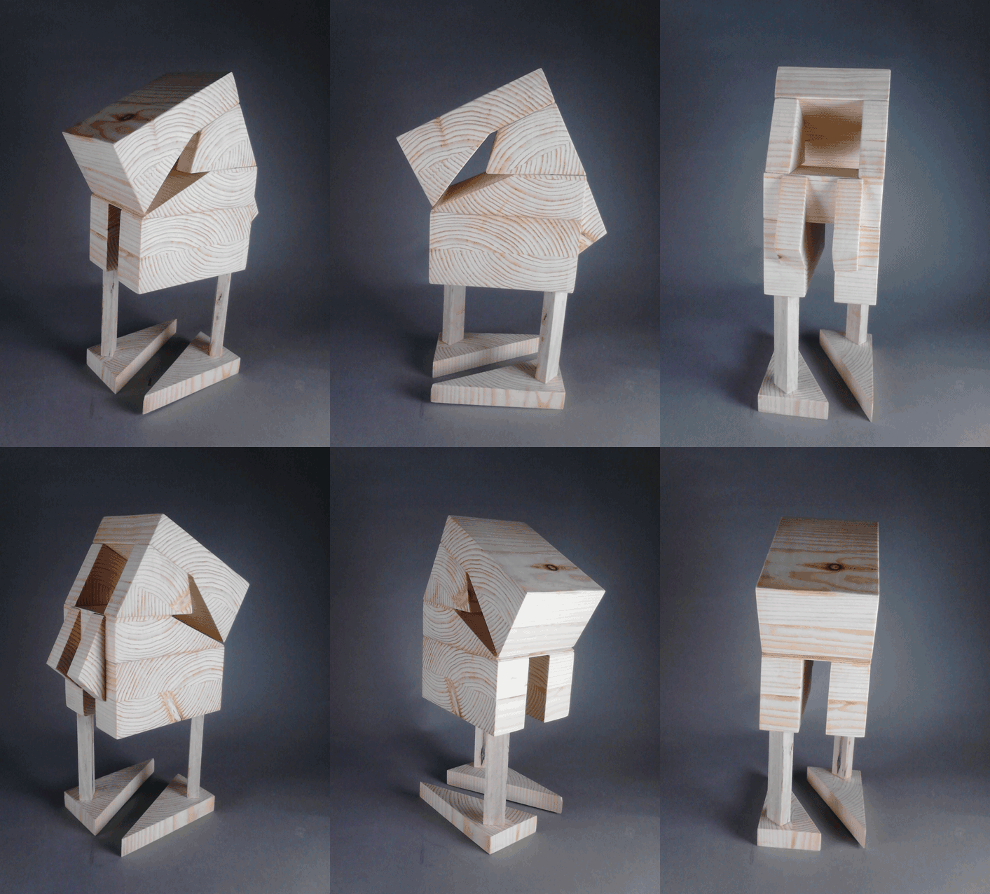
Wood Carving: Additive Sculpture


Title:  Wood Carving: Additive Sculpture
Medium: Wood Sculpture

Notes: This piece changed so many times from conception to completion. It initially started much different, but as the process went on, the puzzle pieces kept radically changing. While I enjoy the result (sort of retro robot feel), it looks nothing like the plan.
Overall, the piece deserves merit in terms of flow. I tried to make a great attempt at trying to play with the angularity as well as using the negative spaces to push the eye back into the piece.
As with the previous piece, I tried to use the patterning of the wood grain to move the eye around the piece. I almost think that having some object placed off-kilter or on the top would make for a nice break-up of the symmetry so that the piece wouldn't be so similar on each side.


Wood Carving: Subtractive Sculpture


Title:  Wood Carving: Subtractive Sculpture
Medium: Wood Sculpture

Notes: My initial thought process was to create an even more, slightly asymmetrical, organic piece. It was originally supposed to look more like a squid-like tentacle, but it ended up being more of a bird-like skull sculpture.
I decided midway through that it would be more interesting to turn the piece on it’s side and mount it slightly off-center to the wood block. I made as many attempts to follow the wood grain patterning as much as possible. I think by doing so I managed to make it even more organic. 
The problem areas seem to stem from the fact that it wasn't as smooth as I would have like it to be (especially around the “neck” area). There are so many nicks and bruises in the wood that it seems more like the piece still has a ton of work in terms of smoothing it out. Hilariously enough, I naturally threw my arm and wrist out while working on this piece

20/40 Planed Shapes


Title:  20/40 Planed Shapes
Medium: Shaped Paper

Notes:  The overall craftsmanship began moderately well, but I have since discovered that working larger tends to make things a bit clearer. I began with a much simpler design, and then realized that there weren't enough shapes to make up the overall design. I then began to place more objects in a circular pattern to mimic the exterior shape of the icosahedrons and then expanding that form at the bottom of the piece. I then took that a step further by opening the bottom of the shape to include smaller cube shapes in the interior. Since a triangular shape is the most stable shape, I decided that this would help to create a good sense of balance throughout. The shape breakup had to happen with the cubes being echoed on the outside as well.
I wish I had made the external shape at the top more load bearing because it would have helped to create a more solid viewpoint from the bottom. Also I would have liked much better craftsmanship overall, but as I stated initially, working smaller tends to be a detriment. So for next time, bigger IS better.


Dynamic Wire Sculpture


Title:  Dynamic Wire Sculpture
Medium: Shaped Wood, Wire

Notes:  For the majority of the gesture drawings, I had a tendency to draw prone animals (let’s face it, most of the animals in the zoo have become slightly apathetic). So I decided it would be ideal to find the largest animal I could find and draw it in the prone position as many times as I could before it stood up. Which led to my gesture wire frame as the bear.
My wire sculpting techniques seem to err on the slightly more gesture side instead of directly figurative. I tried to think about each of the sculpts as though I was going to 3D model the wire frame, but the output did not look as interesting as I would have liked. I tried to my best to loosen up the wire.
I could literally draw poses for days. I went to a website (www.characterdesigns.com) and attempted to gesture draw a ton of action poses. The pose that I chose was like a pre-leap pose because it gives an implied motion rather than an “in-motion” which I think might have been a bit more interesting perhaps.
For each base I tried to give a bit more dynamics to the piece by sort of tying the base to the piece. For example, with the bear piece I tried to give a sort of shale or rock texture. And for the leaping piece, I harkened back to the childish game of “don’t step on the crack or you’ll break your mother’s back” that I used to play as a kid.


Illustration II - Digital Portfolio


Title:  Illustration II - Digital Portfolio
Date: January - May 2013
Medium: Varies
Scale: Varies

Notes:  See each piece for more on the notes of each. As a whole though, this is the entirety of my illustration II class. For the most part each piece has all the work involved next to it, the only difference is that I had to truncate the amount of sketches that were with each piece.


WIP: Face that Could have been a Painting up Front


Title:  WIP: Face that Could have been a Painting up Front
Date: May 3, 2013
Medium: Photoshop

Notes:  While looking for a good reference to paint from, I stumbled upon this girl's deviant art page. She actually looks like she's painted up front, which is kind of strange, but I decided to try my hand at painting her. Unfortunately, it's still extremely stylized and the colors are kind of strange, BUT I was actually staring at Caravaggio's palette while painting this piece and tried a new technique of building up the layers. Hopefully it's starting to show some improvement, but I think I still have quite a ways to go.

Wednesday, February 6, 2013

Nothing terribly interesting today... just some sketches for my upcoming project in Illustration II. We are supposed to paint (in gouache) an electronic device in a sort of advertisement-esque series of three paintings. I kind of went a bit further and turned them all into advertisements. I guess my inner graphic-designer is showing...

Electronic Device Sketches A


Title:  Electronic Device Sketches A
Date: February 6, 2013
Medium: Photoshop
Scale: Original is 8.5" x 11"

Notes:  The first electronic device that I thought about was my headphones... I really like this layout myself. I think I would rather go with this one over the latter, but I still think that they are both interesting in different ways.


Electronic Device Sketches A

Title:  Electronic Device Sketches B
Date: February 6, 2013
Medium: Photoshop
Scale: Original is 8.5" x 11"

Notes:  I then thought about my tablet... It would be good to do all those features in the subsequent ads. Ehh... either way, they are both fun.

I also had a third one, but couldn't get around to sketches of my camera. I think it would work just as well as the headphones in the end. I need to continue practicing in goauche, I've been trading in paintbrushes for my tablet the past couple of days...

Anyway... more soon!


Wednesday, December 12, 2012


Continuing on from the last post...

Drawing Composition Class!

Reduction from Reference


Title:  Reduction from Reference
Date: September 10, 2012
Medium: Collage, Conte, Charcoal
Scale: 30" x 22"

Notes:  I worked from a representation master and reduced the painting to no more than four values. The tried to really emphasize the composition throught the design of the entire piece.


Reduction from Life


Title:  Reduction from Life
Date: September 17, 2012
Medium: Collage, Conte, Charcoal, Ink Wash, Acrylic
Scale: 30" x 22"

Notes:  Using the same techniques as before, I needed to work from observation using a complex subject. In this case a still life. I made sure to emphasize the overall design of the objects and the finished result.


Compositional "Architecture"


Title:  Compositional "Architecture"
Date: September 24, 2012
Medium: Vine Charcoal, Chalk
Scale: 30" x 22"

Notes:  While working from observation, I was to do a drawing using a single focal point. The point was to focus on one object and make the entire composition serve that single focal point.


"Building" Composition


Title:  "Building" Composition
Date: October 1, 2012
Medium: Vine Charcoal, White Chalk, White Acrylic
Scale: 22" x 30"

Notes:  This piece was entirely based on blocking in the composition using a push-and-pull method while working. I was to push the media around with the white and black meeting in the middle creating a huge variety of grays throughout the piece. This was also worked in from a still life during class.

 
Interior / Exterior Space


Title:  Interior / Exterior Space
Date: October 8, 2012
Medium: Ink Wash, Conte, White Chalk, Charcoal
Scale: 30" x 22"

Notes:  The point of this piece was to focus on an interior looking out into an exterior. You had to make sure that the entire composition was based solely around this fact. The piece was to be a push into the outside.


Expanding Picture Plane


Title:  Expanding Picture Plane
Date: October 8, 2012
Medium: Charcoal
Scale: Each piece is 15" x 15"

Notes:  While working from a still life I was supposed to try and create three different pieces that were each a composition of there own. The point was to make each one use the rule of thirds and create a good focal point in each piece. Then I was to join them together to create one solid composition.


Extreme Viewpoint


Title:  Extreme Viewpoint
Date: October 15, 2012
Medium: Ink Wash, Conte, Charcoal
Scale: 30" x 22"

Notes:  Working from observation I did a drawing which presented the subject from an extreme angle. In this case, that angle was a worm's eye view. 


Grid and Rule of Thirds


Title:  Grid and Rule of Thirds
Date: October 29, 2012
Medium: Ink Wash, Charcoal, White Acrylic, White Chalk
Scale: 30" x 22"

Notes:  Working from observation, I used a landscape to make a grid-like armature that also implemented the rule of thirds.


Decorative Space


Title:  Decorative Space
Date: November 5, 2012
Medium: Oil Pastel
Scale: 30" x 22"

Notes:  Working from observation, I did a full color drawing that transformed the three-dimensional objects into flat surfaces. The point of this was to reference pop-art of the '60's to create a piece using those non-realistic and non-traditional color scheming. 


Grid Reproduction


Title:  Grid Reproduction
Date: November 12 - 19, 2012
Medium: Black Ink and Stick, White Acrylic
Scale: 22" x 30"

Notes:  Firstly, we had to create one mark (in my case it was that cross pattern) and then lay in highlights and low-lights according that that single mark. Secondly, we had to use a master (in this case William Whitaker) and try to reproduce it according to a grid. It is extremely difficult at times to FORCE a piece to work on a grid, but this was my finished result.


Applied Cezanne Study


Title:  Applied Cezanne Study
Date: December 3, 2012
Medium: Charcoal, Chalk, White Acrylic
Scale: 22" x 30"

Notes:  Working from observation, I was to create a piece that emphasized the light and shadow according to how Cezanne would have. Very loose gestural line-marks, large strokes, and paying close attention to the structure were of the greatest import during this piece. I am glad that my subject was so willing to sit there during the creation of this (Thank you madam!!!).


Repetition / Movement


Title:  Repetition / Movement
Date: December 10, 2012
Medium: White Chalk, White Acrylic, Vine Charcoal
Scale: 22" x 30"

Notes:  Using referenece, we were to simulate a movement in space. The image was to make it look like a sort-of 'ghosted' image throughout. We were meant to attempt to show movement throughout the piece. I think I bit off a bit more than I could chew, but I sure tried! (Reference image from: http://tasastock.deviantart.com/ - Thanks!!)


Let's let this blog get real weird for a moment...

Sooooo, oh man! This semester was INSANE! I literally didn't think it was going to ever end. But thank god I'm finally on break. Now it's time to get all that schooling that I've been in, let it float to the top, through the sifter and try and apply it all to the artses that I make on the side during break.

The next few days will just be a gathering of my sketchbooks, paintings, drawings, etc. and just pretty much playing catch-up. I have sooo much to upload, and then it'll be time to create even MOAR!

I guess I should get to it...

Let's start with Idea, Process, and Critique (IPC class):

Consumption Junction


Title:  Consumption Junction
Date: October 18, 2012
Medium: Sculptural Form

Notes:  My sole purpose of this piece is to show, in a very literal sense, that the energy drinks that people consume are speeding up the process in which we expire. Much like batteries, the human body can only withstand so much energy intake before it overloads. The same can be said about energy drink consumption. It tends to wear on the body rather quickly.

This piece was actually created using an energy drink and ibuprofen. We were required to make something using one repeated form (in my case the pill form) and make it mean something.


Addiction Transformation


Title:  Addiction Transformation
Date: November - December 6, 2012
Medium: Photoshop
Scale: Original Scale Varies

Notes: I am exploring the thought that one can literally become addicted to anything. Is it possible? Can an addiction eventually become an obsession? In that same vein, can it even become a life-threatening compulsion? From my research it appears that anything can become addictive through sheer repetition.

The work presented here is my exploration into all these aspects at once. I initially started with a photograph, taken every twelve hours (one at 10:00AM, and then one at 10:00PM). This step was meticulous as it could impose upon anything that was being done at the time. After this simple data collection had ended, I gathered up all these images and began to paint them all, one-by-one. They started as small digital paintings (thus the first one being the smallest), and eventually became larger. This is to represent that an addiction always starts small, but develops into a full-blown, can’t live without, obsession.

Digital painting is another aspect that is prevalent throughout this piece. It is representing that ‘quick-fix’ that one can experience through some drugs. It literally has no dry time, and can be corrected extremely fast, so there is much less risk involved. Thus the person attempting this can get quick satisfaction from this type of media.

I am exploring the transformation both physically and psychologically that one experiences in the throes of addiction. Each image’s quality gets a bit more diminished with a crest at about image fifteen. The viewer is meant to see a visual connection between the image quality and the figure represented.

Through research, it shows that the minimum amount of days it takes to develop (and break) an addiction is actually only twenty-one (thirty for maximum impact). These two recurring numbers found their way into my piece. The number of paintings presented takes on this minimum, while the time spent on each painting takes on the latter number (thirty minutes each).

The doors over each piece are to represent the unknown when first beginning an addiction. They are each numbered to simply show the day that each painting was done. These are hung in a random fashion to show the mindset that one has when starting an addiction, meaning you never know where you’ll end up or even where you’re beginning when first undertaking an addiction (which initially one might not view as an addiction).


Title:  Entwined Revelations
Date: November 26, 2012
Medium: Sculptural Form

Notes: With the apparent addiction to technology, is it more important to use our devices, or breathe air? With addictions such as nomophobia (the fear of being without a cell phone – which is said to result in heroin addiction like withdrawal) on the rise, the public seems to vote for the former. A majority of people wouldn’t consider a day without their myriad of devices, they would rather stop breathing.

Everyday, I go through seeing people ignore others, trapped entirely in their electronic devices. I understand that we live in an age of technology, but when did man get taken out of the equation. Technology has completely withdrawn humanity from nature. If you go to a park on any given Saturday, you don’t even see children out on the playgrounds anymore. I have gone entire weekends, walking through parks, and noticing the complete lack of children. When I was a child going to the park was the only thing that we ever wanted to do. We would play and interact from sun-up till sundown. It has become a very sickening problem that needs addressing. Humanity is so far out of touch with nature because of our complete obedience to our technological devices.
In my opinion the world has gone from a world of regular social interaction to a ‘screen’ society. We are lacking interaction in most forms, making way for the virtual world to overtake the physical. Humans rank as one of the most socially dependent creatures in the world, but it is amazing how a social need affects birds. They need this social interaction. The small subjects in the trees are going to be tiny tinfoil birds with televisions for faces. They are to expressly show the visual representation of what social interaction looks like. The wires themselves are to be a clue as to the way we interact with not only ourselves, but to nature itself. I plan on using small electronic devices on the end of each of the wires that will play a TV static sound. This is to show the distinct disconnect between man and nature.
The viewers themselves should be able to climb into the trees to view the subject matter up close. As well as pick up and inspect the birds themselves. The dangling ‘sound devices’ will be discarded electronic devices to show how fast we move in this purchase and throw away consumerist society.

I want to make sure to have a very disturbing contrast between the electronic man-made versus the natural element.

Technological Sea


Title:  Technological Sea
Date: September 18, 2012
Medium: Sculptural Form

Notes: My intention of this piece is to open the eyes of people to show that they are literally drowning in a sea of technology.

I plan on using a piece of wood, affixing a sculptural form of a hand to it, then draping a multitude of wires over the hand one-by-one.

The hand is to look youthful and smooth, thus I want to use tape to bind the hand after it's been sculpted out of tinfoil. The point of this is to not only help the hand retain form, but to help it become more structurally sound for when I drape the wires over the piece.

I will affix the hand down with glue and more tape, all the while attempting to work as fast as possible.

I will then drape wires onto the piece one by one, affixing them down on the edges so that they can stay free on the inside of the piece. To make the piece interesting and convincing, it would be best to use wires that are differing colors and thickness.

The piece is to be represented with the wires being 'water' and the hand attempting to break out of it, but unfortunately getting sucked right back in.


I'll have to update more soon with my next class!

Follow Mat @artofmatk

Follow Ash @ashley.storyteller