Wednesday, June 26, 2013


"Glitch Mob - Drink the Sea (Full Album)"


Couple of productive days have gone by!
Most of which I can't really share with anyone. Most of which is pretty exciting as I've been making leaps and bounds in the digital painting department and the face anatomy department.

Either way, I'm getting super pumped and somehow I wonder if the correlation between working out, reading and just drawing my ass off have officially kicked up the art into high gear.
Either way, it's been an awesome (and enlightening) past couple of days.

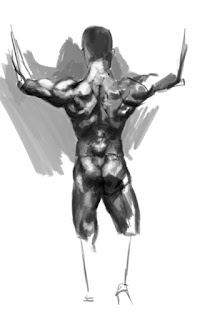
Anatomy Study: Bodies in Motion - Combined


Title: Anatomy Study: Bodies in Motion - Combined
Date: June 20-23, 2013
Medium: Photoshop

Notes: I think these turned out well and actually look pretty good all combined together. I've kind of turned onto a new type of study for this week, but will resume the next poses as we go. All-in-all, these are turning out alright, but I think having them out of context or maybe having them more drawn is really dragging the process down. I'm not really sure, but either way, the point is... I want to do more of them, but I also want to do them as accurate as possible, so I'll have to continue them next week.
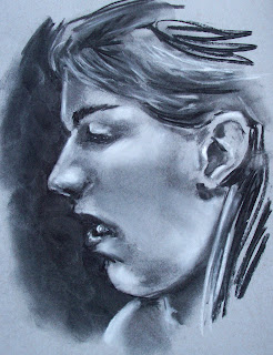
Master Study - 1 - Grey scale (Composition Study)


Title: Master Study - 1 - Grey Scale (Composition Study)
Date: June 24, 2013
Medium: Photoshop

Notes: Okay, so... this is really the meat and potatoes of this update. I have recently discovered (again) how useful master studies can be. ESPECIALLY for composition and color study. Not only will they enhance your composition know-how ten-fold in a short time, but they just plain look cool (even in black and white). I have a ton of these to do this week -- the goal is fifty gray, fifty color -- to really get my chops up. I think that I have to level up now instead of just wasting time doing study upon study and not learning enough. But yeah, this is just a small sampling of what I've been up to.

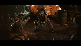
Jurassic Park Girl


Title: Jurassic Park Girl
Date: June 26, 2013
Medium: Photoshop
Scale: Same as Above.

Notes: THIS is the culmination of all the studies that I've been doing this week. I think the thing that makes this one a wonder in my eyes is not only the detail, but the speed! I finished this one (as far as I wanted anyway) in about thirty minutes. Honestly, this one feels like a major breakthrough in terms of my digital painting skills. Now only like one-hundred more to go...........

Friday, June 21, 2013

Model-esque Finished


Title: Model-esque Finished
Date: June 18-21, 2013
Medium: Photoshop

Notes:  As I said previously, this mainly was just a material test. I made a grand attempt to cluster the tones all throughout. Since last you saw this, I widened the entire model to be more accurate, clustered those tones, and tried my best to 'paint' the values with that oil brush pack I found.
Anatomy Study: Bodies in Motion - 3


Title: Anatomy Study: Bodies in Motion - 3
Date: June 20-21, 2013
Medium: Photoshop

Notes:   Yet again, more bodies in motion. I'm trying to get better and faster at anatomy, but it seems to be more like I'm slowing down (maybe that's what I need to do?). I think really LOOKING at what you're doing is just as important ts really drawing. Another thing is coming up though, it makes me wonder if my digital method of art works the opposite of the way I do with my pencils. I think I think more like a painter in this respect, considering value over line. Interesting... must continue this line of thought.

Oil Paint Ashley


Title: Oil Paint Ashley
Date: June 20, 2013
Medium: Photoshop
Scale: Original is 2700px x 2454px

Notes:  So, I found some oil brushes for Photoshop.  They are kind of interesting, and in a way I think they help me experiment by just manipulating value quickly. It's still a tough sell, mainly because it's extremely rough at the moment, but I'm trying to see how quickly you can lay in value with new brushes. Like I said though, I still have more experiments to do on this.

Wednesday, June 19, 2013

Man Butt


Title: Man Butt
Medium: Photoshop

Notes:  Just making an attempt to start learning not only anatomy, but more practice on digital painting.

Model-esque


Title: Model-esque
Date: June 18-19, 2013
Medium: Photoshop

Notes:  This mainly was just a material test... but I have to really focus on the material. As always I have a tendancy to want to do the face first, but I need to get the ear correct. Then comes the meticulous rendering of the leather 'biker' coat. More work on this one soon.

Master Study: Rembrandt -- 1


Title: Master Study: Rembrandt -- 1
Date: June 19, 2013
Medium: Photoshop

Notes:  Rembrandt's color palette was incredible. I have a ton of work to go on this one before I can even consider it done. There are textures to deal with, material tests, skin tone tests... This is going to be an epic one, and hopefully I can get it to look good. I'll have to paint the whole thing and then compare closely and probably color correct at the very end. Wish me luck!

Tuesday, June 18, 2013

So I just finished Mass Effect for the second time... and I have to say, it was just as fulfilling as the first time I played it. Honestly, I'm now going to make a run with a Vanguard and try out Insanity difficulty. It seems like it will be hard as I'm already encountering Geth Destroyers and I haven't even left Eden Prime yet. But regardless, I mainly just wanted to bring up Mass Effect for the music. If you haven't played it or heard the soundtrack at least, then I believe you are missing out to the max (ESPECIALLY the ending theme)! It (recently) took my number one spot for top game (which was long held by Chrono Trigger).

I'm actually wondering if my choices for video games are based all around the soundtrack more than anything. I could probably list like one-hundred games right now that I absolutely love the soundtracks for (I'd like to know your favorites in the comments below). 

On a side note... I'm going to try something new from here forward. I want to try and start writing reviews of movies that I watch along with the painting. I'm no English major, but I want to try and drum up some appeal for the movies I watch. Maybe in the future my madam will pick up the reigns and write the reviews (hers would be infinitely better than mine HAHAHAHA).


STAKE LAND
"Martin was a normal teenage boy before the country collapsed in an empty pit of economic and political disaster. A vampire epidemic has swept across what is left of the nation's abandoned towns and cities, and it's up to Mister, a death dealing, rogue vampire hunter, to get Martin safely north to Canada, the continent's New Eden."

Stake Land -- A Review


Title: Stake Land -- A Review
Date: June 17, 2013
Medium: Photoshop

Notes:  So, if The Road, 30 Days of Night and Lone Wolf and Cub all had a baby, this would be it. This movie in my honest opinion is kind of an unnoticed gem. It has a certain amount of horror factor that plays almost from the very beginning (but I guess this should be obvious what with the vampire theme being all-throughout). But somehow when watching the movie it becomes a bit blurry as to who the real monsters are. I don't want to reveal anything, but when watching movies like this I think most people go into it with a certain degree of moral gray areas.

Technically, I think the acting is pretty spot on, and I honestly had a hard time picking out any character that didn't really suit my taste. The main thing that shines though, I think, is the ambiance. The sets are all really well lit and the fast-paced cinematography adds another level of depth. Couple that with some great dialog (Mr. might be one of my favorite (anti?)heroes that I've come across in this genre -- plus he's a real smart ass), and some over-the-top action, and you get this movie all wrapped up in a tortilla.

About the one thing that didn't seem to be as good in this movie was probably Belle.  She seems a little out-of-place in this environment to me. Maybe it's her innocent nature? Maybe it's the fact that she seems to need to be protected? I'm not entirely sure, but from beginning to end, she just seems to not fit quite right into the little troupe. And oddly... her hair seems to stay perfectly clean all the way to the end.

Overall, I think this movie is a pretty damn good movie, and I had no expectations when starting to watch it. I would suggest that you just grab a beer, grab some popcorn and just enjoy the ride in the back seat of Mr.'s crappy giloppy. 

Rating:  ****

Saturday, June 15, 2013

"Saladin" -- Hybrid

So I decided that it might be high time to start a twitter (really I'm only starting one to hopefully start getting some freelance opportunities / more exposure -- whether it'll work out or not, who knows).

Anyway, the more important stuff: ART!

Anatomy Study: Bodies in Motion - 2


Title: Anatomy Study: Bodies in Motion - 2
Date: June 14, 2013
Medium: Photoshop

Notes:   The continuation of the poses from last post.  I feel like I'm getting better but for some reason the sketches keep getting bigger and bigger. Will the last pose be like a full page or something?

Random Sketches


Title: Random Sketches
Date: June 14, 2013
Medium: Photoshop
Scale: 9" x 12"

Notes:  An entire day at the doctor's office will leave you with a ton of time to sketch. It gave me a bunch of time to not only sketch but to keep working on ideas for my fiancee's characters (I think we might be making a comic soon YHEY!).

Friday, June 14, 2013

Outside the Box Ashley


Title: Outside the Box Ashley
Date: June 11, 2013
Medium: Charcoal, Chalk
Scale: 9" x 12"

Notes:  It's hard to capture someone while they are just reading, because their head constantly swivels and changes position. I think that learning to simplify life into a static image is one of the hardest things that one can do because the motion is what makes life.
For this piece I tried to blend the two medias together as seamless as I can. I still think that I made her face a little longer than it is in real life, and a little narrower. I really need to stop worrying about the boundaries of the page. Fred Burton (my Life Drawing instructor from last semester) actually had some really good advice: "Draw what you see exactly how you see it, even if you have to add a page to the outside to fit what you're looking at. Don't worry about the size of your media when you start out, just try to get the most accurate representation of your figure possible." Maybe I could have used another sheet or a bigger sheet attached to this one to keep the image from looking so cramped.

Anatomy Study: Bodies in Motion - 1


Title: Anatomy Study: Bodies in Motion - 1
Date: June 12, 2013
Medium: Photoshop

Notes:  This is an awesome experiment, and I recommend it to anyone pursuing comics as a potential career path. Okay, so, take this website and literally draw every pose back to back. Not only will this level up your media's skill, but will very, very quickly improve your overall anatomy. As you can see here from pose one to pose six, my painting skill increased ten-fold just in that small span of time. I still have quite a few more poses in this series (if you want to follow along, I'm doing this series]. I plan on doing literally every one of t these because for comics next semester I need to get a good handle on not only including more than one figure in an image, but also combat scenarios and character overlap.
I think once I finish with this series I will try to start putting a few characters in battle mode in some sort of context so they aren't just floating idly.

Tuesday, June 11, 2013

Time Travelling


Title: Time Travelling
Date: June 9, 2013
Medium: Ink
Scale: 9" x 12"

Notes:  Again, going with that white gel pen on top of the black ink washes makes for some really interesting tones. I love the way this looks, I just need to get the underlying figure still more in order, but I feel like I'm getting there, albeit slowly but surely.

Portrait Double


Title: Portrait Double
Date: June 8, 2013
Medium: Graphite, Chalk
Scale: Each piece is 9" x 12"

Notes:  I think as always, drawing from life is key. The top one is done from a photo, and the bottom is done from life. I honestly think that the 'from life' one looks infinitely better. I think in my image though she looks a ton more serious than she did during that drawing. As with a bunch of my pieces, these are matter of focus driven.

Cora, Beer-o-Clock


Title: Cora, Beer-o-Clock
Date: June 9, 2013
Medium: Graphite
Scale: Original is on 9" x 12"

Notes: Trying to make it a daily habit to draw Cora. I'm not entirely sure if she'll be the focus of my comics class next semester, but she might very well become my comic go-to character.

True Blood Portrait Series -- Eric


Title: True Blood Portrait Series -- Eric
Date: June 7, 2013
Medium: Photoshop

Notes:  I think there might still be a few things wrong with the eyes, but I'm just going to call it and move on. I think it's a big step up from where I was not even a month ago, with both digital and anatomy. Either way, I have a bunch of these True Blood characters to go.

Sunday, June 9, 2013


"Through Fire and Flames" - DragonForce

Sorry I haven't been around for a bit, but I just wanted to throw a quick update for everyone. I have been drawing like a madman lately (stuff that I can't show yet as it's a project that my fiancee and I have been working on together), but I thought it would be nice to just show you guys that I'm not dead yet!

Either way, more updates are definitely on the way. I would like to get back to what I was doing last summer and try and update like every other day or something.

Also, the other reason that I haven't been updating is that I'm getting back into wood carving, and not only does that stuff take a while to do, but it also doesn't tend to look like much until the end result. Gotta get those guns, and what better way to do that then to carve like a beast. BEASTMODE!

Assorted Anatomy


Title: Assorted Anatomy
Date: January - May 2013
Medium: Graphite
Scale: Each 'page' is 11" x 14"

Notes:  The majority of these are supposed to be full-page spreads of anatomy study. The hands and feet were meant to be a double-page spread that would act as one piece, but the way the picture was taken (one day I need to make a damn light-box) makes them look like separate pieces. The skull studies though (I actually was looking through Mentler's pieces and really analyzing them to the max} are more from just analyzing. 

Ashley's Storytime


Title: Ashley's Storytime
Medium: Watercolor, Ink, Graphite
Scale: Original is 9" x 12"

Notes:  I was watching her read from life, and just decided this would be a great time to do some life painting. Of course it was done with a sketch first, then I just started laying down tones of color that reflected the surrounding garden area. The ink parts are mainly just in the border.

Charcoal Studies


Title: Charcoal Studies
Date: January - May 2013
Medium: Charcoal
Scale: Varies

Notes:  I had started these by watching old 'film-noir' esque movies on Hulu, but they (de?)volved into just really quick studies. I was just having fun. The interesting (at least I think so) part was that the charcoal was actually right out of my fire pit that was next to me while I was drawing.

Palette Cleansing


Title: Palette Cleansing
Date: Jan - May 2013
Medium: Gouache, Ink, White-out Pen
Scale: Each 'piece' is 11" x 14"

Notes:  Each piece here was a combination of reduction and testing of color. I tend to use my background color as a good piece of my finished piece, so I wanted to experiment with different color approaches. The backdrop was actually made from cleaning my palettes that I was using for my watercolors. I think would lay down the character in ink and pigment liners (the colored kind) and the extremely simplify the backgrounds so that they were just basic lines to give each of them a context.

Comic Characters


Title: Comic Characters
Medium: Graphite

Notes:  Cora, Cora, Cora. I wonder if maybe I draw her too much? I think she will end up being a character that I stick with for awhile. I actually want to try and start writing something about her sometime to try my hand at some writing. I've already drawn her more (need to take more images - ugh]. I need to hire someone to take these shots and then talk about them... anyone wanna be my official blog-updater? :P

InkSperiments


Title: InkSperiments
Date: January - May 2013
Medium: Ink
Scale: Each 'piece' is 11" x 14"

Notes:  Each image here was done literally in like five-minutes. I wasn't allowed to look down at my paper and so the proportion was completely out of whack, but it was another interesting experiment.

Ink Reductions


Title: Ink Reductions
Date: January - May 2013
Medium: Ink
Scale: Each 'piece' is 11" x 14"

Notes:  These are on the opposite end of that spectrum. Complete reductions (to the point where a ton of detail gets lost) were the name of the game here.  As you can see in the portraits of 'Comic-Book Life' the lack of detail can make for an interesting silhouette. I think that this might be the most important part of comic-books, is to be able to get a readable character or whatever simply off of a single flat tone.

Characters in Motion


Title: Characters in Motion
Date: May 9, 2013
Medium: Graphite
Scale: Each 'piece' is 11" x 14"

Notes:  This was simply an attempt to capture a character in motion.

Skeleton Washes


Title: Skeleton Washes
Date: January - May 2013
Medium: Ink (left), Charcoal (right)
Scale: Each 'piece' is 11" x 14"

Notes:  Yet again, the anatomy study continues. Two different approaches to doing skeletons. If you ever use tombow markers, as they go out I strongly suggest you keep them (or give them to me), because you can mix water over them with a brush and get those really nice washes that the left piece has.

Follow Mat @artofmatk

Follow Ash @ashley.storyteller