

.png)

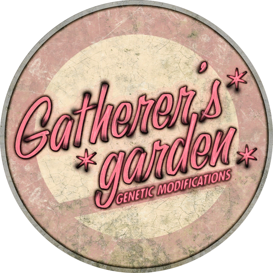
Effective?
I think that the logo is effective mainly because of it's simplicity.
Clear?
Again, the simplicity is ultimately what makes this logo so memorable.
Improvements?
Because of the flourished text that is used throughout most of the logos in the rest of the game, I would have assumed that the main logo itself would have continued this tradition.
How would you approach the same concept?
I would have continued to look into the other logos that were designed for the game itself, such as Poseidon Plaza or Gatherer's Garden for a bit more flourish. Granted it's following suit with the time period of simple, straight-forward design. But I don't know, for how many other logos there are throughout the game that are over-the-top, I would have perhaps gone a bit further with the text treatment.

Effective?
D&D has kind of always had good logo. Perhaps simplifying it down to just D&D could have helped some.
Clear?
Definitely readable, the text isn't too far out there or anything.
Improvements?
Maybe a bit of simplification could have helped. I know I'm contradicting myself from the previous logo example, but I think I would go for a less wordy final logo. Especially since it's been simplified to D&D for so long.
How would you approach the same concept?
I think this could work very well as a simple vertical logo the the D&D done side-by-side with a sword cutting straight through the middle. The first D being backwards, the ampersand symbol being right over the blade just as above, and then the second D going forward like normal. It could have condensed the overall logo into just three characters.

Effective?
The simplicity of the text treatment makes it hard to forget.
Clear?
The 'Hot Fresh' and 'Every Day' is kind of strange to be thrown in there. Realistically I think it could work as just simply 'Einstein Bros.'.
Improvements?
Just like I said, I would cut the 'Hot Fresh, Bagels, and Every Day' and make it simply Einstein Bros. I think that could make it a bit more iconic rather than simply making it a Bagel company. It might have been hard to do this though because it seems like that would already be trademarked somewhere else.
How would you approach the same concept?
I think I would have tried to make the characters that are in the center more a part of the actual wording of the logo. I mean, it's cool that they are using what looks like bagels as monocles, but I don't know, it seems like the text and image could be more married in some way.
Effective?
It's a gear, in a box. Can it get more effective than that?
Clear?
Seriously. Gear. Box. Done.
Improvements?
Not really much to improve here in my opinion. Maybe make it more 3-D perhaps? But that could possibly change it to GearCube... which isn't as cool.
How would you approach the same concept?
Perhaps one could try to implement the gear into the word box somehow. Marrying they two together so that it would be less space conscious. Really just throwing things out there to get more conceptualizing going.
Effective?
This one I think might be the most obscure of the logos. But for some reason being a rooster just simply makes it memorable.
Clear?
The obscurity makes it hard to connect with an art company, but the clarity of the image makes it so unforgettable that it basically gets burned into your mind.
Improvements?
I bet the design department threw this one all over the place. I'm thinking that maybe the design could have been more leading towards the type of company that it's associated with, but realistically how could you change the logo into something else?
How would you approach the same concept?
My initial thought was to create it into a simple "MB" but that gets pretty close to Milton Bradley. Perhaps changing the design into a more art-related icon could work. I would just play with things like pills and art supplies (don't ask me why I thought of pills - it just seems related).

Effective?
This one is just clever. It's in the psychology building of the University of Memphis. It's a play on the Rorschach test combined with the Memphis tigers logo.
Clear?
It doesn't really say anything about it being food related, but it's unforgettable just because of the silly word juxtaposition.
Improvements?
I think it could be tied in some way to food.
How would you approach the same concept?
I think I would have made the tiger imagery more centralized or used splattered ink to create the words 'Roar Shack'. Plus I would have made the text black to simplify it even further.
Effective?
Just like Gearbox above, this one is super simple. 'R'ock Star. Doesn't get much more simple than that.
Clear?
The clarity of this is nice because of the simplicity.
Improvements?
I think it couldn't hurt to combine the two images a little better.
How would you approach the same concept?
I think since most of the games that they create are geared around violence, street themes, etc. I think I would have gone less straight-forward with the logo and perhaps used it more like a spray paint stencil or something similar. I would have also tried to make the star look like it had shot out from the 'R' rather than just glued at the bottom.

Effective?
This logo errs less on logo and more on just straight up illustration, much like the dungeons and dragons one above, but I love it. The text treatment could have worked a little better in a brighter blue in my opinion but that's just being nit picky.
Clear?
The text is a little hard to read simply because of the color treatment, but I love the logo overall. Especially since the text has a black interior.
Improvements?
I would have changed the color of either the text to a blue or changed the backdrop scroll work to a blue to make the text pop even more.
How would you approach the same concept?
I still to this day wonder why they chose the skull for the logo, but I love the fact that they implemented a scroll with circuitry on it. I've been trying to mimic this logo forever mainly because of how damn awesome it looks, but let's see, how would I approach the logo design? I think I would have axed the skull perhaps and made the text spelled out in the circuitry. That way the entire image could be tied together instead of the text simply resting on top of some kick-ass art.

Effective?
This one is just clever in my opinion.
Clear?
I might sound like a dumb ass, but it took me a minute to really see it at first, but like the FedEx logo, once you see it, you can't un-see it.
Improvements?
This one is hard mainly because of how damn clever it is.
How would you approach the same concept?
To be completely honest, this is the kind of clever decision making in my graphic work that I've been trying to do for years. This one wins in my book, and I'm not sure that I would be able to even compete with design choice like this. I would have probably gone a little more typical and just used a Spartan soldier somewhere in the text treatment. I know, no where near as clever, but there you have it.
Effective?
A little bland in terms of text treatment, and the image and text are both separate, but it just looks nice.
Clear?
The clarity is kind of thrown out the window since they are both so interchangeable, but I think it has a good artistic approach to logo design.
Improvements?
It could be interesting to combine the imagery with the words more so that they aren't so split up. I would have also either used the rock texture in the backdrop blue, or pulled the cloud texture down into the text.
How would you approach the same concept?
I think it could have been interesting to use things like Dark Castle Entertainment's logo as inspiration for this one and tried to marry they two a bit closer. It's the same type of thought behind it, but it seems to make the two images a little more close in comparison. It could have been interesting to use the lantern as a tie-in element rather than the two separate elements seen here.

No comments:
Post a Comment