Showing posts with label logos. Show all posts

Friday, April 25, 2014

3D Illustration: Gears


Title: 3D Illusttration: Gears
Medium: Mixed Media

Notes: For the final 3D illustration project we were allowed to work in teams and had to create more-or-less a scene and storyboard.

I looked to my right immediately and there was instantly like a silent agreement between Colton, Rob, and I. So off we went, just throwing around suggestions and different ideas. I think somewhere in there I was like, "Let's do a self-portrait of ourselves as adventurers trying to break into a dungeon." <we all shook our head pretty quickly to that> So we kept scribbling and searching for ideas, and I just kinda toss out this idea of, "Hey... what if we were to do robots. DRUNK ROBOTS!" <again, we all shook our head and kind of had a laugh> There was a silence over us for a few minutes. I think there was a certain hive mind brewing for a minute about this. And then I think it was Rob that looked over and was just like, "Well... what if we did Wall-E as a wanted poster.", to which I responded, "Yeah, he would be wanted for Grand Theft because he's constantly putting shit in that little drawer of his!" <laughter ensues> And literally from that moment, the project's scope just grew and grew. Looking back, I wonder if this project is a testament to see just how far and ridiculous we can go with a project.

Regardless, it was incredibly fun! I also think that after the fact, Rob looked at us and was like... I think I want to make an entire city of this stuff! Potential for future team-projects? We shall see...

So here's the breakdown of who did what:

Mat Kaminski - passed out drunkard robot,  bar stools, and all the advertisements and posters on the wall.
Colton Beretta - the bartender and all the accessories to the bar - cups, bottles, mugs.
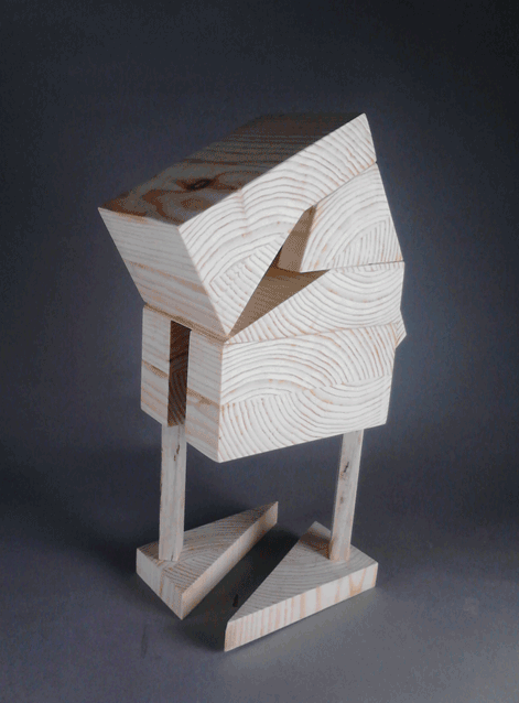
Rob McElhaney - "wrestler bot", and the bar itself, and gears logo.


Tuesday, March 4, 2014

Illustration 4: Levitt Shell Poster and T-Shirt Finals


Title: Illustration 4: Levitt Shell Poster & T-Shirt Finals
Medium: Photoshop CS3, Illustrator CS3

Notes: PHEW! Big 'ole mess, but this project is officially over. As always though, here comes the next one in the pipe...

This project was the Levitt Shell here in Memphis was holding a competition to promote their summer rock series for the upcoming year. We had to enter this piece into that competition and see how we fare. Hopefully I'll do alright.

Wednesday, January 15, 2014

Potential Logo Designs


Title: Potential Logo Designs
Date: January 14, 2013
Medium: Pencil
Scale: Original is 9" x 12"

Notes: We are assigned to create a series of logos for a potential company that could exist. 

Mission Statement: "We Bleed Inc. / Origin Entertainment is a full service studio serving up high quality creative endeavors on a client-by-client basis. We provide many outlets of creativity such as Illustration, Storyboarding, Animation Assets, Graphic Design, as well as Script Design, Screenwriting, Story Development and even Consulting to help get your project on it's way.
We Bleed Inc. / Origin Entertainment is located in the heart of Memphis, TN. As a result we are centrally located and have the ability to ship your project cross-country if need be.
Let us create for you so that you can be free of the burden that's been keeping you up at night."

Since there are two potentially companies, I have split between the two. Hopefully during feedback I will get a definite on one or the other.

Tuesday, January 14, 2014


Effective?
I think that the logo is effective mainly because of it's simplicity.
Clear?
Again, the simplicity is ultimately what makes this logo so memorable.
Improvements?
Because of the flourished text that is used throughout most of the logos in the rest of the game, I would have assumed that the main logo itself would have continued this tradition.
How would you approach the same concept?
I would have continued to look into the other logos that were designed for the game itself, such as Poseidon Plaza or Gatherer's Garden for a bit more flourish. Granted it's following suit with the time period of simple, straight-forward design. But I don't know, for how many other logos there are throughout the game that are over-the-top, I would have perhaps gone a bit further with the text treatment.


Effective?
D&D has kind of always had good logo. Perhaps simplifying it down to just D&D could have helped some.
Clear?
Definitely readable, the text isn't too far out there or anything.
Improvements?
Maybe a bit of simplification could have helped. I know I'm contradicting myself from the previous logo example, but I think I would go for a less wordy final logo. Especially since it's been simplified to D&D for so long.
How would you approach the same concept?
I think this could work very well as a simple vertical logo the the D&D done side-by-side with a sword cutting straight through the middle. The first D being backwards, the ampersand symbol being right over the blade just as above, and then the second D going forward like normal. It could have condensed the overall logo into just three characters.


Effective?
The simplicity of the text treatment makes it hard to forget. 
Clear?
The 'Hot Fresh' and 'Every Day' is kind of strange to be thrown in there. Realistically I think it could work as just simply 'Einstein Bros.'.
Improvements?
Just like I said, I would cut the 'Hot Fresh, Bagels, and Every Day' and make it simply Einstein Bros. I think that could make it a bit more iconic rather than simply making it a Bagel company. It might have been hard to do this though because it seems like that would already be trademarked somewhere else.
How would you approach the same concept?
I think I would have tried to make the characters that are in the center more a part of the actual wording of the logo. I mean, it's cool that they are using what looks like bagels as monocles, but I don't know, it seems like the text and image could be more married in some way.


Effective?
It's a gear, in a box. Can it get more effective than that?
Clear?
Seriously. Gear. Box. Done.
Improvements?
Not really much to improve here in my opinion. Maybe make it more 3-D perhaps? But that could possibly change it to GearCube... which isn't as cool.
How would you approach the same concept?
Perhaps one could try to implement the gear into the word box somehow. Marrying they two together so that it would be less space conscious. Really just throwing things out there to get more conceptualizing going.


Effective?
This one I think might be the most obscure of the logos. But for some reason being a rooster just simply makes it memorable.
Clear?
The obscurity makes it hard to connect with an art company, but the clarity of the image makes it so unforgettable that it basically gets burned into your mind.
Improvements?
I bet the design department threw this one all over the place. I'm thinking that maybe the design could have been more leading towards the type of company that it's associated with, but realistically how could you change the logo into something else?
How would you approach the same concept?
My initial thought was to create it into a simple "MB" but that gets pretty close to Milton Bradley. Perhaps changing the design into a more art-related icon could work. I would just play with things like pills and art supplies (don't ask me why I thought of pills - it just seems related).


Effective?
This one is just clever. It's in the psychology building of the University of Memphis. It's a play on the Rorschach test combined with the Memphis tigers logo.
Clear?
It doesn't really say anything about it being food related, but it's unforgettable just because of the silly word juxtaposition. 
Improvements?
I think it could be tied in some way to food.
How would you approach the same concept?
I think I would have made the tiger imagery more centralized or used splattered ink to create the words 'Roar Shack'. Plus I would have made the text black to simplify it even further.


Effective?
Just like Gearbox above, this one is super simple. 'R'ock Star. Doesn't get much more simple than that.
Clear?
The clarity of this is nice because of the simplicity.
Improvements?
I think it couldn't hurt to combine the two images a little better. 
How would you approach the same concept?
I think since most of the games that they create are geared around violence, street themes, etc. I think I would have gone less straight-forward with the logo and perhaps used it more like a spray paint stencil or something similar. I would have also tried to make the star look like it had shot out from the 'R' rather than just glued at the bottom.


Effective?
This logo errs less on logo and more on just straight up illustration, much like the dungeons and dragons one above, but I love it. The text treatment could have worked a little better in a brighter blue in my opinion but that's just being nit picky.
Clear?
The text is a little hard to read simply because of the color treatment, but I love the logo overall. Especially since the text has a black interior.
Improvements?
I would have changed the color of either the text to a blue or changed the backdrop scroll work to a blue to make the text pop even more.
How would you approach the same concept?
I still to this day wonder why they chose the skull for the logo, but I love the fact that they implemented a scroll with circuitry on it. I've been trying to mimic this logo forever mainly because of how damn awesome it looks, but let's see, how would I approach the logo design? I think I would have axed the skull perhaps and made the text spelled out in the circuitry. That way the entire image could be tied together instead of the text simply resting on top of some kick-ass art.


Effective?
This one is just clever in my opinion.
Clear?
I might sound like a dumb ass, but it took me a minute to really see it at first, but like the FedEx logo, once you see it, you can't un-see it.
Improvements?
This one is hard mainly because of how damn clever it is. 
How would you approach the same concept?
To be completely honest, this is the kind of clever decision making in my graphic work that I've been trying to do for years. This one wins in my book, and I'm not sure that I would be able to even compete with design choice like this. I would have probably gone a little more typical and just used a Spartan soldier somewhere in the text treatment. I know, no where near as clever, but there you have it.


Effective?
A little bland in terms of text treatment, and the image and text are both separate, but it just looks nice.
Clear?
The clarity is kind of thrown out the window since they are both so interchangeable, but I think it has a good artistic approach to logo design.
Improvements?
It could be interesting to combine the imagery with the words more so that they aren't so split up. I would have also either used the rock texture in the backdrop blue, or pulled the cloud texture down into the text. 
How would you approach the same concept?
I think it could have been interesting to use things like Dark Castle Entertainment's logo as inspiration for this one and tried to marry they two a bit closer. It's the same type of thought behind it, but it seems to make the two images a little more close in comparison. It could have been interesting to use the lantern as a tie-in element rather than the two separate elements seen here.

Sunday, May 5, 2013

Silverspun Pickups - The Royal We

Welcome back... sheesh, that was a whirlwind of crazy to get from the last update to here. I've been cranking out like crazy. I actually have quite a few pieces to update this go around plus some writing.

One more day to go (Monday) then I'm free for the summer! OH MAN! THE PLANS!

Can't start dwelling on that yet, must finish out this last day... thus I need to get my sketchbook in order.

Speaking of sketchbooks, I have sooo many pages to get onto here. 

But yeah, before all that, let me catch up my pieces thus far in the digital realm. I'll have the next couple of months to play catch-up on my sketchbooks...

Here was my final essay for contemporary novel by the way:


An Insignificant Cart 
When someone generally thinks of a cart, they tend to just think about the physical description of a cart: four wheels, metal, maybe some plastic, quite possibly an area to set a child into. In a post-apocalyptic world such as the world in The Road by Cormac McCarthy, it can become so much more than that. It was a home and an unflinching friend on top of being what it was initially: A mobile storage container. This essay is an in-depth exploration as to what the cart itself represented, the personification of the cart, and even the emotional responses gathered from the characters themselves, all while tying back into the idea that the cart could arguably be one of the most influential ‘characters’ of the book.

The cart was initially introduced as a seemingly inconspicuous grocery cart with no real description given besides that. When it was first introduced it seemed so minute, so insignificant because even this page in the story had already built up the story up with such epic grandiose. It could be argued though, that without this cart, the father and boy might not have survived very long. In a way, it was the glue that bound them to survival. Without the cart they would not have had a method of carrying the larger amounts of supplies that they had throughout the story. Quite a few times the cart seemed to come to their rescue with promises of supplies and potentially shelter. If things would have been dire enough, the man could have probably even tipped the cart over and covered it with a tarp and they would have had a makeshift shelter for at least the boy to get by in. The cart itself seemed to almost represent their very floor of survival.

The author alluded to the importance of the cart, even though it could not talk, when he wrote: “Clamped to the handle of the cart was a chrome motorcycle mirror that he used to watch the road behind them” (McCarthy, 6). The story didn't explicitly state that the cart had any other specific modifications done to it to make it more appealing to anyone else save for the supplies themselves that were burdened upon it. The second cart got stolen once but it didn't seem to complain, it was just content doing what it did best, move objects from one spot to another. Luckily each time they found a cart it was a four-wheeled cart and not a three-wheeled one (like a wheelbarrow), because the sense of stability offered by a four-wheeled cart is much better and wouldn't fall over if stopped when they had to pull the gun on the cart thief later in the story. Each time they stopped, the cart would wait there like a very well trained dog, sitting with it’s tail wagging constantly just wanting nothing more than attention.

The boy seemed to feel a sense of abandonment (more so than the father) when he and his father had to leave the cart behind and “took a last look through the basket but that was it. Let’s go, he said. The boy took one last look back at the cart and then followed him out to the road” (McCarthy, 100). In a way the cart could - at this point - be compared to a used up prostitute being left in an alley way with nothing but her panties around her ankles. It was a sad state of affairs when the cart had to be abandoned. It could be argued that in a way the father and son found this cart on the road in the same way that a person might find a drifter on the side of a long dusty desert road. They both picked it up, rode along with them, then proceeded to turn on the cart and dump it when it had used up all it’s usefulness. To add even further insult to the original cart, they find one later in the story. “There was a market at the end of the street and in one of the aisles piled with empty boxes there were three metal grocery carts. He looked them over and pulled one of them free and squatted and turned the wheels and then stood and pushed it up the aisle and back again.”(McCarthy, 150) This could be argued as the treatment of man vs. man. The personified cart is a reflection of the selfishness of mankind’s nature. They will literally use something until it is completely used up and then toss it aside without so much as a reflective thought before moving on.

Throughout this essay there was an exploration into the ‘character’ of the cart, treatment of that character throughout, and the responses that the other characters show to this cart. All-in-all Cormac’s story in The Road is a very bleak outlook on a hypothetical near future, but somehow through man’s perseverance alone, it is actually more of a story of survival and struggle. The cart in the story is not explicitly given a minor character role, but throughout the entire journey it is always there, unflinching in the face of danger. For god’s sake  if someone were to be trapped in this hypothetical future completely alone without so much as a backpack or even a pair of pants with a bunch of pockets, at the very least hope for a cart without a squeaky wheel.

Oh, right ... art!

Wood Carving: Additive Sculpture


Title:  Wood Carving: Additive Sculpture
Medium: Wood Sculpture

Notes: This piece changed so many times from conception to completion. It initially started much different, but as the process went on, the puzzle pieces kept radically changing. While I enjoy the result (sort of retro robot feel), it looks nothing like the plan.
Overall, the piece deserves merit in terms of flow. I tried to make a great attempt at trying to play with the angularity as well as using the negative spaces to push the eye back into the piece.
As with the previous piece, I tried to use the patterning of the wood grain to move the eye around the piece. I almost think that having some object placed off-kilter or on the top would make for a nice break-up of the symmetry so that the piece wouldn't be so similar on each side.


Wood Carving: Subtractive Sculpture


Title:  Wood Carving: Subtractive Sculpture
Medium: Wood Sculpture

Notes: My initial thought process was to create an even more, slightly asymmetrical, organic piece. It was originally supposed to look more like a squid-like tentacle, but it ended up being more of a bird-like skull sculpture.
I decided midway through that it would be more interesting to turn the piece on it’s side and mount it slightly off-center to the wood block. I made as many attempts to follow the wood grain patterning as much as possible. I think by doing so I managed to make it even more organic. 
The problem areas seem to stem from the fact that it wasn't as smooth as I would have like it to be (especially around the “neck” area). There are so many nicks and bruises in the wood that it seems more like the piece still has a ton of work in terms of smoothing it out. Hilariously enough, I naturally threw my arm and wrist out while working on this piece

20/40 Planed Shapes


Title:  20/40 Planed Shapes
Medium: Shaped Paper

Notes:  The overall craftsmanship began moderately well, but I have since discovered that working larger tends to make things a bit clearer. I began with a much simpler design, and then realized that there weren't enough shapes to make up the overall design. I then began to place more objects in a circular pattern to mimic the exterior shape of the icosahedrons and then expanding that form at the bottom of the piece. I then took that a step further by opening the bottom of the shape to include smaller cube shapes in the interior. Since a triangular shape is the most stable shape, I decided that this would help to create a good sense of balance throughout. The shape breakup had to happen with the cubes being echoed on the outside as well.
I wish I had made the external shape at the top more load bearing because it would have helped to create a more solid viewpoint from the bottom. Also I would have liked much better craftsmanship overall, but as I stated initially, working smaller tends to be a detriment. So for next time, bigger IS better.


Dynamic Wire Sculpture


Title:  Dynamic Wire Sculpture
Medium: Shaped Wood, Wire

Notes:  For the majority of the gesture drawings, I had a tendency to draw prone animals (let’s face it, most of the animals in the zoo have become slightly apathetic). So I decided it would be ideal to find the largest animal I could find and draw it in the prone position as many times as I could before it stood up. Which led to my gesture wire frame as the bear.
My wire sculpting techniques seem to err on the slightly more gesture side instead of directly figurative. I tried to think about each of the sculpts as though I was going to 3D model the wire frame, but the output did not look as interesting as I would have liked. I tried to my best to loosen up the wire.
I could literally draw poses for days. I went to a website (www.characterdesigns.com) and attempted to gesture draw a ton of action poses. The pose that I chose was like a pre-leap pose because it gives an implied motion rather than an “in-motion” which I think might have been a bit more interesting perhaps.
For each base I tried to give a bit more dynamics to the piece by sort of tying the base to the piece. For example, with the bear piece I tried to give a sort of shale or rock texture. And for the leaping piece, I harkened back to the childish game of “don’t step on the crack or you’ll break your mother’s back” that I used to play as a kid.


Illustration II - Digital Portfolio


Title:  Illustration II - Digital Portfolio
Date: January - May 2013
Medium: Varies
Scale: Varies

Notes:  See each piece for more on the notes of each. As a whole though, this is the entirety of my illustration II class. For the most part each piece has all the work involved next to it, the only difference is that I had to truncate the amount of sketches that were with each piece.


WIP: Face that Could have been a Painting up Front


Title:  WIP: Face that Could have been a Painting up Front
Date: May 3, 2013
Medium: Photoshop

Notes:  While looking for a good reference to paint from, I stumbled upon this girl's deviant art page. She actually looks like she's painted up front, which is kind of strange, but I decided to try my hand at painting her. Unfortunately, it's still extremely stylized and the colors are kind of strange, BUT I was actually staring at Caravaggio's palette while painting this piece and tried a new technique of building up the layers. Hopefully it's starting to show some improvement, but I think I still have quite a ways to go.

Monday, February 18, 2013

I thought about it... and if I want to continue with these abstract blog titles, it might make a little bit of sense to actually put the song that I'm getting these titles from...


Ulrich Schnauss - Monday - Paracetemol

And on the note of music... there has actually been something bothering me for awhile, and while I'm not sure if it's a good thing or a bad thing, but... does anyone notice that sometimes when more modern songs have been remade, they become completely new songs? Don't get me wrong, usually I love both of the songs equally, but it would seem that some songs are just a completely genre. Take these two for example: 


They are both amazing in their own right, but Gary Jules' version is completely depressing by comparison. I've actually been finding quite a few of these throughout the years...


I mean, this list could probably go on and on!

Anyway... Time to get back onto the task at hand: Art!

So, I finally started a Tumblr account. This is my first branch out from this blog in quite some time.

But anyways... here's the update for today:

Headphones Paint #1


Title:  Headphones Paint #1
Date: February 7 - 11, 2013
Medium: Gouache on Illustration Board
Scale: Original is 8" x 8"

Notes:  This is the finalized version of the headphones piece that I was writing about earlier. This is actually Ashley's (my fiancee) face put in this image. Painting a gray scale image was pretty tough with just a tiny focus of color. Had to make sure that no color got mixed in with the person. Does anyone know if gouache naturally has a tiny bit of blue in the black paint? Like is it a cool tone naturally? Every time I try to make gray with it, I tend to get a sort of 'blue/gray'.


Headphones Paint #2


Title:  Headphones Paint #2
Date: February 7 - 11, 2013
Medium: Gouache on Illustration Board
Scale: Original is 8" x 8"

Notes:  The second one I painted I feared would have a more washed out look. The color I think got a little unsaturated, so it kind of flattened out a bit because of so much black used.


Headphones Paint #3


Title:  Headphones Paint #3
Date: February 7 - 11, 2013
Medium: Gouache on Illustration Board
Scale: Original is 8" x 8"

Notes:  This one still puts me in a good mood every time I see it. I intentionally made it look like that because it was essentially the basis for my entire advertisement campaign that we were to create. 


Headphones Retro Advertisement


Title:  Headphones Retro Advertisement
Date: February 15 - 16, 2013
Medium: Gouache on Illustration Board, Photoshop
Scale: Original of each painting is 8" x 8". Final Advertisement is 8" x 10"

Notes:  This is the finalized version of the advertisement campaign. I went into it with a retro vision up front. Thus the text treatment and the abstract shape design. I had to clean up the paintings quite a bit. I wonder if that was because my camera isn't as good as I assumed it would be, or if the paintings were muddy from get-go. Either way, there you have it, my first journey back into painting...


Wednesday, February 6, 2013

Nothing terribly interesting today... just some sketches for my upcoming project in Illustration II. We are supposed to paint (in gouache) an electronic device in a sort of advertisement-esque series of three paintings. I kind of went a bit further and turned them all into advertisements. I guess my inner graphic-designer is showing...

Electronic Device Sketches A


Title:  Electronic Device Sketches A
Date: February 6, 2013
Medium: Photoshop
Scale: Original is 8.5" x 11"

Notes:  The first electronic device that I thought about was my headphones... I really like this layout myself. I think I would rather go with this one over the latter, but I still think that they are both interesting in different ways.


Electronic Device Sketches A

Title:  Electronic Device Sketches B
Date: February 6, 2013
Medium: Photoshop
Scale: Original is 8.5" x 11"

Notes:  I then thought about my tablet... It would be good to do all those features in the subsequent ads. Ehh... either way, they are both fun.

I also had a third one, but couldn't get around to sketches of my camera. I think it would work just as well as the headphones in the end. I need to continue practicing in goauche, I've been trading in paintbrushes for my tablet the past couple of days...

Anyway... more soon!


Tuesday, February 28, 2012


Artist of the Week! 
This week it goes to: DStraX
Your studies just keep getting more and more amazing! I'm actually going to start following in your footsteps as far as the art related stuff goes... I really need to step it up on many things, such as matieral tests, rendering tests, etc. I can't wait to see you reach your full potential, it will be one for the stars. The main thing that I would like to see you work on would be fully utilizing dynamic posing. Once you get that down, I'm not sure what will stop you...
Thanks for the AMAZING advice that you and 'another artist' gave me... More on him next week.


Alright let's see.... this week hasn't been a major breakthrough in the art department, EXCEPT that I started breaking away from just my strange brush that I've been using. I guess that makes me a bit more versatile when it comes to just painting around. Either way, I still just want to have more time to paint hahaha

I've been sleeping a bit more than usual. I'm not sure if that's a good or a bad thing who knows. Oddly enough though, I've been extra sleepy since I've been doing that. Not sure how that works.

Uhhh... Not really a whole lot going on besides that. Thought about switiching to Illustration major, but that would leave me sticking around the school for another semester (not that I wouldn't like that, but I don't think my bank account would appreciate that). So I think I'll just keep doing as I am and just gear all my electives toward illustration or painting or whatever. It might be best that way.

Anyway, as always... here's the art!


Crushed Can JUSTICE


Title: Crushed Can JUSTICE
Date: February 24, 2012
Medium: Photoshop

Notes: Trying to study how metal crushes in the hand. This was for a poster idea that I was working out. Don't think I'll have time to do it right now, but it will fester on the back-burner just like all these other ideas...


Cora Character Exploration AGAIN


Title: Cora -- Character Exploration AGAIN
Date: February 23, 2012
Medium: Photoshop
Scale: Original is 3000px x 3000px

Notes: Well, it's time to redesign her again, so we're back to the 'ole drawing board. Oh well, more doodles and exploration as always.


Tom Servo Look-Alike


Title: Tom Servo Look-Alike
Date: February 24, 2012
Medium: Photoshop

Notes: More of the study from above... Was fun to try to use different colors to shade instead of just back to white.


Color Studies


Title: Color Studies
Date: February 20 - 23, 2012
Medium: Gouache
Scale: Each 'piece' is 7" x 10"


Doodlin'


Title: Doodlin'
Date: February 21 - 25, 2012
Medium: Graphite
Scale: Original is 9" x 12"

Notes: Just trying to loosen up again and just relax with different stuff...


Full Action-Pose Study


Title: Full Action-Pose Study
Date: February 23, 2012
Medium: Graphite
Scale: Original is 9" x 12"

Notes: This is a work in progress, but I fully intend to finish this guy!

Thanks for looking! More coming soon...

Follow Mat @artofmatk

Follow Ash @ashley.storyteller