

As an artist, it seems like the landscape is ever-changing from simply the tools to the aesthetic. I intend to be an artist that never wants to stop learning and as such, I find more and more interesting artists everyday. Each artist has a unique insight and point of view, no matter the experience level. New views help open my mind and teach me there are many ways to utilize my skills and I hope that sharing our stories will help others in the same way. I believe there are many paths on an artistic journey, and each interview will help to show the stories of the artists that tread them.
Today we'll begin with Dean Zachary.

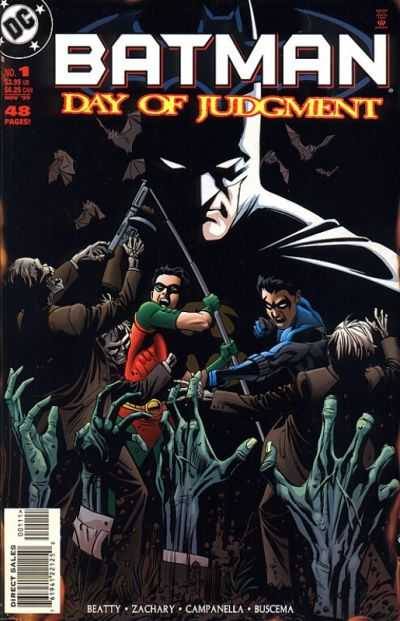
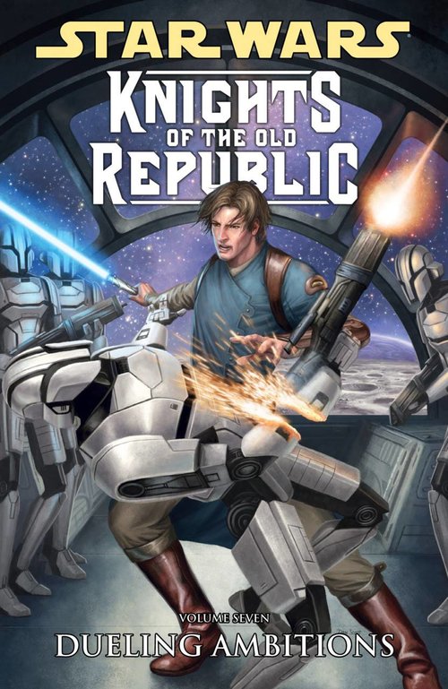
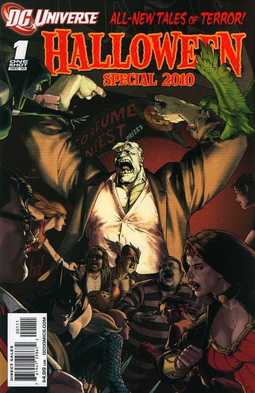
After earning a Graphic Design degree, Dean spent several years as a commercial artist for ad agencies. His lifelong passion for drawing led him into the imaginative world of comic books. Dean has illustrated various titles, including: Batman, Superboy, Green Lantern, The Night Man, Hawk & Dove, Sliders, Johnny Quest, and Phoenix. His recent works include: Star Wars: Knights of the Old Republic #38 and DC Comics Halloween Special 2010 (featuring a Wonder Woman short story). Currently, he is developing a Creator Owned Property and working on a re-launch of Cat & Mouse, written by Roland Mann.
Kaminski: Firstly, what made you pursue the comic industry? And in that vein, what KEEPS you pursuing it?
Zachary: I’ve always been a fan of visual storytelling, particularly in movies such as James Bond, Star Wars, Raiders of the Lost Ark, and Alien. My earliest comic sequential art was me adapting my favorite movies into comics. I remember drawing key scenes from The Empire Strikes Back in panel-to-panel storytelling. At the same time, I was reading comics and noticing artists like Neal Adams (Batman) and John Byrne (Spiderman/Human Torch). THE comic that made me decide to draw comics? Starlord by Chris Claremont and John Byrne.
It was B&W and incredibly powerful. I could “SEE” the drawing: pure and without color. I was hooked! THIS is what I wanted to do for a living.
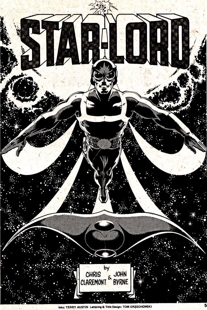
Starlord, by Chris Claremont and John Byrne
While working in advertising in Atlanta, I remember walking past a comic book display in a bookstore (remember those? Ha!) and seeing some poorly drawn covers, and I thought, “I can do better than that!” An inner voice challenged me, “Why not prove it!” This led me to hunt down my copy of "How To Draw Comics the Marvel Way", and research how to submit to publishers and start getting work. A couple of years later I was drawing for Malibu Comics.
Below are some developmental sketches from a Batgirl/Bronze Tiger pitch Mike Baron and I presented to DC a few years back. I think these sketches really demonstrate my influences.
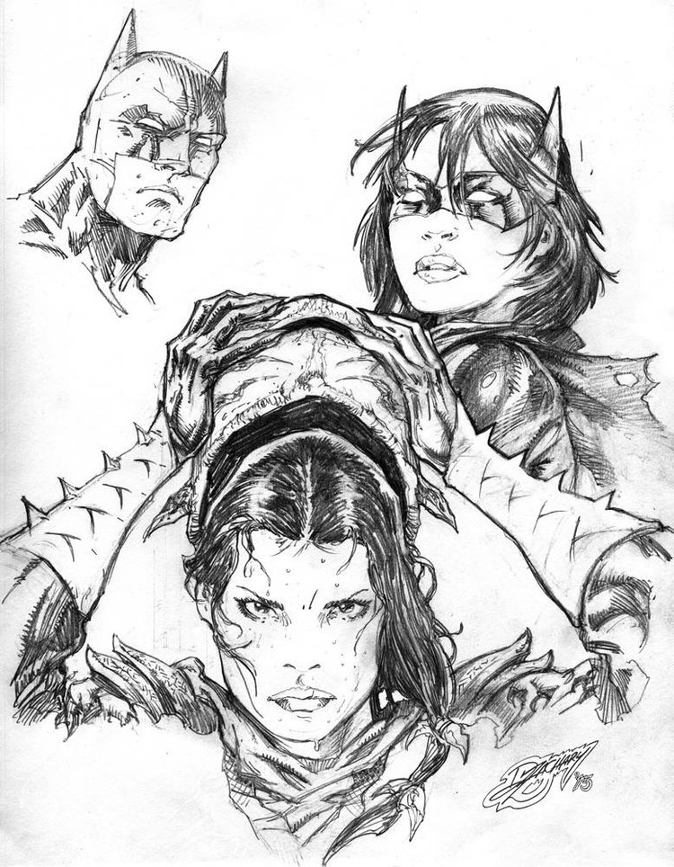
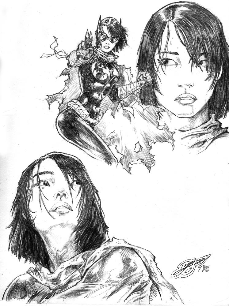
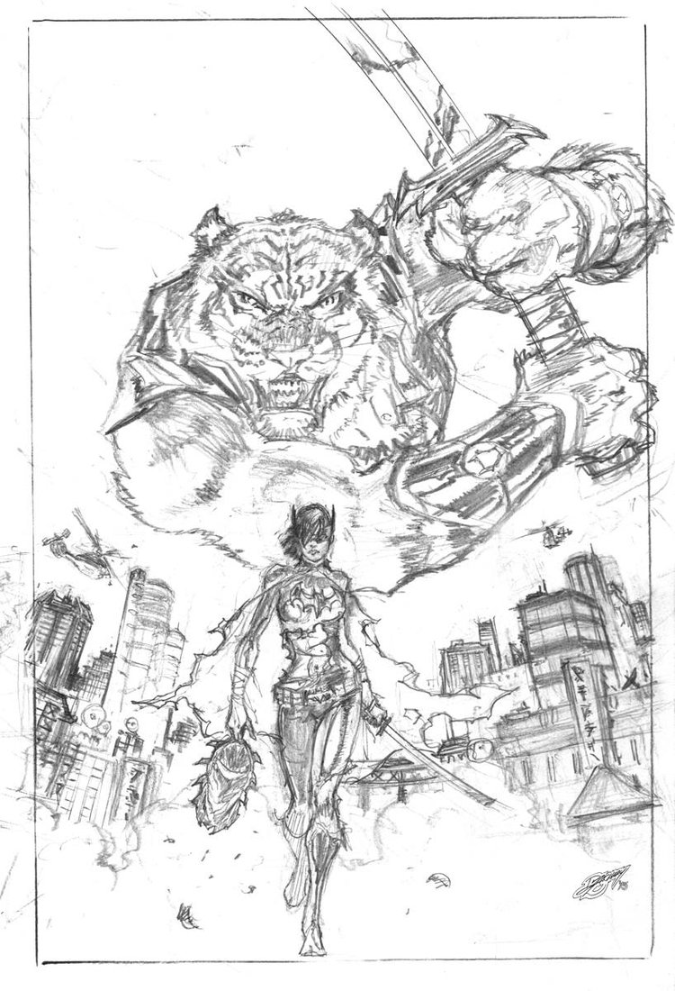

Original Pencils for DC Comics that Zachary has done.
Kaminski: Incredible! I don’t disagree with your love for line and ink. I’m a huge fan of B&W simply for the fact that the contrast itself sparks a very visceral reaction. Your work has a similar style to Jim Lee’s: the lines are there, but meant to guide the eye rather than just lay in arbitrarily. Interestingly, a modern artist that you may enjoy, for his use of line, is Scott Murphy. It’s a bit on the gritty side, but lends itself towards great ink work.
Who or what helped you transition from a hobbyist to a professional? What gave you that “AH-HA!” moment?
Zachary: My current collaborator, Roland Mann was an editor at Malibu and decided to give me that “first break” into color super hero comics. That led to DC, a Green Lantern book, and then Batman. Then the market changed, but that’s a story for another time…
Kaminski: Did you have any formal training for your art, or was it just something you naturally came across?
“I PRACTICED BY COPYING THE STYLES OF ARTISTS I ADMIRED, AND BEGAN DRAWING PAGES TO SUBMIT TO PUBLISHERS.”Zachary: I majored in Graphic Design, which requires freehand drawing courses, so I did get formal figure drawing training, but not sequential art training. Back then, sequential art training on the University level wasn’t readily available. SO…I practiced by copying the styles of artists I admired, and began drawing pages to submit to publishers.
Kaminski: The formal figure drawing seems to have paid off. Your accuracy is pretty spot on in your work! You say art wasn’t as popular in the University days, so what was it like getting your feet wet in the comics industry? And how has it affected your view on the industry as a whole today?
Zachary: I’m fortunate, in that I have a natural sense of visual storytelling. I also do fairly detailed “rough thumbnails” for my editors, so that they can approve layouts before I draw the page at full size. Some of today’s artists’ do most of their work on digital tablets, but I still draw everything by hand before scanning the page at full size. I may do minor digital editing before sending the scan to the inker. I prefer the feel of pencil on board or paper. I also prefer my work to be colored with “flatter” colors, so as not to interfere with the often complex contour hatching.
One way of describing my comic book drawing philosophy is that the pencil art is the Art, in my opinion. Inks and colors are necessary production additions for the market place. This statement is not to diminish the incredible inking and coloring skill sets of my colleagues in the field. It’s simply that pencils are my focus and always have been.
Kaminski: I don’t disagree. I feel like the pencils are the foundation – kind of like the framework of the house so to speak. Whereas the inks and colors are more part of the decoration.
Outside of purely professional work, when tackling personal projects, what kinds of themes so you enjoy, or what themes tend to pop out of your work?
Zachary: As far as themes go, I enjoy Action Adventure, with a strong sense of the struggle between Good and Evil. The postmodern deconstruction of heroes don’t interest me in the least. Antiheroes, like the Punisher don’t really interest me. Street-fighting good guys, like Daredevil, Batman, and Captain America are compelling because I can relate to them a bit more, than say Superman. Spider-Man is a unique exception in that while he is incredibly powerful, his insecurity and self-doubt make him accessible.
I’ve also loved martial arts my entire life. Characters connected with martial arts directly, like Iron Fist, Master of Kung Fu, and even Cassandra Cain (Batgirl 3) are attractive as well.
I have a Wandering Martial Artist Epic with a female lead planned for some time in the future, as an online comic.
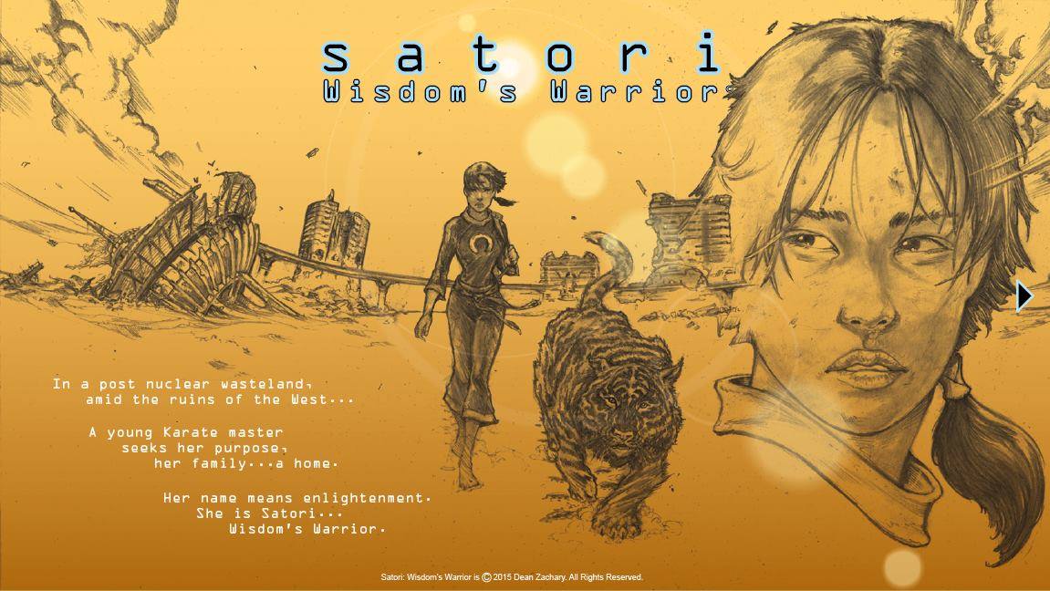

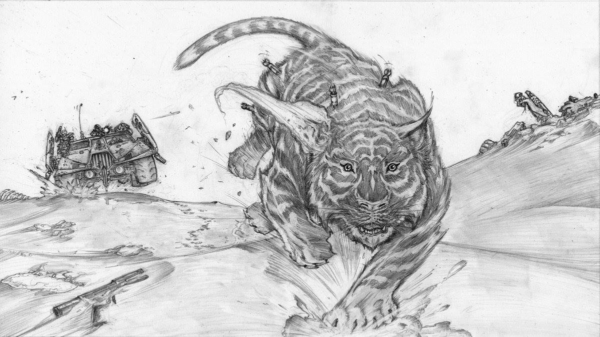
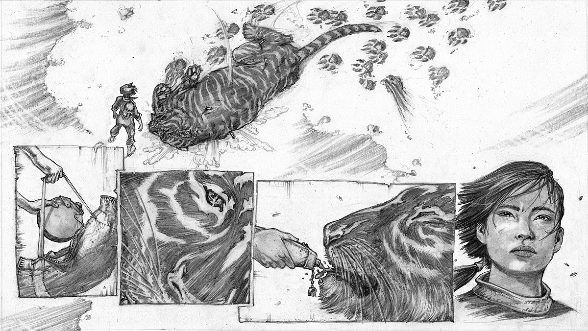
Dean's Internet Comic, "Satori" is in his long range plans and features a wandering martial artist and her mutant tiger sidekick struggle to survive a post apocalyptic future.
Kaminski: That was actually my next question: If not under any sorts of non-disclosure (NDA), can you talk about any projects that you’re currently working on?
Zachary: I’ve currently got two projects in the works, with my former Malibu editor (now writer-collaborator) Roland Mann. The first is an Action Adventure featuring a pair of street fighting teens battling human traffickers in New Orleans – Cat & Mouse. The second is an Action Adventure comic about a woman battling supernatural threats using magical artifacts, called Silverblade.
Silverblade could be described as Indiana Jones meets Constantine with a female lead. Silverblade also describes the weapon used to battle these supernatural threats. Here is the dagger I designed, originally forged by King Solomon.


I actually had a prop made, by my friend Jeremy Jones, to help us promote the book once it’s done.
Kaminski: I see that you also do digital work: Are there any sort of tips or tricks you’d have for aspiring digital artists?
“TRY NOT TO DEPEND ON DIGITAL FIREWORKS ALONE TO CREATE YOUR WORK.”Zachary: Yes. Remember to use digital tools as you would any other tool: to communicate your concepts. Try not to depend on digital fireworks ALONE to create your work. Learn the basics before decorating them with complex digital effects. Learn to draw everything by hand first: figure, environments, vehicles, props, etc… Learn how to tell stories with your art. Computers are just another tool to demonstrate your skill, not a crutch to “cover up” your deficiencies.
Kaminski: It’s good that you point out that digital art still requires the artist to know fundamentals and that it’s not some sort of magic wand.
Because of versatility, do you have any short or long term goals?
Zachary: Short term goals: I want to get Cat & Mouse and Silverblade out there as comic books, to reconnect with new fans who are unfamiliar with my work! Long term: I want to improve as an artist in both draftsmanship AND storytelling.
The best is yet to come!
Kaminski: And finally: What’s the best piece of advice you’ve received, or the best piece of advice you’d give to aspiring artists?
Zachary: Advice for aspiring artists: Draw every day and never give up! More specifically, draw from life and take classes if you can. Learn the basics and then break rules after you learn them. Bruce Lee developed his own version of Kung Fu AFTER learning traditional Wing Chun. Your style will emerge naturally.
Zachary: Advice for aspiring artists: Draw every day and never give up! More specifically, draw from life and take classes if you can. Learn the basics and then break rules after you learn them. Bruce Lee developed his own version of Kung Fu AFTER learning traditional Wing Chun. Your style will emerge naturally.
“LEARN THE BASICS, THEN BREAK RULES ONCE YOU LEARN THEM.”Kaminski: I want to thank you very much, Dean. You’re my first interview and it went very well! You’ve been a breeze to work with.
Thank you for reading, I hope you enjoyed this interview with Dean Zachary.
If you did please share it with your friends!
View all of my interviews with fellow artists here.
You can find more about Dean Zachary, such as upcoming events, a portfolio of his work and many other things at his main site: http://www.deanzacharyart.com/
For more on his Cat & Mouse project, check out the following: https://www.facebook.com/CatandMouseComic/
And lastly, his FB: https://www.facebook.com/deanzacharyartist
Edited, for clarity, by Ashley Webb.
If you would like to be a guest in my interview series, simply fill out the contact form HERE and I'll get back with you as soon as possible.
THANKS FOR VIEWING!


