Showing posts with label posters. Show all posts

Tuesday, February 6, 2018


"Metal Marionette: Antoinette"
The final piece is a 20" x 30" digital painting. 

This is the second in a series of paintings that will be all based around an overall cyberpunk theme. I'm playing with the natural-to-unnatural balance in the images what with placing some of them in a very natural setting. In some ways I find this to be in juxtaposition to what we typically see. We usually see cyberpunk characters in ultra-high tech settings with tech on all sides. While I won't say this typical variety won't make an appearance, my favorite things to paint happen to be clouds and wires, so I ventured into both of these simultaneously.

Antoinette travels the Mississippi up and down on her barge, the wealthy allowed to journey along side. Her journey is the opposite of the world around her: quiet, relaxing; one of luxury. Few can afford her adventures, but few regret it afterward. 

(WIP Below as well as a bonus environment painting)


(Original sketch for Antoinette)

Saturday, December 13, 2014

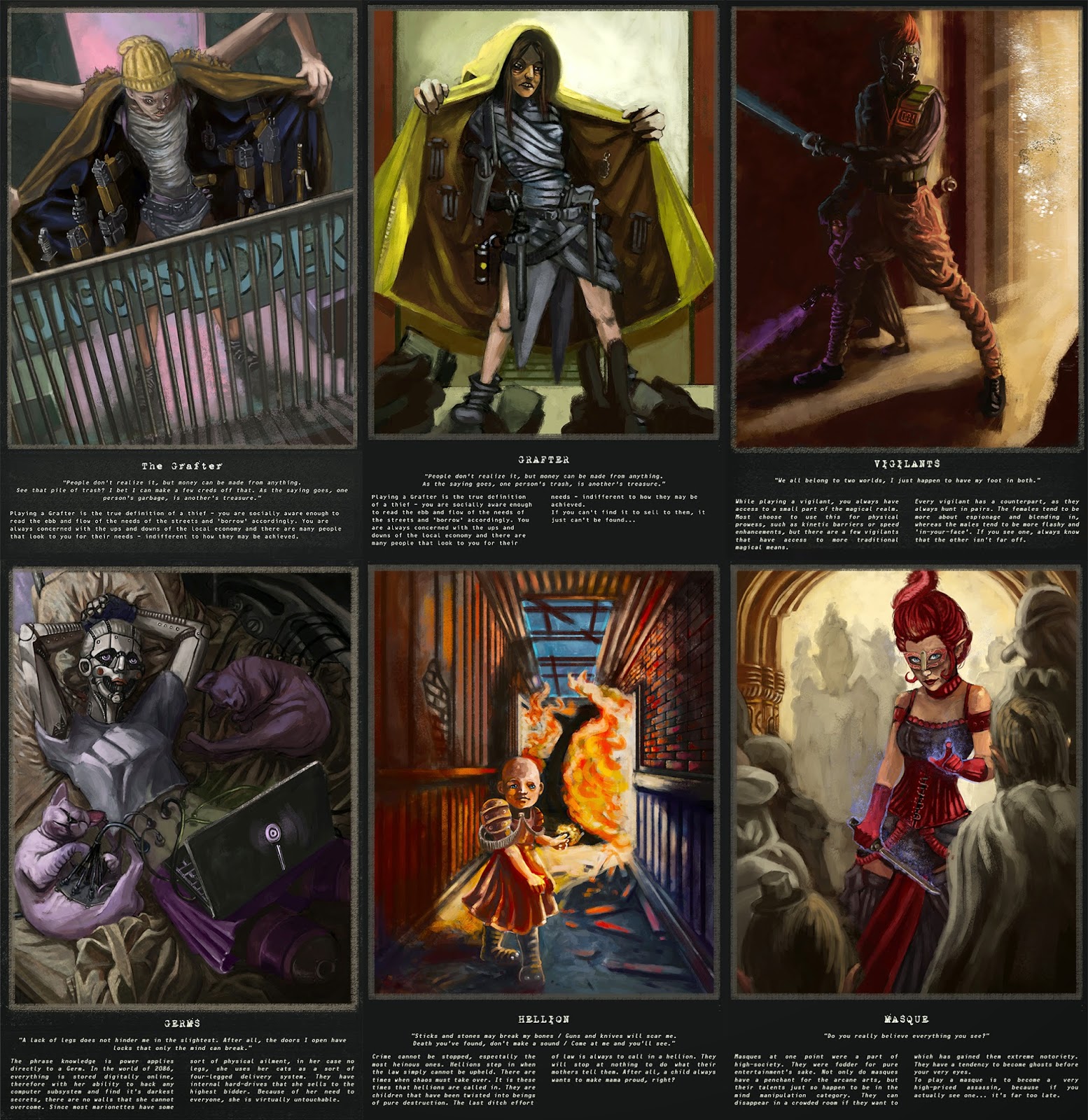
Absolved - Six Character Archetypes


Title: Absolved - Six Character Archetypes
Medium: Photoshop CS6
Scale: Each 'piece' is 11" x 17"

Notes: Over the course of the entire semester, you've probably seen these in some form or another.
Really I just wanted to throw them altogether so that they could be viewed at one place.
Enjoy and remember that there's more to come soon!

Tuesday, March 4, 2014

Illustration 4: Levitt Shell Poster and T-Shirt Finals


Title: Illustration 4: Levitt Shell Poster & T-Shirt Finals
Medium: Photoshop CS3, Illustrator CS3

Notes: PHEW! Big 'ole mess, but this project is officially over. As always though, here comes the next one in the pipe...

This project was the Levitt Shell here in Memphis was holding a competition to promote their summer rock series for the upcoming year. We had to enter this piece into that competition and see how we fare. Hopefully I'll do alright.

Tuesday, February 11, 2014

Illustration 4: Levitt Shell Poster & T-Shirt


Title: Illustration 4: Levitt Shell Poster & T-Shirt
Date: February 8 - 10, 2013
Medium: Photoshop CS3

Notes: This is for the newest project we have on the burner for Illustration 4. We are working with the Levitt Shell for a competition to help design a poster and t-shirt for the summer concert series.

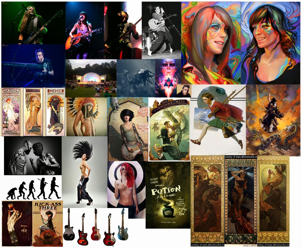
The thumbs above are different ideas that were rolling around my head while looking at a whole bunch of reference photos.

  • Head swirling hair back to make it look like the Levitt Shell. (Janis Joplin?)
  • Evolution chart from birth to rockstar.
  • Half-cut from neck down of a guitarist. Show the guitar leaning towards the audience.
  • Look at Mucha paintings. Maybe one with a rockstar would work?
  • Rudeone - Rock the Casbah. What if it were to an Elvis type figure butted up against a heavily tattoo'd person (back to back).
Were just a couple of ideas that immediately popped out. I'm sure there will be more, but this is where I'm at currently.
Also, the moodboard below reflects all of the applicable images that I could find that were related to those five themes above.


Sunday, December 8, 2013

Illustration 3: Mythical Self-Portrait


Title: Illustration 3: Mythical Self-Portrait
Medium: Photoshop CS3
Scale: Original is 13" x 23"

Notes: Let me start off with, this is the biggest damn thing I've ever painted! I tried to make sure to keep pretty close with the stroke-economy. A few things that were said during critique that I applied were: Add more dust, change the color, only slightly, on the syringe, shrink his forehead only slightly, and possibly change the color of the floor and door in background.
Done and done!
Submitted to Comm Arts

Friday, December 6, 2013

Sorry for lack of updates for a bit... but I was really busy.

All I can say is... WHEW! Now I can relax the rest of the semester away (Monday is last day YEAH!)

But yeah, this is the entire project, sans text.

Independent Study: Displaced Final


Title: Independent Study: Displaced Final
Medium: Photoshop CS3
Scale: Original is 11" x 17"

Notes: The final for the Displaced race for Absolved.

Independent Study: Foundling Final


Title: Independent Study: Foundling Final
Medium: Photoshop CS3
Scale: Original is 11" x 17"

Notes: The final for the Foundling race for Absolved.

Independent Study: Marionette Final


Title: Independent Study: Marionette Final
Medium: Photoshop CS3
Scale: Original is 11" x 17"

Notes: The final for the Marionette race for Absolved.

Independent Study: Absolved Preview Booklet


Title: Independent Study: Absolved Preview Booklet
Medium: Photoshop CS3, Pencil, Ink and Brush
Scale: Each 'page' is 8.5" x 11"

Notes: This is the final for the entirety of my Independent Study. I've had the ideas flowing around for quite awhile, and so taking this independent study pretty much forced me to really get in and dig deep to get this all out. Honestly I hope to one day be able to turn this world into something, but that's for another day I think.

Monday, October 28, 2013

Illustration 3: Student Illustrator Interview - Preview


Title: Independent Study: Student Illustrator Interview - Preview
Date: October 27, 2013
Medium: Photoshop CS3

Notes: The very first page of my interview on Joshua Newton. Much more on this very soon...

Illustration 3: Illustration Annual Color Study - WIP


Title: Independent Study: Illustration Annual Color Study - WIP
Date: October 26 - 28, 2013
Medium: Photoshop CS3
Scale: Original is approx. 20" x 7"

Notes: Yet another WIP for Illustration 3, but this is just a color study for the final. It's got quite a ways to go, but I thought I would share this so far.
Cradle of Filth - "Cthulhu Dawn"
(I've been on a black metal kick lately)

Independent Study: Foundling Final


Title: Independent Study: Foundling Final
Date: October 22 - 27, 2013
Medium: Photoshop CS3
Scale: Original is 11" x 17"

Notes: The final shot of the Foundlings. I was trying my damndest to not make him look like an insane gnome, because that's not what the Foundlings are at all.


Independent Study: London Underground Environment Studies


Title: Independent Study: London Underground Environment Studies
Date: October 27, 2013
Medium: Photoshop CS3
Scale: Original is 8.5" x 11"

Notes: The next race that I have to look into will dwell in an abandoned version of the London Underground. It was more or less militarily quarantined, so I think it would be smart to look into the London Underground as it is today, as well as abandoned subway stations, tubes, etc. More on this soon...

Friday, September 27, 2013

Independent Study: Marionette in Charcoal


Title: Independent Study: Marionette in Charcoal
Date: September 26, 2013
Medium: Charcoal

Notes: Making an attempt to render out one of the marionette faces from memory in charcoal.

Independent Study: Marionette Gang Leader


Title: Independent Study: Marionette Gang Leader
Date: September 25, 2013
Medium: Photoshop CS3

Notes: Because of the previous versions of the final that you see below, I got completely frustrated with the angle that I had. I thought it might work well to change the perspective or the angle of the character. This is really fast, but I think it could be interesting as a smaller sketch perhaps.

Independent Study: Marionette Final


Title: Independent Study: Marionette Final
Date: September 20 - 27, 2013
Medium: Photoshop CS3
Scale: Final is 17" x 11"

Notes: This piece was a huge frustration initially. I reworked this thing as you can see three times from start to finish... The third one is the one I'm going with.

Independent Study: Environment Studies


Title: Independent Study: Environment Studies
Date: September 24 - 26, 2013
Medium: Pencil, Photoshop CS6

Notes: Starting to gather up some reference for the environment possibilites for each of the character archetypes. Tons more of these to go...

Wednesday, July 31, 2013

Dazed and Confused


Title: Dazed and Confused
Date: July 30, 2013
Medium: Photoshop
Scale: Original is 2400px x 3200

Notes: I haven't done a self-portrait in a little while... and here it is, with a little bit of experimentation. Did this one really fast honestly (around 1-hour-ish...) and just had a blast. The portrait is a little on the creepy side... but it was the best of the two I took for ref. Mental note: Try and not be creepy in pictures, but I can't guarantee anything.

Also, this was a contest entry for here!


Also... as a bonus sneak peak into my next piece:


Sunday, May 5, 2013

Silverspun Pickups - The Royal We

Welcome back... sheesh, that was a whirlwind of crazy to get from the last update to here. I've been cranking out like crazy. I actually have quite a few pieces to update this go around plus some writing.

One more day to go (Monday) then I'm free for the summer! OH MAN! THE PLANS!

Can't start dwelling on that yet, must finish out this last day... thus I need to get my sketchbook in order.

Speaking of sketchbooks, I have sooo many pages to get onto here. 

But yeah, before all that, let me catch up my pieces thus far in the digital realm. I'll have the next couple of months to play catch-up on my sketchbooks...

Here was my final essay for contemporary novel by the way:


An Insignificant Cart 
When someone generally thinks of a cart, they tend to just think about the physical description of a cart: four wheels, metal, maybe some plastic, quite possibly an area to set a child into. In a post-apocalyptic world such as the world in The Road by Cormac McCarthy, it can become so much more than that. It was a home and an unflinching friend on top of being what it was initially: A mobile storage container. This essay is an in-depth exploration as to what the cart itself represented, the personification of the cart, and even the emotional responses gathered from the characters themselves, all while tying back into the idea that the cart could arguably be one of the most influential ‘characters’ of the book.

The cart was initially introduced as a seemingly inconspicuous grocery cart with no real description given besides that. When it was first introduced it seemed so minute, so insignificant because even this page in the story had already built up the story up with such epic grandiose. It could be argued though, that without this cart, the father and boy might not have survived very long. In a way, it was the glue that bound them to survival. Without the cart they would not have had a method of carrying the larger amounts of supplies that they had throughout the story. Quite a few times the cart seemed to come to their rescue with promises of supplies and potentially shelter. If things would have been dire enough, the man could have probably even tipped the cart over and covered it with a tarp and they would have had a makeshift shelter for at least the boy to get by in. The cart itself seemed to almost represent their very floor of survival.

The author alluded to the importance of the cart, even though it could not talk, when he wrote: “Clamped to the handle of the cart was a chrome motorcycle mirror that he used to watch the road behind them” (McCarthy, 6). The story didn't explicitly state that the cart had any other specific modifications done to it to make it more appealing to anyone else save for the supplies themselves that were burdened upon it. The second cart got stolen once but it didn't seem to complain, it was just content doing what it did best, move objects from one spot to another. Luckily each time they found a cart it was a four-wheeled cart and not a three-wheeled one (like a wheelbarrow), because the sense of stability offered by a four-wheeled cart is much better and wouldn't fall over if stopped when they had to pull the gun on the cart thief later in the story. Each time they stopped, the cart would wait there like a very well trained dog, sitting with it’s tail wagging constantly just wanting nothing more than attention.

The boy seemed to feel a sense of abandonment (more so than the father) when he and his father had to leave the cart behind and “took a last look through the basket but that was it. Let’s go, he said. The boy took one last look back at the cart and then followed him out to the road” (McCarthy, 100). In a way the cart could - at this point - be compared to a used up prostitute being left in an alley way with nothing but her panties around her ankles. It was a sad state of affairs when the cart had to be abandoned. It could be argued that in a way the father and son found this cart on the road in the same way that a person might find a drifter on the side of a long dusty desert road. They both picked it up, rode along with them, then proceeded to turn on the cart and dump it when it had used up all it’s usefulness. To add even further insult to the original cart, they find one later in the story. “There was a market at the end of the street and in one of the aisles piled with empty boxes there were three metal grocery carts. He looked them over and pulled one of them free and squatted and turned the wheels and then stood and pushed it up the aisle and back again.”(McCarthy, 150) This could be argued as the treatment of man vs. man. The personified cart is a reflection of the selfishness of mankind’s nature. They will literally use something until it is completely used up and then toss it aside without so much as a reflective thought before moving on.

Throughout this essay there was an exploration into the ‘character’ of the cart, treatment of that character throughout, and the responses that the other characters show to this cart. All-in-all Cormac’s story in The Road is a very bleak outlook on a hypothetical near future, but somehow through man’s perseverance alone, it is actually more of a story of survival and struggle. The cart in the story is not explicitly given a minor character role, but throughout the entire journey it is always there, unflinching in the face of danger. For god’s sake  if someone were to be trapped in this hypothetical future completely alone without so much as a backpack or even a pair of pants with a bunch of pockets, at the very least hope for a cart without a squeaky wheel.

Oh, right ... art!

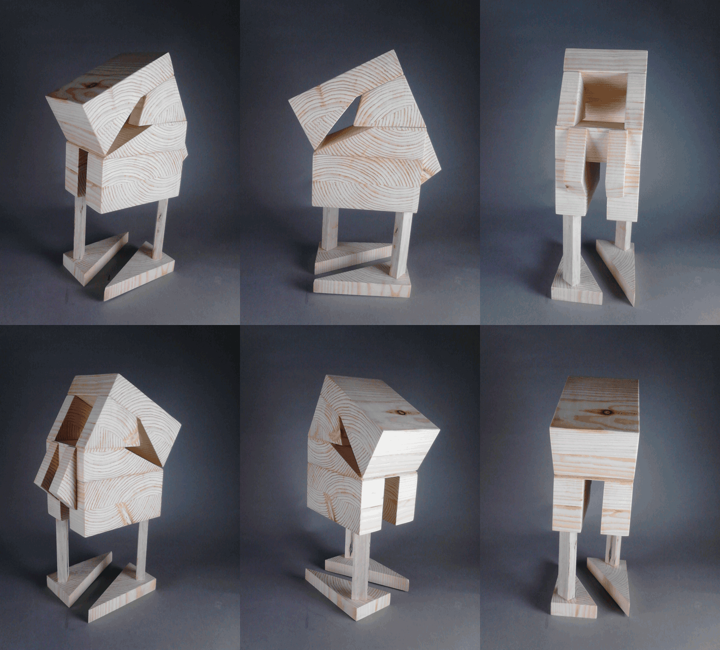
Wood Carving: Additive Sculpture


Title:  Wood Carving: Additive Sculpture
Medium: Wood Sculpture

Notes: This piece changed so many times from conception to completion. It initially started much different, but as the process went on, the puzzle pieces kept radically changing. While I enjoy the result (sort of retro robot feel), it looks nothing like the plan.
Overall, the piece deserves merit in terms of flow. I tried to make a great attempt at trying to play with the angularity as well as using the negative spaces to push the eye back into the piece.
As with the previous piece, I tried to use the patterning of the wood grain to move the eye around the piece. I almost think that having some object placed off-kilter or on the top would make for a nice break-up of the symmetry so that the piece wouldn't be so similar on each side.


Wood Carving: Subtractive Sculpture


Title:  Wood Carving: Subtractive Sculpture
Medium: Wood Sculpture

Notes: My initial thought process was to create an even more, slightly asymmetrical, organic piece. It was originally supposed to look more like a squid-like tentacle, but it ended up being more of a bird-like skull sculpture.
I decided midway through that it would be more interesting to turn the piece on it’s side and mount it slightly off-center to the wood block. I made as many attempts to follow the wood grain patterning as much as possible. I think by doing so I managed to make it even more organic. 
The problem areas seem to stem from the fact that it wasn't as smooth as I would have like it to be (especially around the “neck” area). There are so many nicks and bruises in the wood that it seems more like the piece still has a ton of work in terms of smoothing it out. Hilariously enough, I naturally threw my arm and wrist out while working on this piece

20/40 Planed Shapes


Title:  20/40 Planed Shapes
Medium: Shaped Paper

Notes:  The overall craftsmanship began moderately well, but I have since discovered that working larger tends to make things a bit clearer. I began with a much simpler design, and then realized that there weren't enough shapes to make up the overall design. I then began to place more objects in a circular pattern to mimic the exterior shape of the icosahedrons and then expanding that form at the bottom of the piece. I then took that a step further by opening the bottom of the shape to include smaller cube shapes in the interior. Since a triangular shape is the most stable shape, I decided that this would help to create a good sense of balance throughout. The shape breakup had to happen with the cubes being echoed on the outside as well.
I wish I had made the external shape at the top more load bearing because it would have helped to create a more solid viewpoint from the bottom. Also I would have liked much better craftsmanship overall, but as I stated initially, working smaller tends to be a detriment. So for next time, bigger IS better.


Dynamic Wire Sculpture


Title:  Dynamic Wire Sculpture
Medium: Shaped Wood, Wire

Notes:  For the majority of the gesture drawings, I had a tendency to draw prone animals (let’s face it, most of the animals in the zoo have become slightly apathetic). So I decided it would be ideal to find the largest animal I could find and draw it in the prone position as many times as I could before it stood up. Which led to my gesture wire frame as the bear.
My wire sculpting techniques seem to err on the slightly more gesture side instead of directly figurative. I tried to think about each of the sculpts as though I was going to 3D model the wire frame, but the output did not look as interesting as I would have liked. I tried to my best to loosen up the wire.
I could literally draw poses for days. I went to a website (www.characterdesigns.com) and attempted to gesture draw a ton of action poses. The pose that I chose was like a pre-leap pose because it gives an implied motion rather than an “in-motion” which I think might have been a bit more interesting perhaps.
For each base I tried to give a bit more dynamics to the piece by sort of tying the base to the piece. For example, with the bear piece I tried to give a sort of shale or rock texture. And for the leaping piece, I harkened back to the childish game of “don’t step on the crack or you’ll break your mother’s back” that I used to play as a kid.


Illustration II - Digital Portfolio


Title:  Illustration II - Digital Portfolio
Date: January - May 2013
Medium: Varies
Scale: Varies

Notes:  See each piece for more on the notes of each. As a whole though, this is the entirety of my illustration II class. For the most part each piece has all the work involved next to it, the only difference is that I had to truncate the amount of sketches that were with each piece.


WIP: Face that Could have been a Painting up Front


Title:  WIP: Face that Could have been a Painting up Front
Date: May 3, 2013
Medium: Photoshop

Notes:  While looking for a good reference to paint from, I stumbled upon this girl's deviant art page. She actually looks like she's painted up front, which is kind of strange, but I decided to try my hand at painting her. Unfortunately, it's still extremely stylized and the colors are kind of strange, BUT I was actually staring at Caravaggio's palette while painting this piece and tried a new technique of building up the layers. Hopefully it's starting to show some improvement, but I think I still have quite a ways to go.

Follow Mat @artofmatk

Follow Ash @ashley.storyteller