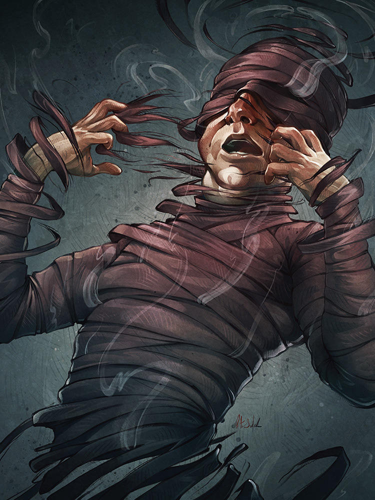
Trying out New Techniques


Title: Trying out New Techniques
Date: September 27, 2013
Medium: Photoshop CS3
Date: September 27, 2013
Medium: Photoshop CS3
Scale: Varies
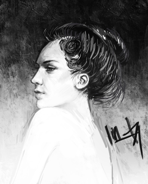
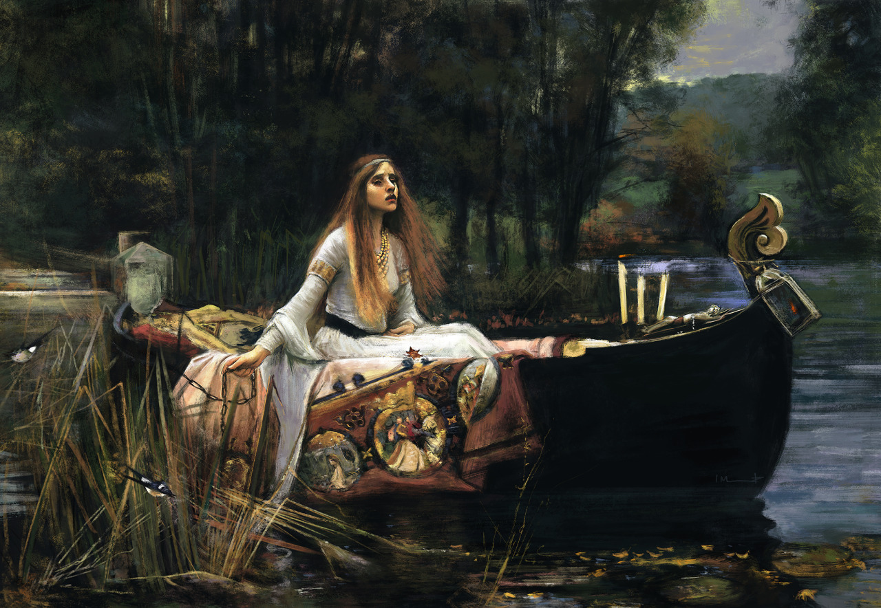
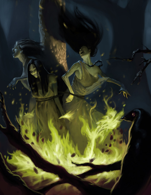
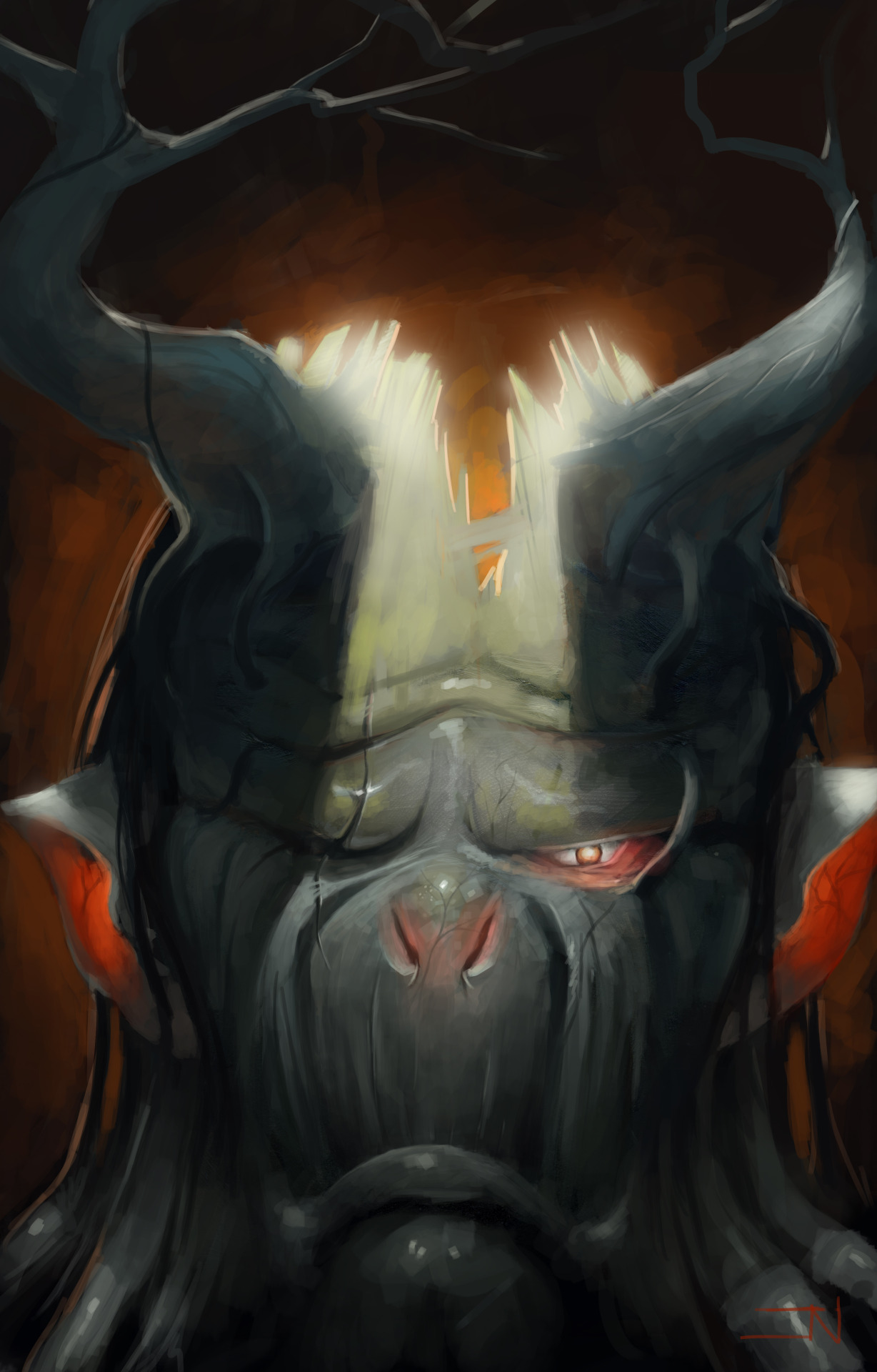
Notes: I found a new set of brushes for photoshop that I believe will help me a bunch when it comes to painting. It's an oil paint brush pack.
It seems to be good to just block in the colors with a solid texture brush and then be able to slowly build up the values with a different brush.
I would love to learn real oil painting, but I think that will be something that I learn through a billion youtube videos and a summer break.
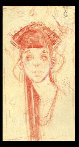
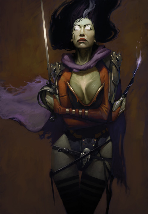
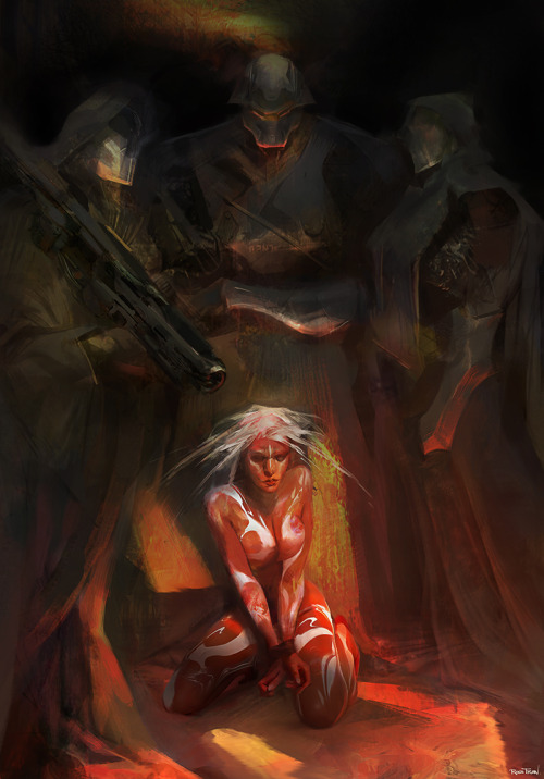
The Duchess (WIP)

Title: The Duchess (WIP)
Date: September 28 & 29, 2013
Medium: Photoshop CS3
Date: September 28 & 29, 2013
Medium: Photoshop CS3
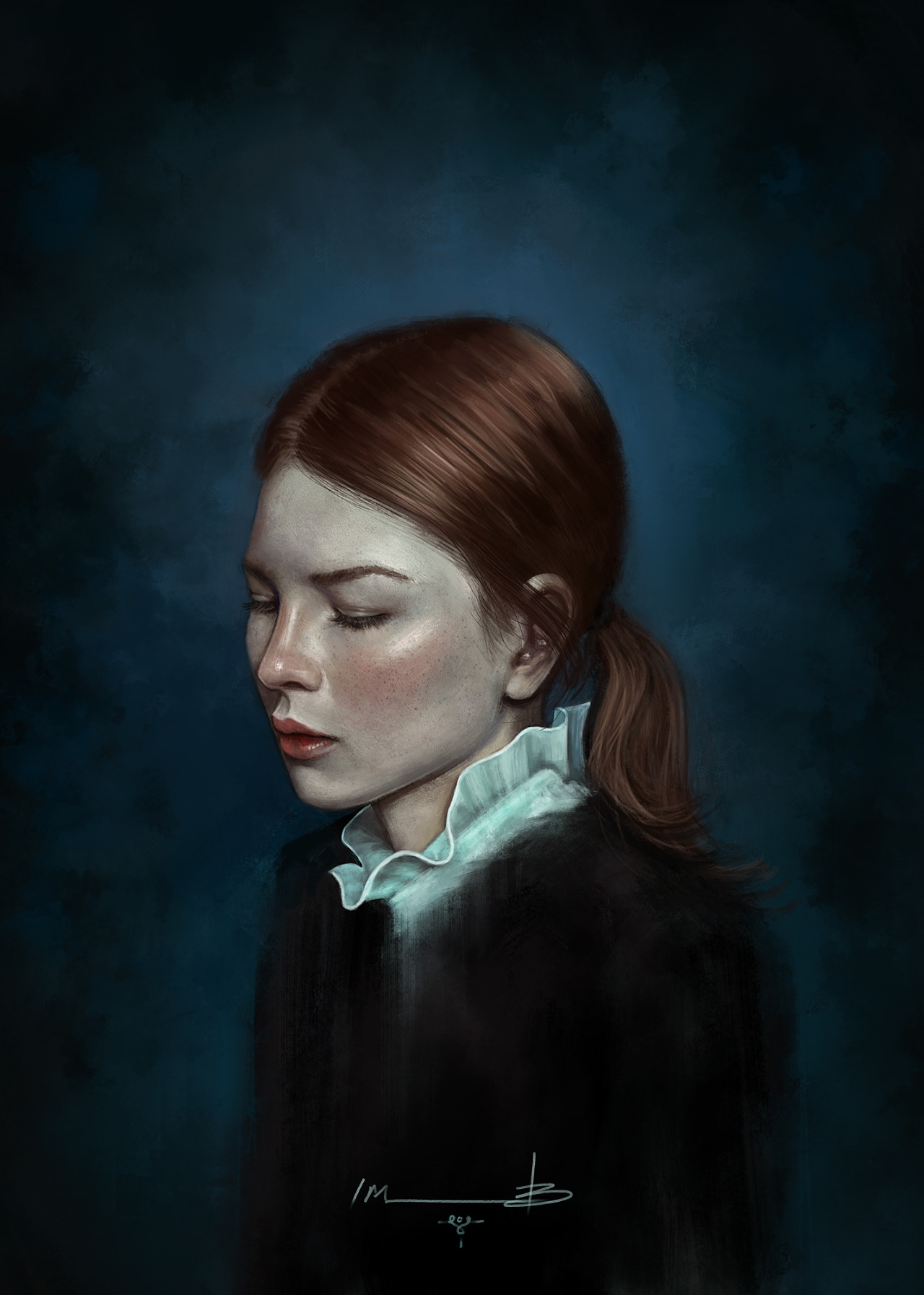
Notes: Applying what I learned with the Oil Brush Pack to a more realized study.
It still has a bunch of work to go, but I thought I would share what I have so far...