Wednesday, July 31, 2013

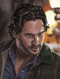
True Blood Portrait Series 2: Alcide Herveaux


Title: True Blood Portrait Series 2: Alcide Herveaux
Date: July 24 & 30 - 31, 2013
Medium: Photoshop
Scale: Original is 10" x 13"
Notes: Err... there was a bit of a break in between on this one. I started it right after the Jessica painting, and I think I just got kind of side-tracked on other things I guess. Or maybe I can just blame my Skyrim addiction as of late. I've been playing quite a bit of that before school starts up again. But what can I say, that game is ridiculously addicting.
Anyway, here is the finished painting of Alcide. I think it's a step up from my previous attempt...
I can say though, to simulate a blurry background is nothing short of impossible. I tried the blur tool, I tried a blur filter... I just said screw it and just used a blurry brush and dabbed it here and there.

Tutorial:


Dazed and Confused


Title: Dazed and Confused
Date: July 30, 2013
Medium: Photoshop
Scale: Original is 2400px x 3200

Notes: I haven't done a self-portrait in a little while... and here it is, with a little bit of experimentation. Did this one really fast honestly (around 1-hour-ish...) and just had a blast. The portrait is a little on the creepy side... but it was the best of the two I took for ref. Mental note: Try and not be creepy in pictures, but I can't guarantee anything.

Also, this was a contest entry for here!


Also... as a bonus sneak peak into my next piece:


Thursday, July 25, 2013

True Blood Portrait Series 2: Jessica


Title: True Blood Portrait Series 2: Jessica
Date: July 21 - 23, 2013
Medium: Photoshop
Scale: Original is 10" x 13"

Notes: HEY! Remember back a few months ago when I painted Jessica (and all the rest of the True Blood cast...) Well, here's a redo!
I'd like to think that I've gotten a little bit better? More on this redo of the portrait series coming soon!

Oh, and as usual, here's the tutorial...


Sunday, July 21, 2013

Melodie


Title: Melodie
Date: July 20 & 21, 2013
Medium: Photoshop
Scale: Original is 1400px x 2100px

Notes: Alright, I've never used filters on a painting before. And going back and looking at like 100 different pieces with the sample filter above, I've come to the conclusion that like 99% of my pieces need that extra little bit of sharpness to pull the details out even further. I think that's what ends up happening on some of the ones that I've tried to submit... the details were just lost. Hopefully I've rectified that situation here by giving it that extra tiny bit of *UMPH*.
Also, the ref is from http://characterdesigns.com/
The goal was merely to draw someone with tattoos, but a majority of the images that I was finding were pretty much completely untasteful. 

Oh... and just for fun, here's a tutorial:


If you have any questions, just comment and I'll get back ASAP.

Enjoy!

Tuesday, July 16, 2013

Cornwell is a Rascal


Title: Cornwell is a Rascal
Date: July 15 & 16, 2013
Medium: Photoshop
Scale: Same as Above.

Notes: So, I was trying out a master study. I've been told that they are useful, and honestly... I can't agree more after trying it out now that I feel a little comfortable with my painting skills. Of course, this is not comfort in the fact that I'm good at it by far, but comfort in the fact that I don't get discouraged after five minutes of painting.
Here's the source image: $2000 Reward
I think after painting for like an hour or so and really getting a feeling of the paint, I then realized that not only was the figure too wide, but the actual image itself was like half an inch to the left.
This was really my second exploration into the whole 'flipping the canvas' every like fifteen minutes. It seemed to really help.
Either way, I think my colors are a little more accurate than they've been in awhile. No color sampling for me. As I think that's flat out cheating.

Sunday, July 14, 2013


Faith has Learned Her Lesson


Title: Faith has Learned Her Lesson
Date: July 14, 2013
Medium: Photoshop

Notes: For anyone that keeps up with Buffy or Angel (which I was skeptical about at first, but it actually proves to be a pretty awesome show), this is a powerful scene from Angel. I just really wanted to try and continue on that push with the painting, and this is actually the first time that I have ever used the flip canvas in Photoshop and actually seen results.

Friday, July 12, 2013

So, I've been listening to this concept band: Mind.In.A.Box for quite some time, but I never really told many people why. Well, interestingly enough, it's actually all about a story. Each track is like a chapter in a story.
I'll let you judge the story, but you have to start here:


"Light & Dark" - Mind.in.a.Box

From there, here is the timeline all the way up to current:


Lost Alone
  1. Light & Dark
  2. Change
  3. Falling
  4. You Will See
  5. Questions
  6. Waiting
  7. Lost Alone
  8. Walking
  9. Take My Soul
  10. Forever Gone
  11. Lost Alone 2
  12. Leave
Dreamweb

  1. Tape Evidence
  2. Certainty 
  3. Lament for Lost Dreams
  4. Machine Run
  5. Loyalty
  6. Sun and Storm
  7. Out of Time
  8. Dead End
  9. The Dream
  10. Reflections
  11. Between Worlds
  12. Escape
Crossroads
  1. Introspection 
  2. Amnesia
  3. Into the Night
  4. Identity
  5. Lucid Dreams 1
  6. Fear
  7. Stalkers
  8. What Used to Be
  9. The Place
  10. Redefined
  11. Lucid Dreams 2
  12. Crossroads
  13. Run for Your Life
Revelations
  1. Remember
  2. Cause and Effect
  3. Transition
  4. Doubt
  5. Control
  6. Fragments
  7. Unknown
  8. Not Afraid
  9. Second Reality
  10. Sanctuary
That Mustache


Title: That Mustache
Date: July 11 & 12, 2013
Medium: Photoshop
Scale: Same as Above.

Notes: As always, more portraits. Trying to get anatomy closer, as well as textures, secondary light, etc. I'd like to think that the skin tones are closer than they usually are. The other thing I'm discovering from doing studies from photos is that the whole 'center of focus' thing is hard to simulate with paint. Lets face it, making it look like something is forced blurry is tough. I also try not to cheat by using the blur tool because in my opinion it looks SUPER artificial.

Tuesday, July 9, 2013

Patterns are for Suckers


Title: Patterns are for Suckers
Date: July 9, 2013
Medium: Photoshop
Scale: Same as Above.

Notes: So... this started out as just a quick "speed" painting... but delved into more or less a pattern study.  And can I say... THAT PATTERN WAS A PAIN IN THE ASS! At first I was tempted to just do a square brush and just copy it over and over, but that would essentially cheat me of actually getting some detailed patterning in. So then I thought, maybe I'll just trace the coat from the original and just keep moving... That would ALSO be a waste of time. I ended up going block by block, some of course messier than others, but I was determined to get that damn pattern at least halfway translated. Either way, I loved painting the pants and shoes!
The unfortunate side effect is that it went from an hour long study to about 3ish...

Forgot... The tutorial!


Monday, July 8, 2013

Got a little sick last week... so trying to make up for it this week...

The Red Fox


Title: The Red Fox
Date: July 8, 2013
Medium: Photoshop
Scale: Same as Above.

Notes: An experimental attempt at a warm-up exercise.  It was an attempt at a speed paint (haven't done one in a few). About one-hour in...

Follow Mat @artofmatk

Follow Ash @ashley.storyteller