Showing posts with label movie studies. Show all posts

Friday, March 6, 2015

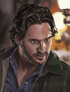
Fan Art Friday: A Lost Son


Title: Fan Art Friday: A Lost Son
Medium: Photoshop CS6
Scale: Original is 12.825" x 16"

Notes: I think that Opie was one of the more interesting characters of the entire Sons of Anarchy canon, mainly because of the inner struggle that we all deal with. I think ultimately, he's how people would really be in this type of world - struggling to fit in all of our worlds at once. Everyone seems to play this multiple role lifestyle that I think he embodies well.
Hope that you enjoy this one, more to come soon.

Little bonus tutorial as well - to show the steps...

Saturday, December 6, 2014

Fan Art Friday Saturday -- Six ft Six Head and Shoulders


Title: Fan Art Friday Saturday: Six ft Six Head and Shoulders
Date: November 5 - 6, 2014
Medium: Photoshop CS6
Scale: Original is 2592px x 1720px

Notes: This was a piece to challenge myself to the max! I wanted to make sure that the next piece that I did was completely full of color. This one was a complete challenge in every aspect. 
Sorry that it was delayed from Saturday... but I hope it was worth it.


And as always... bonus tutorial:


Tuesday, July 1, 2014

June - Anatomy Summary


Title: June - Anatomy Summary
Date: June
Medium: Photoshop CS6
Scale: Varies

Notes: Overall, the month of June was, what I felt like, a bit of an unproductive month. I think maybe I was feeling down or perhaps all the pending housework was destroying my productivity, but I can say that I'm trying to make a point of the things that I need to work on. Edges and Stoke economy. These are the main things that I want to really make sure that I start to watch. I think I'm getting kind of there as far as getting really expressive with my painting technique, but I think it's still falling apart on those two aspects mentioned. It's a long and frustrating process, but hopefully in the end it will be worth it.
As always... time to just keep on powering more down!

Game of Thrones - Season 1, Episode 1
(Stark's Dilemma)
(Work in Progress)


Title: Game of Thrones - Season 1, Episode 1 (Stark's Dilemma) (Work in Progress)
Date: June 17 - 24, 2014
Medium: Photoshop CS6
Scale: Original is 12.8" x 7.8"

Notes: I really want to do a study for every episode, so I've been taking screen caps of what I would consider to be a 'pinnacle' moment of each episode. I'm really behind as far as the work goes, but I love this show so damn much that I just want to keep pushing on my studies for these. They are some great examples of dynamic lighting, crazy scenes, and even awesome character design. Either way... more to come on these.

Demon Lord - Applied Study (WIP)


Title: Demon Lord - Applied Study (WIP)
Date: June 24 - 29, 2014
Medium: Photoshop CS6

Notes: Still plugging away at this WIP. That staff is looking stupid and so is the altar... much work to go!

Monday, August 12, 2013

Ashton Kutcher on Success

You know what I'm sick of? Apathy. Excuses. Laziness.

All of these words are so negative. I hear people everyday talk about how "If only I could have done this..." It just grinds on me everyday. If you want to do it, STOP MAKING EXCUSES. Just do it. Try something new, try it again, don't give up. It might sound cliche, but that old Nike slogan had it right: Just Do It. I think truer words could not be said.

Stop letting things get in the way. If something distracts you, get rid of it. Move it, change things. The world doesn't change in a day. It takes time, but just stick with it.

If it's one thing I've learned since I've started doing art, you just have to do it. There is no special 'instructions' to doing it. You just have to get out there and do it. The media doesn't matter, the size of your paper doesn't matter. Honestly, my Life Drawing professor had it right in some capacity "Some of the most interesting work throughout history wasn't even done with the intention of it coming out that way." Basically just get in there, make a mess. Go in with an open mind, don't think about the results, think about the journey there. And once you get to that destination, look forward and grab a new one.

I've had people ask me why I do art, or even how I got started. Well firstly, I don’t think there is anything else I can do. I tried a multitude of jobs… everyone of them always inevitably led back to doing art somehow.

I worked at a movie theater as a ticket taker: I drew.
I worked as a check printer: I drew.
I worked as an I.T.: I drew.

Over time I saw a pattern and so I just stuck with it. You can actually track my progress from beginning to now…

The point I’m trying to make with this rambling is that everyone needs to stop making excuses and just fucking do it. Do exactly what you set your mind on. I think there is an old saying that goes something like: “Do what you love and life will work itself out.”


KMFDM - "Dogma"


Repo! The Genetic Opera: Pure Addiction


Title: Repo! The Genetic Opera: Pure Addiction
Date: August 8 - 12, 2013
Medium: Photoshop
Scale: Original is 2788px x 4200px

Notes: WHEW! Painting is a blast, but this one was getting close to wearing me out.
This is from Repo! The Genetic Opera. As with all the other fan art I've done for it, if you haven't seen it, you definitely should.
This movie pretty much epitomizes everything I love: Dark themes, technology pretty much taking over, cyberpunk feelings, I'm even a sucker for a musical. I just love this damn movie. Hopefully this painting seems to help drum up even more interest for this one.
Anyway, more painting to come... I still feel like I have one more in me before school starts.

Hopefully these tutorials are helping someone...


Friday, August 9, 2013

Massive Attack - "Inertia Creeps"

The Graverobber (WIP)


Title: The Graverobber (WIP)
Date: August 8 & 9, 2013
Medium: Photoshop
Scale: Original is 2755px x 4150px

Notes: Still a ton of work to do yet, but here is my piece so far... I can't get enough of Repo! The Genetic Opera. I think it might be my favorite movie honestly. I tried to go a little more 'painterly' on this one, but like I said I have a long way to go. And for some reason I keep avoiding the right side... <shrug>


Wednesday, August 7, 2013

True Blood Portrait Series 2: Hoyt Fortenberry


Title: True Blood Portrait Series 2: Hoyt Fortenberry
Date: August 5 & 7, 2013
Medium: Photoshop
Scale: Original is 10" x 13"

Notes: Looks like I skipped a day and didn't even realize it hahaha!! Oh well... here is Jessica's counterpart, Hoyt. He was a bit faster to paint, either that or I'm getting better at this whole transferring thing... Regardless, it was a fun one.
More soon!

True Blood Portrait Series 2: Opposites Attract I


Title: True Blood Portrait Series 2: Opposites Attract I
Medium: Photoshop

Notes: I originally had this plan to lay each of them out side-by-side. Each pairing would be a counterpart type thing. I'm going to try and do each one of them as I go. And then I'll upload them all together at the end to see how they relate, which are better, etc.

Tuesday, August 6, 2013

Ugh... school starts in like two weeks! Must power paint as much as possible until it starts. And get mah game on!

My Muse


Title: My Muse
Date: August 5, 2013
Medium: Photoshop CS3
Scale: Original is 2400px x 3200px

Notes: The coolest part about this painting was how the light was playing on her face. It was like two different light sources competing at the same time for attention. I can't help but love paint ma'lady! She is my muse for sure. She's the one that started me on the path to artlyness, and she's the one that constantly pushes me to do more and more art! Without her I don't really think that I would do any art at all...


Preview time! 
Guess who this is:

Wednesday, July 31, 2013

True Blood Portrait Series 2: Alcide Herveaux


Title: True Blood Portrait Series 2: Alcide Herveaux
Date: July 24 & 30 - 31, 2013
Medium: Photoshop
Scale: Original is 10" x 13"
Notes: Err... there was a bit of a break in between on this one. I started it right after the Jessica painting, and I think I just got kind of side-tracked on other things I guess. Or maybe I can just blame my Skyrim addiction as of late. I've been playing quite a bit of that before school starts up again. But what can I say, that game is ridiculously addicting.
Anyway, here is the finished painting of Alcide. I think it's a step up from my previous attempt...
I can say though, to simulate a blurry background is nothing short of impossible. I tried the blur tool, I tried a blur filter... I just said screw it and just used a blurry brush and dabbed it here and there.

Tutorial:


Dazed and Confused


Title: Dazed and Confused
Date: July 30, 2013
Medium: Photoshop
Scale: Original is 2400px x 3200

Notes: I haven't done a self-portrait in a little while... and here it is, with a little bit of experimentation. Did this one really fast honestly (around 1-hour-ish...) and just had a blast. The portrait is a little on the creepy side... but it was the best of the two I took for ref. Mental note: Try and not be creepy in pictures, but I can't guarantee anything.

Also, this was a contest entry for here!


Also... as a bonus sneak peak into my next piece:


Thursday, July 25, 2013

True Blood Portrait Series 2: Jessica


Title: True Blood Portrait Series 2: Jessica
Date: July 21 - 23, 2013
Medium: Photoshop
Scale: Original is 10" x 13"

Notes: HEY! Remember back a few months ago when I painted Jessica (and all the rest of the True Blood cast...) Well, here's a redo!
I'd like to think that I've gotten a little bit better? More on this redo of the portrait series coming soon!

Oh, and as usual, here's the tutorial...


Sunday, July 14, 2013


Faith has Learned Her Lesson


Title: Faith has Learned Her Lesson
Date: July 14, 2013
Medium: Photoshop

Notes: For anyone that keeps up with Buffy or Angel (which I was skeptical about at first, but it actually proves to be a pretty awesome show), this is a powerful scene from Angel. I just really wanted to try and continue on that push with the painting, and this is actually the first time that I have ever used the flip canvas in Photoshop and actually seen results.

Tuesday, June 18, 2013

So I just finished Mass Effect for the second time... and I have to say, it was just as fulfilling as the first time I played it. Honestly, I'm now going to make a run with a Vanguard and try out Insanity difficulty. It seems like it will be hard as I'm already encountering Geth Destroyers and I haven't even left Eden Prime yet. But regardless, I mainly just wanted to bring up Mass Effect for the music. If you haven't played it or heard the soundtrack at least, then I believe you are missing out to the max (ESPECIALLY the ending theme)! It (recently) took my number one spot for top game (which was long held by Chrono Trigger).

I'm actually wondering if my choices for video games are based all around the soundtrack more than anything. I could probably list like one-hundred games right now that I absolutely love the soundtracks for (I'd like to know your favorites in the comments below). 

On a side note... I'm going to try something new from here forward. I want to try and start writing reviews of movies that I watch along with the painting. I'm no English major, but I want to try and drum up some appeal for the movies I watch. Maybe in the future my madam will pick up the reigns and write the reviews (hers would be infinitely better than mine HAHAHAHA).


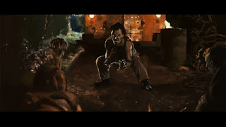
STAKE LAND
"Martin was a normal teenage boy before the country collapsed in an empty pit of economic and political disaster. A vampire epidemic has swept across what is left of the nation's abandoned towns and cities, and it's up to Mister, a death dealing, rogue vampire hunter, to get Martin safely north to Canada, the continent's New Eden."

Stake Land -- A Review


Title: Stake Land -- A Review
Date: June 17, 2013
Medium: Photoshop

Notes:  So, if The Road, 30 Days of Night and Lone Wolf and Cub all had a baby, this would be it. This movie in my honest opinion is kind of an unnoticed gem. It has a certain amount of horror factor that plays almost from the very beginning (but I guess this should be obvious what with the vampire theme being all-throughout). But somehow when watching the movie it becomes a bit blurry as to who the real monsters are. I don't want to reveal anything, but when watching movies like this I think most people go into it with a certain degree of moral gray areas.

Technically, I think the acting is pretty spot on, and I honestly had a hard time picking out any character that didn't really suit my taste. The main thing that shines though, I think, is the ambiance. The sets are all really well lit and the fast-paced cinematography adds another level of depth. Couple that with some great dialog (Mr. might be one of my favorite (anti?)heroes that I've come across in this genre -- plus he's a real smart ass), and some over-the-top action, and you get this movie all wrapped up in a tortilla.

About the one thing that didn't seem to be as good in this movie was probably Belle.  She seems a little out-of-place in this environment to me. Maybe it's her innocent nature? Maybe it's the fact that she seems to need to be protected? I'm not entirely sure, but from beginning to end, she just seems to not fit quite right into the little troupe. And oddly... her hair seems to stay perfectly clean all the way to the end.

Overall, I think this movie is a pretty damn good movie, and I had no expectations when starting to watch it. I would suggest that you just grab a beer, grab some popcorn and just enjoy the ride in the back seat of Mr.'s crappy giloppy. 

Rating:  ****

Wednesday, May 8, 2013

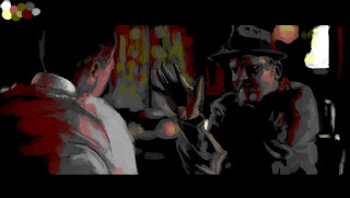
"Killer Inside Me" Still


Title:  "Killer Inside Me" Still
Date: May 8, 2013
Medium: Photoshop
Scale: Original is 2700px x 1525px

Notes:  This is unfinished, and I think this is as far as I'm going to go with this one. Okay, so a little back story: I actually plan on doing a still from every movie (somewhere in it) of every movie that I watch this summer. I want it to be a good iconic spot of the movie, and would actually perfer it to have some interesting lighting situation or good interaction between characters. Let's face it, illustration should be about not only interesting characters, but interaction and A STORY. I consider these not only great color studies, but also mood, and interaction studies. Plus embedding the character in an environment.
This one in particular was a study in not only all those mentioned, but also  Reduction, Matter of Focus, and Limited Palette. Hopefully it reads from a distance as well.
All of these are going to be what I'll be going for in the next couple of months...

Follow Mat @artofmatk

Follow Ash @ashley.storyteller