Tuesday, February 28, 2012


Artist of the Week! 
This week it goes to: DStraX
Your studies just keep getting more and more amazing! I'm actually going to start following in your footsteps as far as the art related stuff goes... I really need to step it up on many things, such as matieral tests, rendering tests, etc. I can't wait to see you reach your full potential, it will be one for the stars. The main thing that I would like to see you work on would be fully utilizing dynamic posing. Once you get that down, I'm not sure what will stop you...
Thanks for the AMAZING advice that you and 'another artist' gave me... More on him next week.


Alright let's see.... this week hasn't been a major breakthrough in the art department, EXCEPT that I started breaking away from just my strange brush that I've been using. I guess that makes me a bit more versatile when it comes to just painting around. Either way, I still just want to have more time to paint hahaha

I've been sleeping a bit more than usual. I'm not sure if that's a good or a bad thing who knows. Oddly enough though, I've been extra sleepy since I've been doing that. Not sure how that works.

Uhhh... Not really a whole lot going on besides that. Thought about switiching to Illustration major, but that would leave me sticking around the school for another semester (not that I wouldn't like that, but I don't think my bank account would appreciate that). So I think I'll just keep doing as I am and just gear all my electives toward illustration or painting or whatever. It might be best that way.

Anyway, as always... here's the art!


Crushed Can JUSTICE


Title: Crushed Can JUSTICE
Date: February 24, 2012
Medium: Photoshop

Notes: Trying to study how metal crushes in the hand. This was for a poster idea that I was working out. Don't think I'll have time to do it right now, but it will fester on the back-burner just like all these other ideas...


Cora Character Exploration AGAIN


Title: Cora -- Character Exploration AGAIN
Date: February 23, 2012
Medium: Photoshop
Scale: Original is 3000px x 3000px

Notes: Well, it's time to redesign her again, so we're back to the 'ole drawing board. Oh well, more doodles and exploration as always.


Tom Servo Look-Alike


Title: Tom Servo Look-Alike
Date: February 24, 2012
Medium: Photoshop

Notes: More of the study from above... Was fun to try to use different colors to shade instead of just back to white.


Color Studies


Title: Color Studies
Date: February 20 - 23, 2012
Medium: Gouache
Scale: Each 'piece' is 7" x 10"


Doodlin'


Title: Doodlin'
Date: February 21 - 25, 2012
Medium: Graphite
Scale: Original is 9" x 12"

Notes: Just trying to loosen up again and just relax with different stuff...


Full Action-Pose Study


Title: Full Action-Pose Study
Date: February 23, 2012
Medium: Graphite
Scale: Original is 9" x 12"

Notes: This is a work in progress, but I fully intend to finish this guy!

Thanks for looking! More coming soon...

Monday, February 20, 2012


Artist of the Week! This week it goes to: Jackdaw
The style of this artist goes above and beyond basic concept art, they are like a master conceptual artist! Not only that but they seem to have a very painterly style when they approach the digital realm. I'm also giving them a super nod for the fact that they still draw in pencil, something that is seriously lacking in this day and age. Keep on doing your thing!
So, if you haven't noticed... my blog list to the right has seriously bumped up in the amount of artists that I follow... I don't know where I found it, but basically there was a huge list of good art blogs on concept art the other day and I just went through it page-by-page and added all the artists that I found really interesting!

If you get a chance, you should check them out if for nothing else than to fill your artsy brains up with sweet art and leave it flopping around on your desk trying to grasp at some semblance of order to get back to your art with.

Annnyywaayy... so I've been pretty much drawing and painting like crazy lately, hopefully it will start to show some nice progress soon. I think I'm going to start doing some color studies using movie stills, especially since the shows I've been watching lately have been getting some super dynamic angles and lighting.

Just doing more and more art and staying up later and later lately. I wish I didn't have to sleep... at least the Twilight vampires have one awesome thing going for them... the whole 'not sleeping' thing. Although I wouldn't want to be so glittery... that would kind of detract from any sort of 'manliness' I would have.

Werewolves are where it's at. I mean think about all that power. I should draw some werewolves sometime...

I can't wait for free time during the summer. I'll say this now and probably regret it and super procrastinate when it comes around, but... during this summer I really plan on getting some things together. Maybe going on vacations or at least good outings with my special lady friend... Drawing and painting my own stuff... getting some good movie / game / etc. time in...
Enough ranting though... I have more work to get in, here's that art...

Photostudy


Title: Photostudy
Date: February 16, 2012
Medium: Graphite
Scale: Original is 4" x 6"


Cora -- Journal


Title: Cora -- Journal
Date: February 16, 2012
Medium: Graphite
Scale: Original is 9" x 12"

Notes: This was more of a facial study for her... but then it developed into another 'character' design.


Randomness


Title: Randomness
Date: February 17 - 19, 2012
Medium: Graphite
Scale: Original is 9" x 12"

Notes: I couldn't stop staring at Marko Djurdjevic pieces and Wes Burt pieces... and they inspired this randomness. I really like doing these, I might make more of em later.


Cora -- Mask Variants II


Title: Cora -- Mask Variants II
Date: February 14, 2012
Medium: Graphite

Notes: Still trying to make more masks based on animals... having so much fun with this project!


Reclining Pirate


Title: Reclining Pirate
Date: February 14 - 15, 2012
Medium: Graphite
Scale: Original is 12" x 9"

Notes: Was just making a quick go at a contest on Deviantart... I missed the deadline as always, but it was fun to sketch quickly (spanned about two-hours over two-days).


Sunday, February 19, 2012

Can't scan at the moment... scanner too many feet away!

Here's what I did the past couple days in digitals...

Alien Sketch


Title: Alien Sketch
Date: February 17, 2012
Medium: Photoshop
Scale: Original is 3000px x 3000px 

Notes: <shrug>

Samus Aran


Title: Samus Aran
Date: February 18, 2012
Medium: Photoshop
Scale: Original is 3000px x 3000px

Notes: Did kind of a battle with Sushy -- Samus Aran, 1.5 hr (even though my sketching and time wasting used up a great deal of this time...)


Punky Rockery Dude


Title: Punky Rockery Dude
Date: February 16, 2012
Medium: Photoshop
Scale: Original is 3000px x 3000px

Notes: While playing Fallout I suddenly wanted to do a punk badass dude.


Monday, February 13, 2012

So, let's see... what has happened since we last talked...


Artist of the Week! This week it goes to: bloodtaster
If you look at this person's work, it has an almost painted look to it, even though it's in digital. Some of it more than others, like for example: the painted style of this is almost reminiscent of watercolor work. It's a very unique style and I really think it's interesting. Let's not forget the amazing amount of detail smashed into each illustration as well... Great job!


Well, I actually just recently got SUPER inspired by SIXMOREVODKA and the amazing things that they are doing. I mean, not only is my favorite artist the owner of his own, talented studio, but he also seems like a cool guy as well. The entire team over there pretty much blows me away, so much talent, so much awesomeness! If I keep working at it, I think I'll get there eventually.

Other than that, just pretty much been working a ton more on my character, still quite a bit to go, but I have the turnaround all split apart and I am starting to model out the hair and change all the directions of the limbs and things. We're supposed to do a thirty-second dance number with our character when we get it down solid.

Ashley finished reading me Frankenstein the other day, it actually had a much different ending than I though it would. Either way, it was enjoyable for sure... Dracula is next on the list, I hope it will be good! Although oddly, through all the incarnations I've seen / read / heard, I'm not sure how much of it will be new material. I guess I should be careful throwing that out there though... 

Anyway, time to toss up what you might've come here for... ART!

Color Studies -- Chromatic Grey - Mixed


Title: Color Studies -- Chromatic Grey - Mixed
Date: February 10, 2012
Medium: Gouache
Scale: Original is 7" x 10"

Notes: Chromatic Greys are a strange concept to grasp, they are muted colors to the point that they become grey with a tint of hue to them.


Color Studies -- Notes


Title: Color Studies - Notes
Date: February 10, 2012
Medium: Graphite / Gouache
Scale: Each page is 9" x 12"

Notes: Just practicing around with Gouache still...


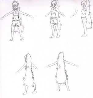
Cora - Turnaround


Title: Cora - Turnaround
Date: February 9, 2012
Medium: Graphite
Scale: Each page is 9" x 12"

Notes: This was a pre-study to my animation pieces. Trying to make sure that I get everything in the correct spots and lined up correctly.


Cora - Mask Variants


Title: Cora - Mask Variants
Date: February 10 - 12, 2012
Medium: Graphite
Scale: Original is 9" x 12"

Notes: I'm trying to modify her mask to reflect an animal. So I have a few more since this, but I have to ask... if anyone can think of something natural in nature that is not identical on both sides of it's face. This was a hard thing to think about... if you have any, just comment below and I'll try to make sure to test it out on the mask itself. Thanks!!!


Cora - Realism


Title: Cora - Realism
Date: February 11, 2012
Medium: Photoshop
Scale: Original is 3000px x 3000px

Notes: This is an attempt to make a more realistic Cora if at all possible...


Color Studies -- Muted - 1 - 3


Title: Color Studies -- Muted - 1 - 3
Date: February 8 - 9, 2012
Medium: Gouache
Scale: Each piece is 7" x 10"

Notes: While these work for Muted, they were supposed to be Chromatic Grey studies... hahah that's a fail.


Sketching Around


Title: Sketching Around
Date: February 7, 2012
Medium: Graphite
Scale: Original is 9" x 12"

Notes: Just having fun with it...

Wednesday, February 8, 2012

So sleepy, so I'm just going to post what I've been up to... will talk more tomorrow or something...

Cora Sample Turnaround


Title: Cora Sample Turnaround
Date: February 8, 2012

Notes: Unfortunately I have to animate the hands and hair separately (as they are all hand-drawn). So this is the 'orthographic' view of Cora.

Frankenstein's Monster


Title: Frankenstein's Monster
Date: February 8, 2012
Medium: Photoshop
Scale: Original is 3000px x 3000px

Notes: Ashley has been reading me Frankenstein, so I decided to try my hand at a 'master study' of the monster from Mary Shelly's Frankenstein. I think that's Robert DeNero, but I'm too lazy right now to look it up hahaha....


Life Anatomy Again


Title: Life Anatomy Again
Date: February 6, 2012
Medium: Graphite
Scale: Original is 9" x 12"

Notes: More life drawing and some imagination stuff.


Ashley's Countenance


Title: Ashley's Countenance
Date: February 6, 2012
Medium: Graphite
Scale: Original is 3" x 3"

Notes: I was actually all set-up for a serious, long-term study... but then I discovered that we were done reading for the day in like 20-minutes... OH! By the way: The most annoyingly-overused word in Frankenstein: "Countenance". Read the book and you too can be annoyed with that word!


Still-Life Study in Ink


Title: Still-Life Study in Ink
Date: February 2, 2012
Medium: Stick and Ink
Scale: Original is 9" x 12"

Notes: Really loving the Stick and Ink studies...


Cora 3/4 Test


Title: Cora 3/4 Test
Date: February 4, 2012
Medium: Graphite
Scale: Original is 9" x 12"


Cora 3/4 Test (color)


Title: Cora 3/4 Test (color)
Date: February 4-5, 2012
Medium: Graphite / Photoshop
Scale: Original is 9" x 12"

Notes: A color comp for my character. Testing some things.


Cora Animation Sample


Title: Cora Animation Sample
Date: February 8, 2012

Notes: This part of the character is fully rigged, I'm going to do replacement animation for the hands (which is why they look like jumbles). It can be posed in any way.

Well... that's all for now. I think I'm going to fall in bed now.


Friday, February 3, 2012


Alright so... here's another update.

Just beginning to do more studies for my character design, and also getting a better grasp on digital painting.
I think I missed an artist of the week this week, so I'll have to do one late. Let's see...

Artist of the Week! This week it goes to: Jason Rainville
This guy is pretty much the epitome of work hard and you'll become awesome. If you look from his first page to his last, there is such a drastic change. Not only has his style completely changed, but his skill has increased like 100-fold. It is kind of an amazing change from then to now. Either way, you should definitely check it out. His art is amazing!
Let's see... pretty much just been up to school and work, with digital painting and things in between. I've been kind of thinking about the upcoming summer, that's going to be a tough one, but hopefully I'll be able to land an internship somewhere and work for an art house during the summer. Either that or really crank up the volume of art so that I can finally land that freelance gig or something that everyone keeps talking about.
Either way, I can't stop the train... not allowed to get off yet. Must get insanely good.

So, here's the art...

Revolver Study and Imaginary Revolver 


Title: Revolver Study and Imaginary Revlover
Date: February 2, 2012
Medium: Photoshop
Scale: Original is 3000px x 3000px

Notes: Just trying to learn how a revolver works so that I can make one up for my character.

Prismatic Colors, 1 - 3


Title: Prismatic Colors, 1 - 3
Date: February 1 - 3, 2012
Medium: Gouache
Scale: Each piece is 8" x 11"

Notes: Trying more gouache painting... I think I'm getting a little better, but it's still really hard. Just gotta keep getting used to it.

Cora Color Comp Test


Title: Cora Color Comp Test
Date: February 2, 2012
Medium: Animation

Notes: Trying to get a feel for her colors.


Follow Mat @artofmatk

Follow Ash @ashley.storyteller