Sunday, February 24, 2013

Urban Myth Club - Spacewalk

and just because it came up next and is AWESOME!
Yoshida Brothers - Inside the Sun (Remix)

Here's that first entry into the SP Sunday.

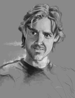
Self-Portrait Sunday - Round 1


Title:  Self-Portrait Sunday - Round 1
Date: February 24, 2013
Medium: Photoshop
Scale: Original is 1180px x 1180px

Notes:  This is my very first entry into what will probably be a weekly thing... Self-Portrait Sunday. This was power-painted. Just trying to get it out at the crack of dawn so that I can start on the next project (maybe another self-portrait?). Verdict?


Monday, February 18, 2013

I thought about it... and if I want to continue with these abstract blog titles, it might make a little bit of sense to actually put the song that I'm getting these titles from...


Ulrich Schnauss - Monday - Paracetemol

And on the note of music... there has actually been something bothering me for awhile, and while I'm not sure if it's a good thing or a bad thing, but... does anyone notice that sometimes when more modern songs have been remade, they become completely new songs? Don't get me wrong, usually I love both of the songs equally, but it would seem that some songs are just a completely genre. Take these two for example: 


They are both amazing in their own right, but Gary Jules' version is completely depressing by comparison. I've actually been finding quite a few of these throughout the years...


I mean, this list could probably go on and on!

Anyway... Time to get back onto the task at hand: Art!

So, I finally started a Tumblr account. This is my first branch out from this blog in quite some time.

But anyways... here's the update for today:

Headphones Paint #1


Title:  Headphones Paint #1
Date: February 7 - 11, 2013
Medium: Gouache on Illustration Board
Scale: Original is 8" x 8"

Notes:  This is the finalized version of the headphones piece that I was writing about earlier. This is actually Ashley's (my fiancee) face put in this image. Painting a gray scale image was pretty tough with just a tiny focus of color. Had to make sure that no color got mixed in with the person. Does anyone know if gouache naturally has a tiny bit of blue in the black paint? Like is it a cool tone naturally? Every time I try to make gray with it, I tend to get a sort of 'blue/gray'.


Headphones Paint #2


Title:  Headphones Paint #2
Date: February 7 - 11, 2013
Medium: Gouache on Illustration Board
Scale: Original is 8" x 8"

Notes:  The second one I painted I feared would have a more washed out look. The color I think got a little unsaturated, so it kind of flattened out a bit because of so much black used.


Headphones Paint #3


Title:  Headphones Paint #3
Date: February 7 - 11, 2013
Medium: Gouache on Illustration Board
Scale: Original is 8" x 8"

Notes:  This one still puts me in a good mood every time I see it. I intentionally made it look like that because it was essentially the basis for my entire advertisement campaign that we were to create. 


Headphones Retro Advertisement


Title:  Headphones Retro Advertisement
Date: February 15 - 16, 2013
Medium: Gouache on Illustration Board, Photoshop
Scale: Original of each painting is 8" x 8". Final Advertisement is 8" x 10"

Notes:  This is the finalized version of the advertisement campaign. I went into it with a retro vision up front. Thus the text treatment and the abstract shape design. I had to clean up the paintings quite a bit. I wonder if that was because my camera isn't as good as I assumed it would be, or if the paintings were muddy from get-go. Either way, there you have it, my first journey back into painting...


Wednesday, February 6, 2013

Electronic Device Sketches C


Title:  Electronic Device Sketches C
Date: February 6, 2013
Medium: Photoshop
Scale: Original is 8.5" x 11"

Notes:  Here's that camera I was talking about. I think the overall layout of this one would be really cool! Maybe I'll have to do it anyway, even though I'm going with the headphones, to follow the whole wires motif that I'm doing this semester.

More to update with soon. I have a ton of sketchbook work and also a ton of finalized pieces. On a side note too, I've finally gotten over my fear of gouache paint! 


Nothing terribly interesting today... just some sketches for my upcoming project in Illustration II. We are supposed to paint (in gouache) an electronic device in a sort of advertisement-esque series of three paintings. I kind of went a bit further and turned them all into advertisements. I guess my inner graphic-designer is showing...

Electronic Device Sketches A


Title:  Electronic Device Sketches A
Date: February 6, 2013
Medium: Photoshop
Scale: Original is 8.5" x 11"

Notes:  The first electronic device that I thought about was my headphones... I really like this layout myself. I think I would rather go with this one over the latter, but I still think that they are both interesting in different ways.


Electronic Device Sketches A

Title:  Electronic Device Sketches B
Date: February 6, 2013
Medium: Photoshop
Scale: Original is 8.5" x 11"

Notes:  I then thought about my tablet... It would be good to do all those features in the subsequent ads. Ehh... either way, they are both fun.

I also had a third one, but couldn't get around to sketches of my camera. I think it would work just as well as the headphones in the end. I need to continue practicing in goauche, I've been trading in paintbrushes for my tablet the past couple of days...

Anyway... more soon!


Tuesday, February 5, 2013

I don't have a ton of time at the moment, in a bit of a rush. But I didn't want to leave anyone hanging (if they were even watching in the first place).
Here's a series I've worked on this weekend... the homework, it's endless.

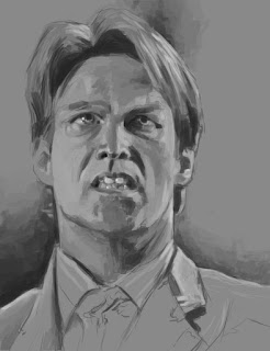
True Blood Portrait Series: Bill


Title:  True Blood Portrait Series: Bill
Date: February 3, 2013
Medium: Photoshop
Scale: Original is 1500px x 1950px

Notes:  The series of portraits did not start off with Bill, but he got lucky and placed in the front. Honestly, out of all the portraits, he seems to be the most anatomically correct. I hope that the slight contrast works well.


True Blood Portrait Series: Alcide


Title:  True Blood Portrait Series: Alcide
Date: February 1, 2013
Medium: Photoshop
Scale: Original is 1500px x 1950px

Notes:  Alcide I believe was the second of the portraits I did. I tried my best to make him as contrasty as possible, but I think the tones are still a little too subtle. He is up there with one of my favorite characters from the show though...


True Blood Portrait Series: Jessica


Title:  True Blood Portrait Series: Jessica
Date: February 2, 2013
Medium: Photoshop
Scale: Original is 1500px x 1950px

Notes:  She was a bit of a difficult character to render, because she is so pale there are only subtle variations in her skin tone.


True Blood Portrait Series: Jason


Title:  True Blood Portrait Series: Jason
Date: February 2, 2013
Medium: Photoshop
Scale: Original is 1500px x 1950px

Notes:  I think I went a bit overboard for Jason's hair, but he was actually pretty fun to paint. I think I could still go back in (as with all of them) and noodle for a bit to make the tones more smooth, but either way, it was exciting.


True Blood Portrait Series: Lafyette


Title:  True Blood Portrait Series: Lafyette
Date: February 1, 2013
Medium: Photoshop
Scale: Original is 1500px x 1950px

Notes:  I actually started with Lafyette. I made him look slightly younger than he actually is, but he was fun to do. I think I have a good time painting African Americans because they tend to have a nice middle to dark tone overall and it makes for an easier time to bring out the hard highlights. 


True Blood Portrait Series: Sam


Title:  True Blood Portrait Series: Sam
Date: February 4, 2013
Medium: Photoshop
Scale: Original is 1500px x 1950px

Notes:  This was the last one of the bunch, so it kind of had a rushed feeling to it. I was just ready to be done at that point. I powered through the bunch and just kept on truckin'. I've been told this one has the most emotion in his face of the bunch...


True Blood Portrait Series: Sookie


Title:  True Blood Portrait Series: Sookie
Date: February 4, 2013
Medium: Photoshop
Scale: Original is 1500px x 1950px

Notes:  This (in my opinion) looks the least of the original people of the bunch. I couldn't quite figure it out while I was painting... Sookie has some difference in the anatomy or something... <shrug>


True Blood Portrait Series: Tara


Title:  True Blood Portrait Series: Tara
Date: February 3, 2013
Medium: Photoshop
Scale: Original is 1500px x 1950px

Notes:  She looks a bit younger than she actually is. But the exciting thing was, this was my first time ever doing braids, so the texture was completely different than normal hair.


True Blood Portrait Series: "Normals"


Title:  True Blood Portrait Series: "Normals"
Date: February 1 - 4, 2013
Medium: Photoshop


True Blood Portrait Series: "Supes"


Title:  True Blood Portrait Series: "Supes"
Date: February 1 - 4, 2013
Medium: Photoshop


Digital Face Studies


Title:  Digital Face Studies
Date: January 31, 2013
Medium: Photoshop
Scale: Original is 3000px x 3000px

Notes:  Doing these studies is actually what started the whole crazy mess above. I was just doing face studies la-de-da, when suddenly I was like... "FACE FEST 2013!" And off I went on a tangent...


Follow Mat @artofmatk

Follow Ash @ashley.storyteller