Saturday, August 31, 2013

Imogen Heap - "2 - 1"

Independent Study: More Warm-up


Title: Independent Study: More Warm-up
Date: August 29 - 30, 2013
Medium: Photoshop CS3, Pencil
Scale: Varies

Notes: Continuing on with that warm-up... there is a variance of media here again (Photoshop crept up in there), and also a variance of 'from head' and 'from reference'. I'm just trying to show that I can pump out quite a bit in a short amount of time. At least I feel like it's a decent amount to pump out with other classes bearing down as well.

Independent Study: Character Sketch


Title: Independent Study: Character Sketch
Date: August 31, 2013
Medium: Photoshop CS3
Scale: Original is 8.5" x 11"

Notes: Basically the purpose of this was to try and use the original pencil sketch that I had done and use absolutely no reference what-so-ever. I was only to use my thumbnail and literally go from sketch to a completed piece using only what I remembered from the original and the thumbnail itself. It's a stylistic difference from my normal that I've been doing, but I think the main point was reached here -- to use less reference and try and break away from a comfort zone that I've fallen into.
I think I have a ton of work to go when it comes to out-of-my-head anatomy (there are some wacky issues I think with it), but all in all I'm kinda happy with how it turned out since I didn't really have much to go on besides that sketch. Other than that, I think it was a bit fast paced, but I think that using faster linework kind of lends a certain grit to the image as a whole.
Hopefully the whole thing is readable, but I'm completely open for critique.
Speed paint Cool-down


Title: Speed paint Cool-down
Date: August 31, 2013
Medium: Photoshop CS3

Notes: Literally trying to paint as fast as possible. This was just something I wanted to do as a final hurrah for the month really. I have one more thing that I need to work on tomorrow for homework, but I just thought it would be nice to just paint something for shits 'n giggles.
Wednesday, August 28, 2013

Depeche Mode -- "Stripped"
(This could not be a better song title for a comics update)

Tie that Shit


Title: Tie that Shit
Date: August 22, 2013
Medium: Pencil
Scale: 9" x 12"

Notes: A simple assignment... or so I thought at first. Do an instructional comic on how to tie a shoe. This actually proved a ton harder than first expected. 

Cora's Lunchtime Conundrum
(DOH! Misspelled that on the comic itself)


Title: Cora's Lunchtime Conundrum
Date: August 25, 2013
Medium: Pencil
Scale: 9" x 12"

Notes: The first real assignment we have out of class is to create an instructional comic about anything.
Of course, what better thing to do a comic about than how to make ramen noodles. They are awesome and cheap -- and a little harder to describe how to make than to actually make. Of course I had to make a packet to see the steps...

Cora Chillin'


Title: Cora Chillin'
Date: August 20, 2013
Medium: Pencil
Scale: 9" x 12"

Notes: Throughout the semester I will be constantly updating images of Cora to keep in practice of drawing her in different positions and expressions.


Muse -- "Uprising"

100 Circles


Title: 100 Circles
Date: August 19 - 26, 2013
Medium: Pencil, Gouache, Ink and Brush
Scale: Each 'page' is 9" x 12"

Notes: We were to paint 100 circles of differing colors (trying not to repeat colors if at all possible) and use those as our driving tool for creating objects and illustrations inside of each. We could combine circles to create a larger piece or break the frame of the circle, the main point was to use the circle as a focal point.

This was actually a really interesting exercise and I found out that doing them while watching TV really helps a ton. You start to force yourself to see things that you wouldn't normally see. I tried to slightly coordinate the circle's color with the object placed inside so that it would further reinforce the image placed into it. I'm not sure it worked out 100%, but I tried.
See if you can guess all the references... there are fifteen in total. Good luck.

40 Silhouettes


Title: 40 Silhouettes
Date: August 19 - 26, 2013
Medium: Pencil, Brush and Ink
Scale: Each 'page' is 9" x 12"

Notes: The next assignment we have is to simplify 40 objects into basic silhouettes.
I instantly broke these down into groups for some reason (maybe I unconsciously read ahead on the syllabus?).  Either way, I tried to find some interesting silhouettes that were nearby, or that I already had a reference image of. That way I wouldn't have to travel far.
The next step is take each of the silhouettes that we found and trace them into a basic outline and make something completely different inside of them. The point is to sort of do a juxtaposition of outer shape as a whole with a different illustration on the inside. As of right now I'm really enjoying the Destruction through Nature set (group 10).
Rob Dougan -- "Clubbed to Death (Kurayamino Variation)"

Every time you see "Independent Study" as part of the title, that will be the bits 'n pieces related to that type of work. 

Time to start uploading those pieces:

Independent Study: Warm-up


Title: Independent Study: Warm-up
Date: August 19 - 28, 2013
Medium: Photoshop CS3, Ink and Brush, Pencil
Scale: Varies

Notes: These are the first of the warm-up period. I wanted to try and do at least twenty clothing studies, and at the bare minimum ten portrait studies. These are merely to try and start informing my speed painting process as well as starting to analyze how to break down the figure in a set amount of time. 
Each figure presented here was done in approximately 3 - 7 minutes.
I tried a quick sketch in digital on number 4 and took the value information and tried to transfer it into a cleaner pencil sketch using only memory and the sketch as reference. Hopefully this method will prove useful in the near future as I want to break away from using reference so directly and try to use reference merely as a tool rather than guiding the entire piece.
My next goal is to take one of these and fully flesh it out into a study that will be due by at the latest Saturday, August 31st.

Thursday, August 22, 2013

IAMX - "President (Accident Remix)"


Comic-Related Stuff


Title: Comic Related Stuff
Date: July - August, 2013
Medium: Photoshop

Notes: There are soooo many more pieces that are attached with this, but this is the digital stuff. I can't really talk much about the subject matter of them, but I just wanted to share that I haven't been too lazy.
At this point of drawing Cora, I can pretty much draw her in most any position off the top of my head. She is an awesome character and I can't wait until Comics 2 class to really flesh her out even more. Hopefully by then I'll be able to paint like Marc Brunet. That guy is rockin' it hard.
On a side note... the first few drawings were earlier in the summer, so that might be my excuse for the wonky anatomy. I feel like from the beginning of summer to the end of summer I kind of leveled up in terms of skill. Hopefully it just continues on an uphill from here... but I need it to be extremely steeply up so that I can start taking on jobs by next summer.
Ugh... I have so much to scan again hahaha!

Monday, August 19, 2013

Monday, August 12, 2013

Ashton Kutcher on Success

You know what I'm sick of? Apathy. Excuses. Laziness.

All of these words are so negative. I hear people everyday talk about how "If only I could have done this..." It just grinds on me everyday. If you want to do it, STOP MAKING EXCUSES. Just do it. Try something new, try it again, don't give up. It might sound cliche, but that old Nike slogan had it right: Just Do It. I think truer words could not be said.

Stop letting things get in the way. If something distracts you, get rid of it. Move it, change things. The world doesn't change in a day. It takes time, but just stick with it.

If it's one thing I've learned since I've started doing art, you just have to do it. There is no special 'instructions' to doing it. You just have to get out there and do it. The media doesn't matter, the size of your paper doesn't matter. Honestly, my Life Drawing professor had it right in some capacity "Some of the most interesting work throughout history wasn't even done with the intention of it coming out that way." Basically just get in there, make a mess. Go in with an open mind, don't think about the results, think about the journey there. And once you get to that destination, look forward and grab a new one.

I've had people ask me why I do art, or even how I got started. Well firstly, I don’t think there is anything else I can do. I tried a multitude of jobs… everyone of them always inevitably led back to doing art somehow.

I worked at a movie theater as a ticket taker: I drew.
I worked as a check printer: I drew.
I worked as an I.T.: I drew.

Over time I saw a pattern and so I just stuck with it. You can actually track my progress from beginning to now…

The point I’m trying to make with this rambling is that everyone needs to stop making excuses and just fucking do it. Do exactly what you set your mind on. I think there is an old saying that goes something like: “Do what you love and life will work itself out.”


KMFDM - "Dogma"


Repo! The Genetic Opera: Pure Addiction


Title: Repo! The Genetic Opera: Pure Addiction
Date: August 8 - 12, 2013
Medium: Photoshop
Scale: Original is 2788px x 4200px

Notes: WHEW! Painting is a blast, but this one was getting close to wearing me out.
This is from Repo! The Genetic Opera. As with all the other fan art I've done for it, if you haven't seen it, you definitely should.
This movie pretty much epitomizes everything I love: Dark themes, technology pretty much taking over, cyberpunk feelings, I'm even a sucker for a musical. I just love this damn movie. Hopefully this painting seems to help drum up even more interest for this one.
Anyway, more painting to come... I still feel like I have one more in me before school starts.

Hopefully these tutorials are helping someone...


Friday, August 9, 2013

Massive Attack - "Inertia Creeps"

The Graverobber (WIP)


Title: The Graverobber (WIP)
Date: August 8 & 9, 2013
Medium: Photoshop
Scale: Original is 2755px x 4150px

Notes: Still a ton of work to do yet, but here is my piece so far... I can't get enough of Repo! The Genetic Opera. I think it might be my favorite movie honestly. I tried to go a little more 'painterly' on this one, but like I said I have a long way to go. And for some reason I keep avoiding the right side... <shrug>


Wednesday, August 7, 2013

True Blood Portrait Series 2: Hoyt Fortenberry


Title: True Blood Portrait Series 2: Hoyt Fortenberry
Date: August 5 & 7, 2013
Medium: Photoshop
Scale: Original is 10" x 13"

Notes: Looks like I skipped a day and didn't even realize it hahaha!! Oh well... here is Jessica's counterpart, Hoyt. He was a bit faster to paint, either that or I'm getting better at this whole transferring thing... Regardless, it was a fun one.
More soon!

True Blood Portrait Series 2: Opposites Attract I


Title: True Blood Portrait Series 2: Opposites Attract I
Medium: Photoshop

Notes: I originally had this plan to lay each of them out side-by-side. Each pairing would be a counterpart type thing. I'm going to try and do each one of them as I go. And then I'll upload them all together at the end to see how they relate, which are better, etc.

Tuesday, August 6, 2013

Ugh... school starts in like two weeks! Must power paint as much as possible until it starts. And get mah game on!

My Muse


Title: My Muse
Date: August 5, 2013
Medium: Photoshop CS3
Scale: Original is 2400px x 3200px

Notes: The coolest part about this painting was how the light was playing on her face. It was like two different light sources competing at the same time for attention. I can't help but love paint ma'lady! She is my muse for sure. She's the one that started me on the path to artlyness, and she's the one that constantly pushes me to do more and more art! Without her I don't really think that I would do any art at all...


Preview time! 
Guess who this is:

Saturday, August 3, 2013

Tentative goals for the upcoming semester:
A) Learn how to work out of my head, and less from direct reference.
B) Continue to learn digital, and try my damndest to get a good handle on it.
C) Sell some art...

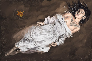
Ophelia


Title: Ophelia
Date: August 1 - 3, 2013
Medium: Photoshop CS 3
Scale: Original is 2025px x 1350px
Notes: I wanted to try something a little different... the main focus of this was not only to do a really good cloth study, but I wanted to try and simulate a master painting with a new spin. I found a good reference, but Ashley pointed out something kinda funny... 
"What is the purpose of her breasts to be out. I mean, maybe there is a small part of sex appeal or whatever, but why not either be fully nude, or have her skirt up too or something, so that way it kind of looks like she was violated and left to die or something... it just doesn't seem to make too much sense."
Silly enough, I hadn't actually thought about that at all during the process of painting, but it struck me right near the end. That girl has some good observations... As always, I need to pay attention to things she says hahaha!

Reference: http://idaniphotography.deviantart.com/art/Ophelia-389897495

Tutorial:


Follow Mat @artofmatk

Follow Ash @ashley.storyteller