Wednesday, September 17, 2014

Digital Painting: Texture Painting


Title: Digital Painting: Texture Painting
Medium: Photoshop CS6
Scale: Same as above.

Notes: For this class we were to do a bunch of different texture paintings. I forgot to post these, but here they are.
I definitely learned a very important detail while doing these: TEXTURE ARTISTS ARE BADASS.
I mean that in the best of ways. When you play a game or watch a 3D animated movie, pay close attention to those texture artists - they got it really hard. These things take longer than I would have assumed, and sometimes they still don't look as good as I would have liked.
Either way, I can say that it was definitely a learning experience. I've never really done anything like this before.

Tuesday, September 16, 2014

Illustration 5: Absolved Character Archetype #2 - Vigilants


Title: Illustration 5: Absolved Character Archetype #2 - Vigilants
Medium: Photoshop CS6, Pencil
Scale: Each 'piece' varies, final is 11" x 17"

Notes: The second archetype in a long string of archetypes that I am working on.
This piece was definitely out of my comfort zone because of the composition, color palette, and mood. But I think it was definitely a push forward in where I want to be.
There was a ton of research done for this archetype, so I feel like it was quite a bit more fleshed out than other ones that I've done thus far. All I can say really is that I want to keep pushing harder and learn from what I did here. As always, more to come!
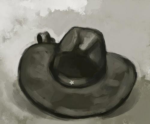
Friday, September 5, 2014

Digital Painting: Twenty Textures


Title: Digital Painting: Twenty Textures

Notes: This was for an assignment in digital painting class. We were to photograph twenty textures that we found interesting.
I'm kinda hoping that we are to use these as bases to paint on or maybe make brushes from. Some of these are pretty interesting to me and a little surprising when you really zoomed in on them. It was fun and unexpected to see what turned out when you really got in on an object.


-----------------------------------------------------------------------------------------------------------------------
In unrelated news:
-----------------------------------------------------------------------------------------------------------------------

Preview of Next Illustration


Title: Preview of Next Illustration
Date: September 4, 2014
Medium: Photoshop CS6

Notes: The next illustration is going to be an interesting one. I can't give any info except this teaser. You'll just have to watch and see soon! I really want to push this one next to THE MAX! 
See you soon.

Wednesday, September 3, 2014

Illustration 5: Absolved Character Archetype #1 - The Grafter


Title: Illustration 5: Absolved Character Archetype #1 - The Grafter
Medium: Photoshop CS6, Pencil
Scale: Each 'piece' varies, final is 11" x 17"

Notes: The first assignment for the semester! And these are going to be such fast turnarounds.
Okay, so the first character archetype for Absolved is basically a glorified fence. I intend this character type to be more of a social gamer rather than a combat first type of character.
Throughout the sketches not only was I exploring the character, but also the Displaced race as a whole. What kind of clothing would they wear? What type of areas would they live in? Basic questions were at the forefront of my mind so that I could start to create a bit of environment for these guys / gals to live in.
Ultimately, I realized in the final that there are some shortcomings that I need to get over, most notable the real lack of distinguished light source. But I can say that this is a real step in the right direction for me because I have a real hard time breaking from my reference, so this is a major push into the right direction!
I want to redo this piece before the semester is over so that I can make it right!
More to come.

Saturday, August 30, 2014

Digital Painting: Speed Paintings


Title: Digital Painting: Speed Painting
Date: August 29, 2014
Medium: Photoshop CC
Scale: Each 'piece' varies.

Notes: I've never really done applied speed painting before, and I can say that this exercise was REALLY fun to do, albeit extremely difficult. 
First, let me preface with saying that each one was timed, in a reverse progression. We started with the thirty-minute painting and worked our way down to five minutes. The bottom-most piece (Donatello) was the first, and then they go in reverse order from there, scaling down by five minutes each. I think it was only natural that the objects become more simple as the time was reduced, but some people really gave it a try even at the five-minute mark.
Either way, we all powered our paintings down and there wasn't much fuss. It was really fun to do, and I actually want to try and do these more often. I think setting a time limit really helps!

Friday, August 29, 2014

"Ascendancy Soundtrack"

I posted recently about some goals... A bit of this will be reiterating that.
I am still planning on pursuing these, but let me preface these by saying that I am going to be pushing harder than ever this semester! I have very clear objectives for this class that I hope to achieve. 

Firstly, let me start with where I am planning on going this semester. I think that should start with some serious thought into where I get my inspirations from, specifically for my portraiture.


I choose this one because of the subject matter. 
I think it's interesting to vary your character designs. Alex Negrea seems to be a bit versatile from hyper realistic, to space-faring aliens. Because of this, I want to try and push towards the realistic rendering style combined with this subject matter.


Ultimately, I can't get away from this painterly style. 
I think that my style actually lends itself towards this type of rendering. I love it so much, and it just so happens to be a good push towards an 'old-world' type of rendering. If you notice throughout some of my work, this happens to be what type of art I paint like.


I pursue this one because of the process. And also the texture. 
I want to learn how to have a ton more edge control like here. 


Texture, texture, texture!
I tend to fail in putting anything that visually breaks up the canvas, and somehow Bumskee manages to use this to great effect. I want to learn to start messing around with this.


Not only do I like how these are done, but I also love the color approach. 
I want to try and push into this as well! As I implement color, I want to start approaching it with a more academic approach in terms of what color combinations to use and things.

When I first started doing art, I initially wanted to do environment art for no other reason than the fact that I didn't want to animate. As I continue on, I realize that I actually prefer to just design characters. For some reason I had it stuck in my head that environments would be simpler. The reasons are insignificant, because it's much more important to A) have a clear goal up front, and B) to never compromise because "It's easier." As the saying goes, nothing good comes easy. And I whole-heartedly agree, because if it were easy, everyone would be doing it and it wouldn't be worth the time. Like I said, pay attention to yourself early on. I was interested in the character designs from the get-go, and I didn't listen to myself. Fast forward a tiny bit (not much) and you get closer to what I really wanted to do: character art. Baldur's Gate was probably my first real experience into what makes good character art - specifically for the portraiture.


I think from the moment I saw these until now, I just want to do portraits all day long. Character art was really pushed to the fore-front of my mind then and there. I guess that's why if you look through my blog, I've been constantly going back to the portraiture and characters. I have gotten into portraiture probably mostly in the past few months and I think this is an after-effect of my childhood gaming habits. I think I secretly always wanted to do this, I was just worried that I would never be good enough to get to this level.

My goal, overall, this semester is take portraits of people that I know, and use them as a basis for the final result of high-fantasy portraits. It's basically a combination of using very direct reference (since I have this crazy habit of using that), but using imagination to push them into interesting places from the character design aspect. If you look back the past few weeks, I've been starting to rethink my process and really get into a more painterly, but realistic approach to my painting style. If I can master this, I think it could potentially be a gateway into character illustration. Throughout this semester I think I will be heavily diving into the deep end of character-driven illustration. Be ready!


-----------------------------------------------------------------------------------------------------------------------
All artwork above this line is NOT MY WORK
Each artist is listed with their respective work.
-----------------------------------------------------------------------------------------------------------------------

And on a side note... BOXES!

Cardboard is the Best Board


Title: Cardboard is the Best Board
Date: August 28, 2014
Medium: Photoshop CS6
Scale: Original is 2048px x 1612px

Notes: Continuing on with what we were doing last class, I thought it would be good to paint a bunch of cubes all together. What better thing than a bunch of cardboard boxes! Anyway... just a fun painting to mess around with.

Follow Mat @artofmatk

Follow Ash @ashley.storyteller