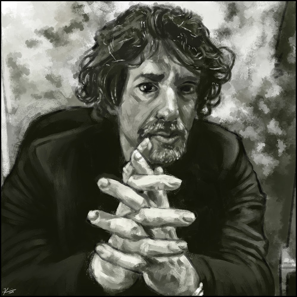
Pin Ups - Bettie Paige

Medium: Photoshop CS6
Notes: Talking to a buddy of mine at work, we decided that he needed a little more art on his walls. Eric Crimmins is quite the convention goer and I thought it would be awesome to try out an official art trade with him. So here's the result, now it's time to hand it over so that we can get this show on the road!