Thursday, February 27, 2014

The Prodigy - Invaders Must Die (Full Album)

Flight


Title: Flight
Medium: Oils
Scale: Original image is around 4ft x 2ft

Notes: No joke... this is the biggest painting I've ever done.
For some reason I had this in my head early on. Before I even started painting it I kind of knew exactly what I wanted to paint. Not only that, but this was one of the first real attempts at doing anything in oil that was more than just black and white. Oh this was so exciting to me and I definitely DEFINITELY want to do more of this.

Dust Sprites


Title: Dust Sprites
Date: February 14, 2013
Medium: Gouache
Scale: Original image is 15" x 20"

Notes: This was a birthday present for my special lady friend. She loves these little guys! I wish I could be as happy as they are all the time! They are from Miyazaki films such as Spirited Away and My Neighbor Totoro.

Serious Face


Title: Serious Face
Medium: Oils
Scale: Original is 9" x 12"

Notes: This was my first attempt at oil paints ever. I think it turned out okay, but those eyes are still wonky. From what I hear you can just go right over oil paints with more oil paints. OOHHH I'm so excited about Oil painting!

Sketchin' the Night Away


Title: Sketchin' the Night Away
Medium: Graphite
Scale: Each 'page' is 9" x 12"

Notes: These are all just various things that pop into my head while relaxing as well as doing sketches for different assignments. Just a small sampling really, but I thought I would share.
Comics 2: Characters 1 - 5


Title: Comics 2: Characters 1 - 5
Medium: Graphite
Scale: Each 'page' is 9" x 12"

Notes: The characters that we've had to flesh out so far for comics 2. From the top: Cora, Aleksi, Cora (alternate), Mr. Johnson, and the Journal. I can't really talk much about the overall character descriptions at the moment, but each one has about 1000 words talking about their past, their attitudes, why they exist, etc.

Characters are so damn fun... makes me more and more want to study Wes Burt and Marko Djurdjevic's character design!

Wednesday, February 26, 2014

Wednesday, February 19, 2014

Placebo - Space Monkey

False Starts


Title: False Starts
Medium: Photoshop CS3 & CS6
Scale: Varies

Notes: I think the most important thing to realize here, is that this happens to everyone. The sketching. I used to think this was a bad thing to not finish what you start. And I still think it sometimes. The point though, is to realize that sometimes the process is just as important as what you ultimately get out of the final piece. 

John Lee goes on about this type of thing over and over here. I would honestly suggest that you read a bunch of this to really get some good advice!

More pretty sound advice from Jeff Simpson at the Collective here. (thanks Erica!)

All-in-all, the point I'm trying to make is two-fold:

1) Do whatever it takes to get your final piece out. I mean, WHATEVER it takes. The industry from what I understand has such a huge turnaround rate that I think it's important to note that you might have to make finalized pieces in a day. I once read an article (can't find it at the moment) that talked about if you have a week to finish a piece, it better be a damn good piece. If you have an hour, then you give them your very best in an hour. Point being, always try your damn best!

2) Sometimes just purely sketching is just as important as finalized pieces. Just make sure that all of your sketching is actively pushing you towards some goal or you are just sketching for the sake of sketching. While this may work for certain artists (mainly because they lack a specific end-goal) you should always be actively researching things, making them look representational (and I could start a whole rant about how stylized and abstraction should be first influenced by correct basics, such as proper anatomy, proper color theory, etc.), and overall, making them appealing. Not specifically to everyone else, make sure that YOU enjoy your output. If you can't love your own work, how do you expect anyone else to?

ANYWAY... just some thoughts I had while sketching.

Finally... more advice on exposure from Gregory Manchess.

Tuesday, February 18, 2014

Logo Final 1: Origin Entertainment


Title: Logo Final 1: Origin Entertainment
Medium: Illustrator CS3

Notes: The final logo that I came up with for Origin Entertainment. One day this will hopefully become a reality... one day.

Logo Final 2: Cannonball Cakes


Title: Logo Final 2: Cannonball Cakes
Medium: Photoshop CS3

Notes: As a continuation of the logo design project, we were to take someone else's logo in the class, and then redesign it to fit around our own personal style. Of course there was someone in the middle that served as our art director and they would hand off their sketch and then we were to finalize it.

Saturday, February 15, 2014

Depeche Mode - Dream On

Black Magic Woman


Title: Black Magic Woman
Date: February 14, 2013
Medium: Photoshop CS3
Scale: Original image is 1224px x 1632px

Notes: Continuing on attempting that oil painting style with my digitals. 
I tried some new stuff in terms of using different brushes in different areas to see how that would change things. I don't know why I love portraits so much. I should break away from them for a bit maybe and do some animals or something... Unfortunately for the oil paintings that I'm working on, since I'm not comfortable with the materials, I'm working with comfortable subject matter.

Anyway... more soon!

Tuesday, February 11, 2014

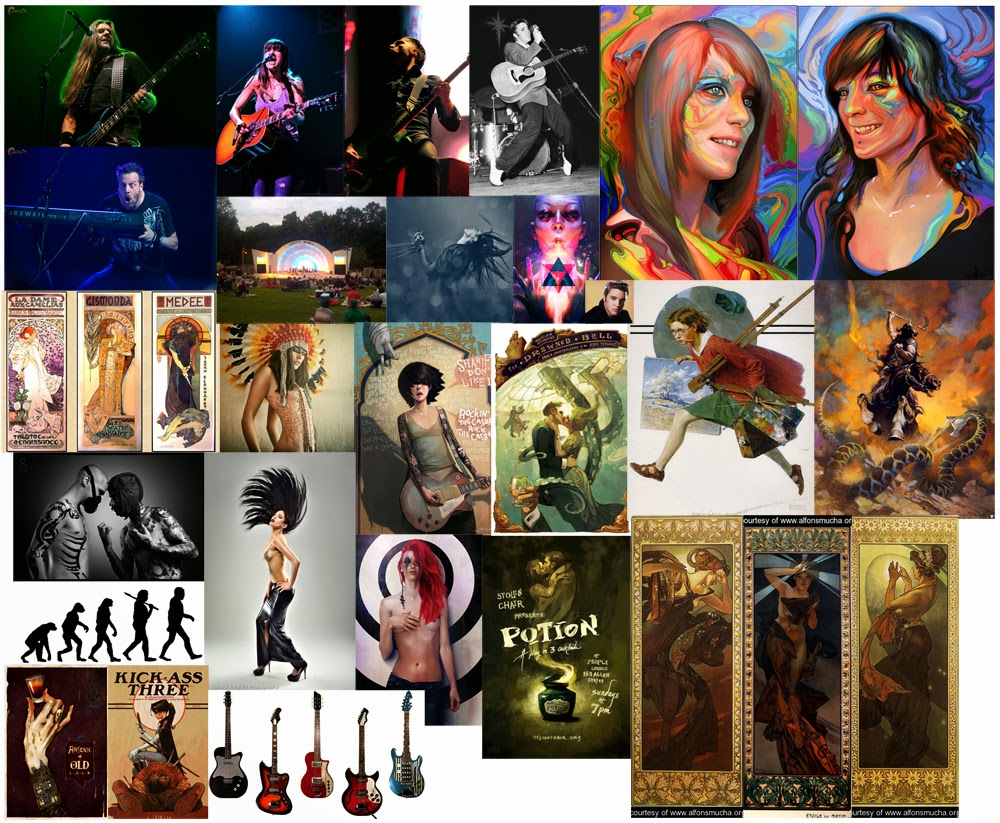
Illustration 4: Levitt Shell Poster & T-Shirt


Title: Illustration 4: Levitt Shell Poster & T-Shirt
Date: February 8 - 10, 2013
Medium: Photoshop CS3

Notes: This is for the newest project we have on the burner for Illustration 4. We are working with the Levitt Shell for a competition to help design a poster and t-shirt for the summer concert series.

The thumbs above are different ideas that were rolling around my head while looking at a whole bunch of reference photos.

  • Head swirling hair back to make it look like the Levitt Shell. (Janis Joplin?)
  • Evolution chart from birth to rockstar.
  • Half-cut from neck down of a guitarist. Show the guitar leaning towards the audience.
  • Look at Mucha paintings. Maybe one with a rockstar would work?
  • Rudeone - Rock the Casbah. What if it were to an Elvis type figure butted up against a heavily tattoo'd person (back to back).
Were just a couple of ideas that immediately popped out. I'm sure there will be more, but this is where I'm at currently.
Also, the moodboard below reflects all of the applicable images that I could find that were related to those five themes above.


Mysterious Woman


Title: Mysterious Woman
Date: February 10, 2013
Medium: Photoshop CS3
Scale: Original image is 1428px x 1800px

Notes: I've been watching more oil painting demos and then attempting to apply them to my photo studies that I do digitally. This is my newest attempt. Of course I think it helps a ton to get read to while working. 

On a side note, I've finally braved it. I have more work to do on it, but I've started to officially oil paint!

I'll post that later when I'm satisfied with it...

Here's the tutorial for this one. As always, leave a comment if you need any clarification or if you want a better tutorial.


Thursday, February 6, 2014

DJ Shadow - Endtroducing...

The Stars Come Out to Play


Title: The Stars Come Out to Play
Date: February 6, 2013
Medium: Photoshop CS3
Scale: Original image is 1600px x 1470px

Notes: Yet again, watching those oil painting videos is really helping out. Seriously in the next few days I'm going to bust out the oil paints for sure! I'm so damn anxious to get them to work right.
Anyway... feeling ill today so I just sat around working on homework (clay sculpture). I decided to take a break for a bit and cranked this thing out. Just a photostudy, but I feel like things are starting to get a little easier. I guess that's how it goes, the more you do it, the easier it gets?
Eh, whichever... here's a tutorial for anyone that wants it:


Comics 2: Cora's Wonderful Writing Day


Title: Comics 2: Cora's Wonderful Writing Day
Date: February 1 & 2, 2013
Medium: Photoshop CS3
Scale: Each page is 8.5" x 11"

Notes: Since posting the character design sheet we were tasked with creating a comic that was two-to-four pages in length using our main character as a driving force for an action.

Overall, I can personally say that I rushed this one too hard. I had the script hewn out pretty early, but for some reason I just wasn't feeling it. This will most likely be one project that I will have to rework because as of right now it looks more like it's at the like earlier stages. You can see that story there, but it still seems to have some work to go in my opinion.
Either way, Cora feels nice and inspired...

Follow Mat @artofmatk

Follow Ash @ashley.storyteller